Everyday Media

An everyday blog about media by everyday blogger Louise Alice Wilson.

Category: Uses of Photography (page 1 of 2)

Week 12 – Editing, Post-processing

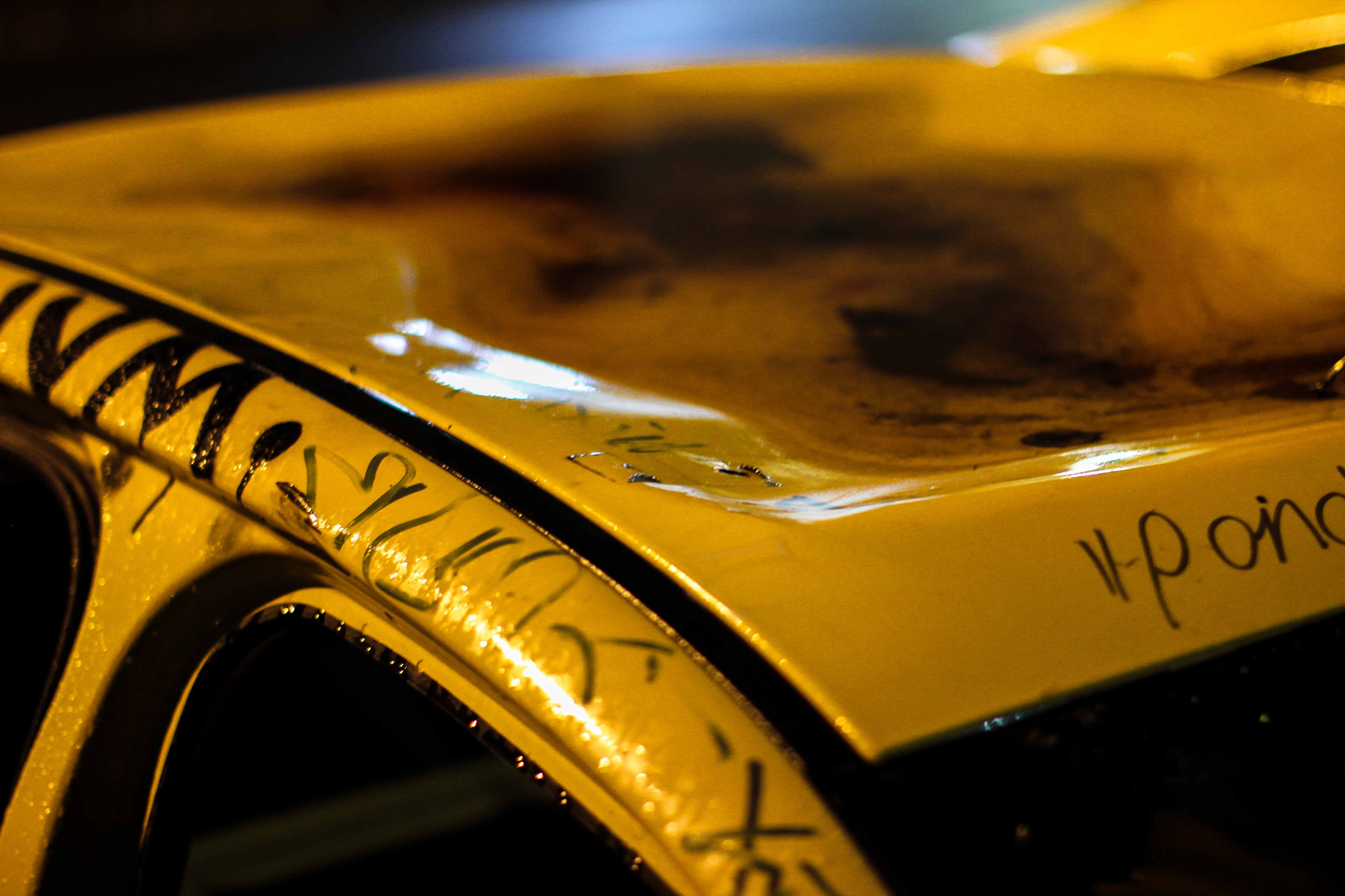
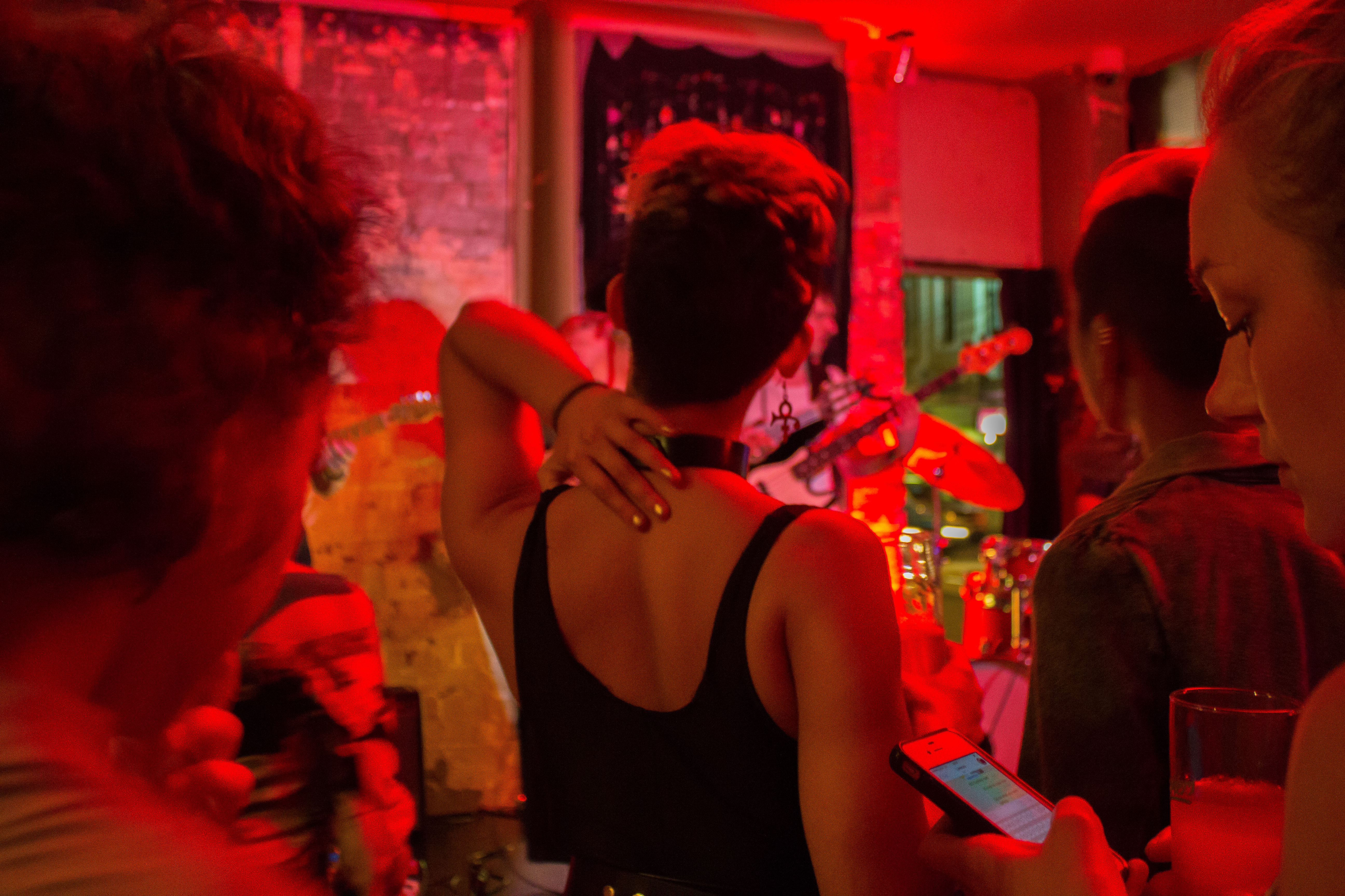
After completing each of my shoots I began to post-process my images using Adobe’s Lightroom. Some of the images were edited a lot more than others, some required little editing, but overall I attempted to maintain a sense of consistency throughout the collection. Certain editing manipulations were applied to every single one of my images, rough numerical values of these manipulations are as follows:

  • Increasing contrast to +30
  • Reducing  highlights to -30 to -20
  • Increasing clarity to +20
  • Increasing vibrance to +30
  • Increasing sharpening to 80
  • Increasing noise reduction to +30

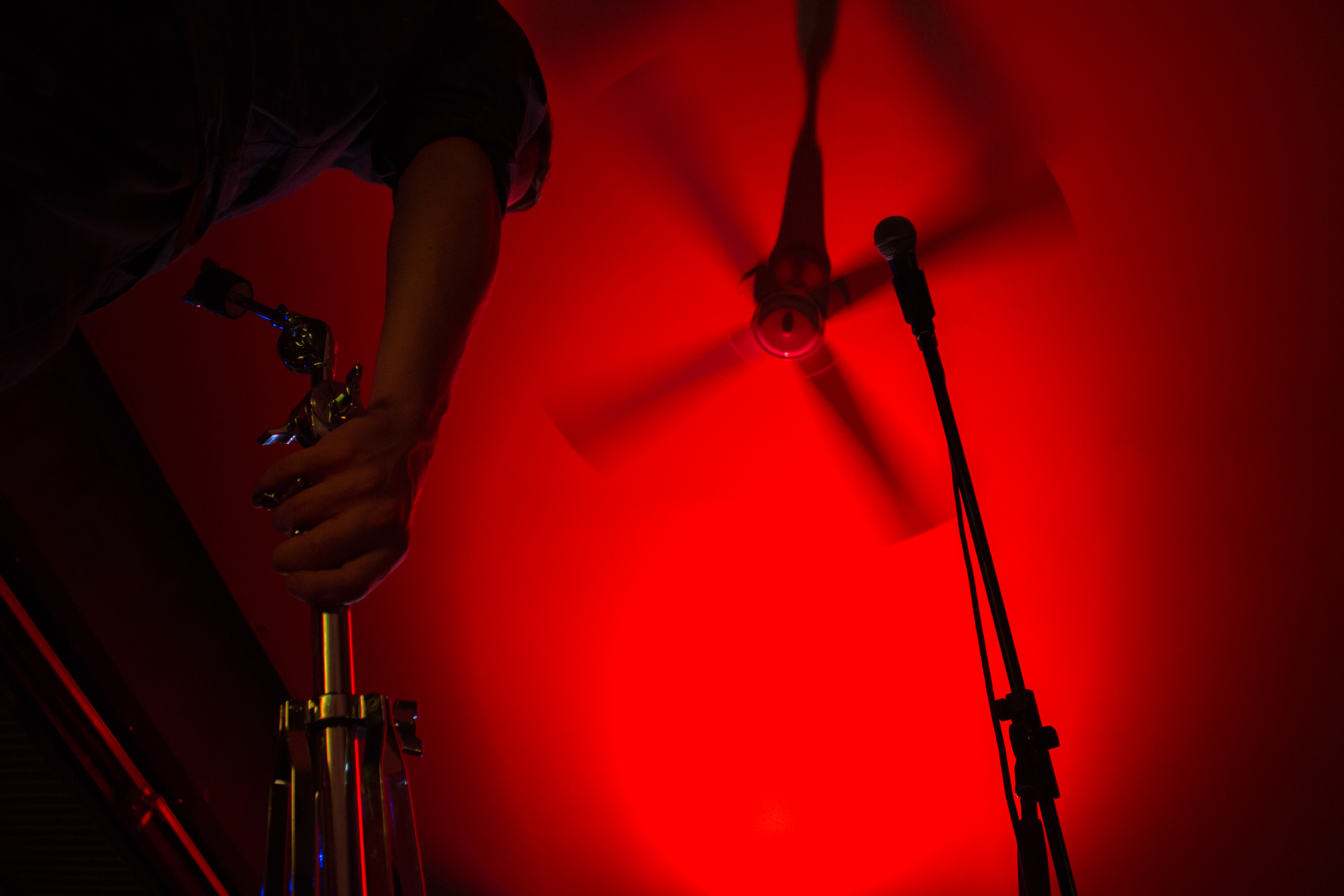
Increasing contrast, clarity and sharpening all have a similar effect. They essentially make the image appear more defined, crisp and stark. This ends up making the image appear grittier, more textured and more ‘professional. Reducing the highlights helps regain information that is lost through over saturation of light, retaining more detail in the image. It also helps to balance the exposure of the image, so there’s not one area that’s significantly brighter or more saturated with light than the rest. Increasing the vibrance helped to bring out under-represented colours within the image, making the images appear livelier and more dynamic. Increasing noise reduction just stops the images from appearing to grainy, sometimes if you overdo it the image appears super creamy and soft. Because I wanted these images especially gritty I tried to keep noise reduction to a minimum.

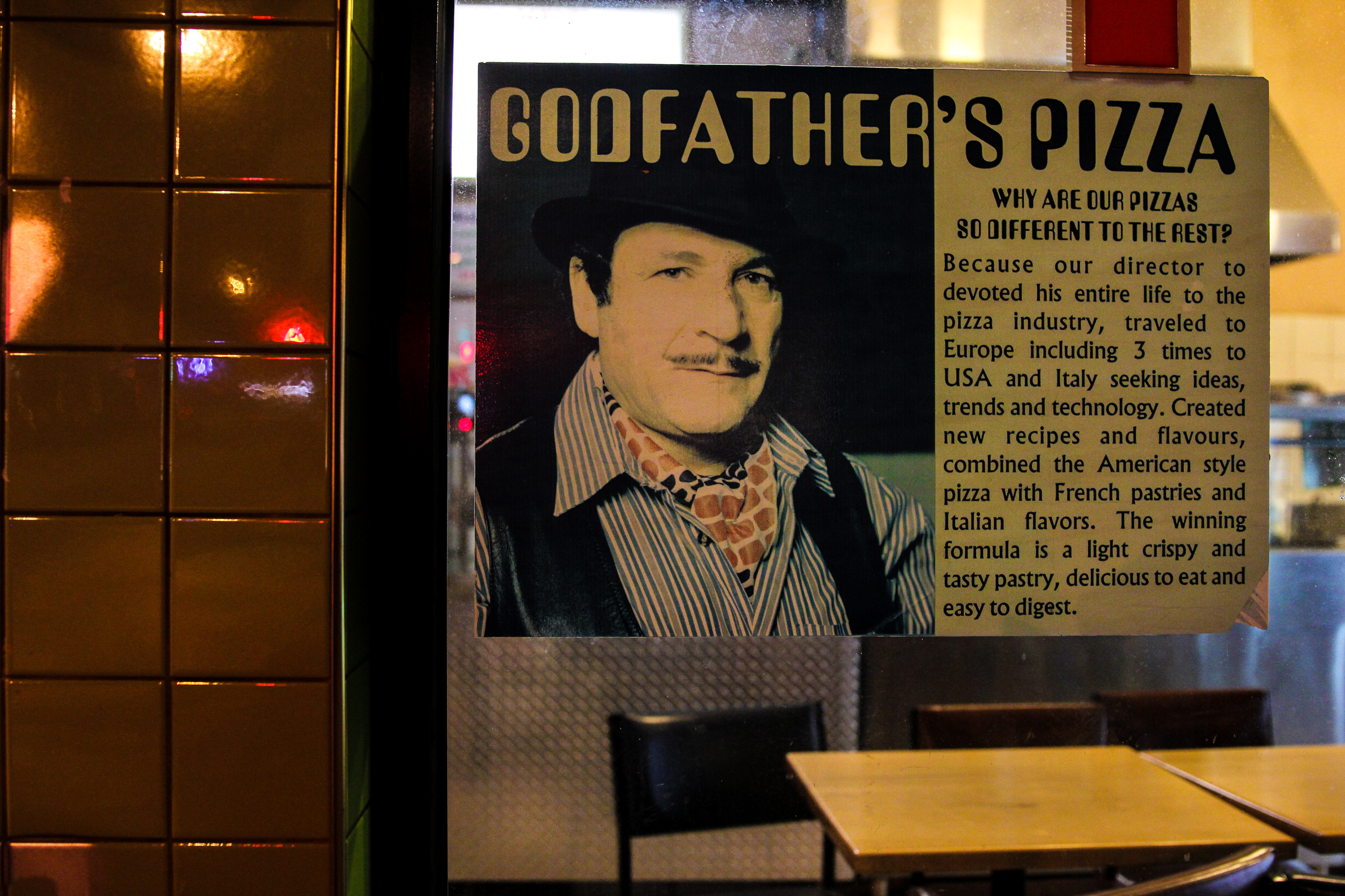
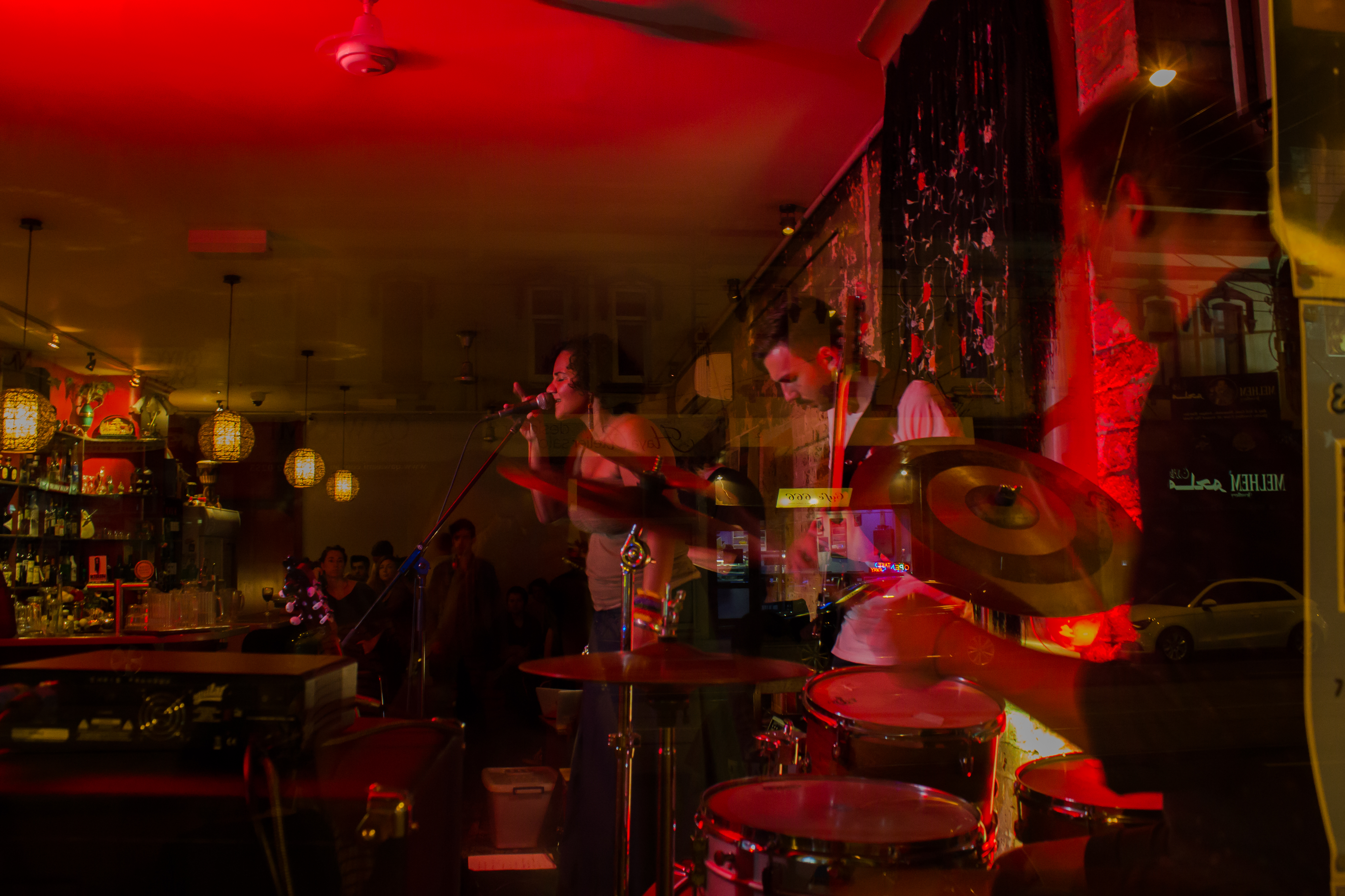
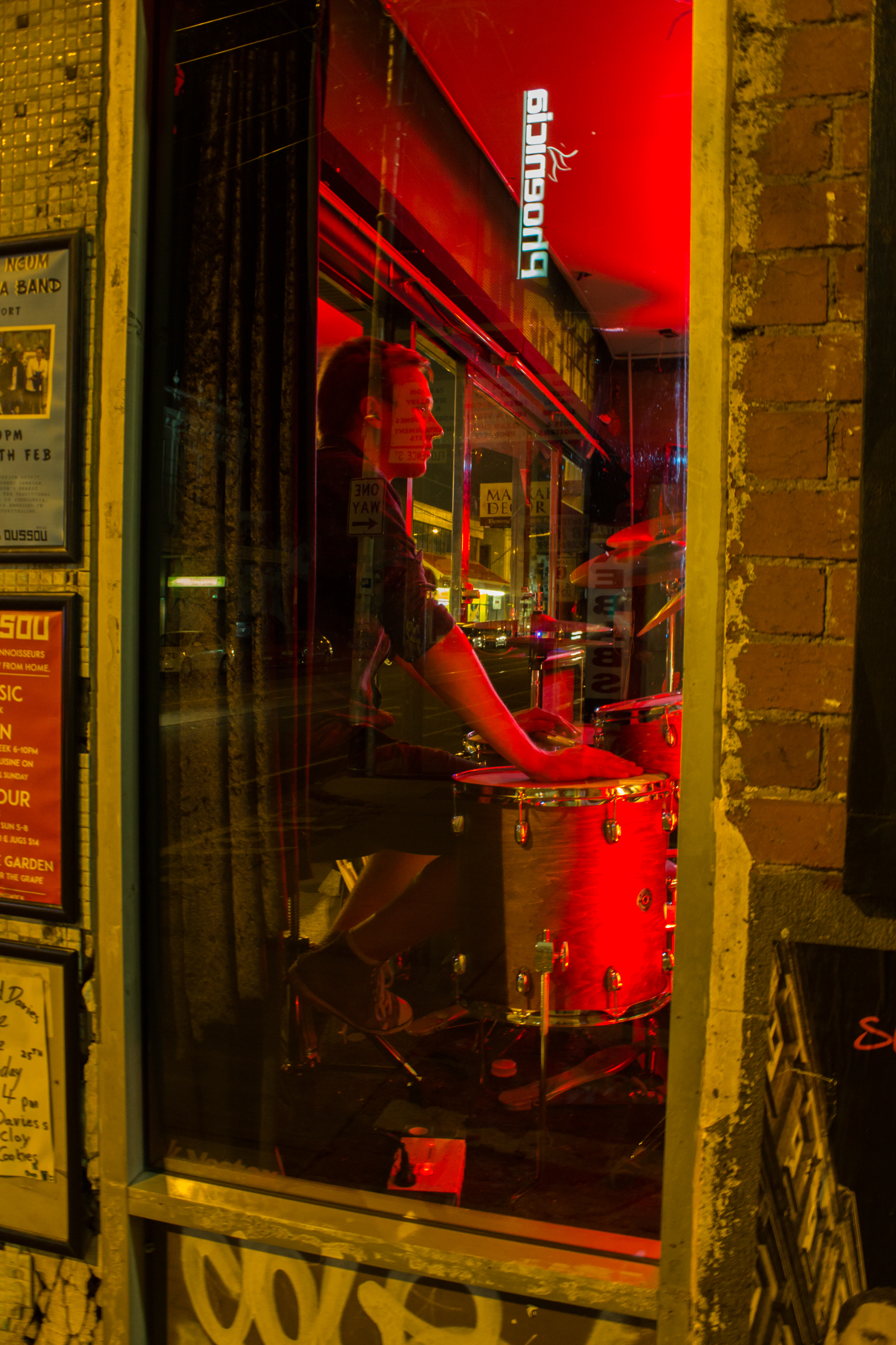
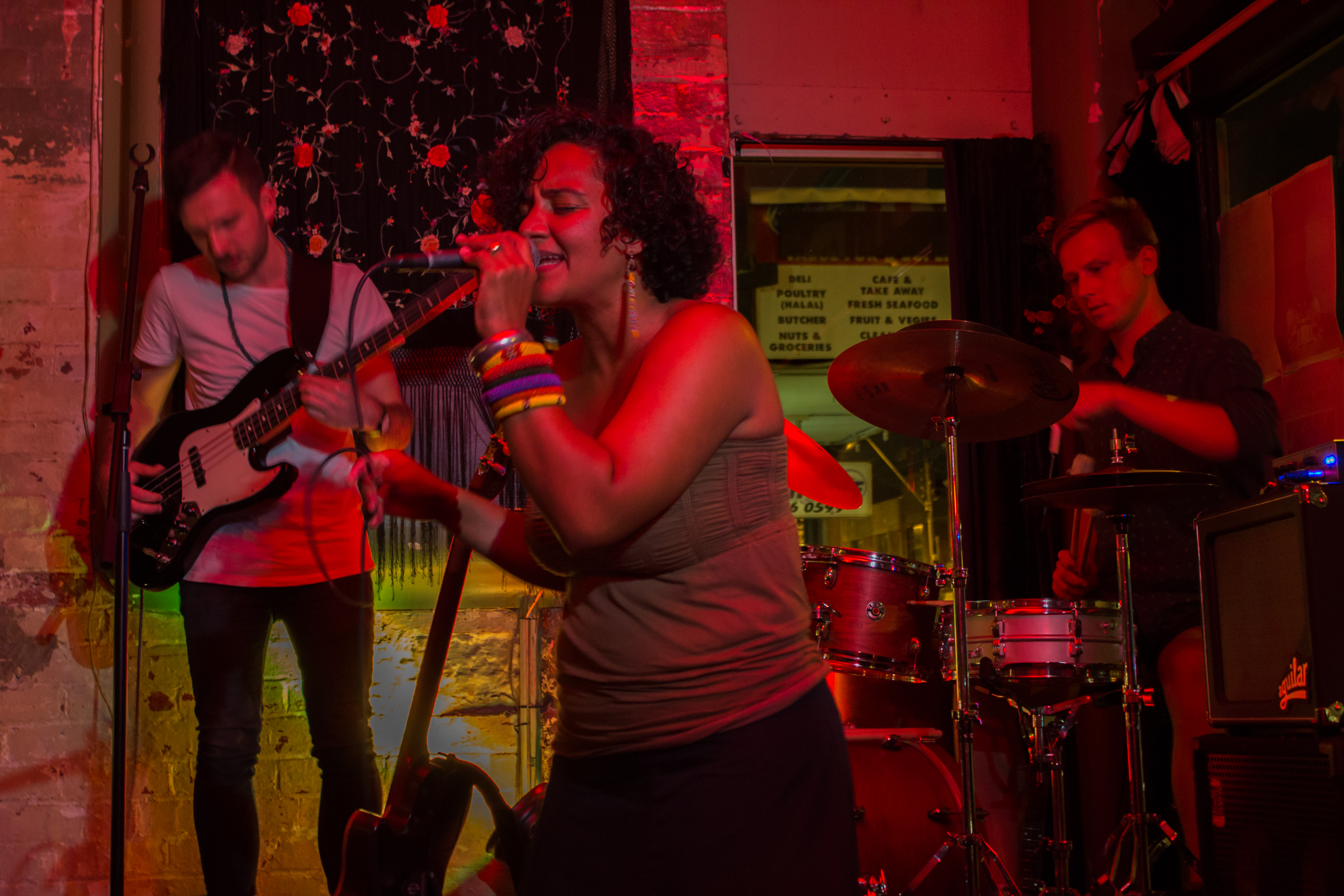
Below are some examples of the individual editing manipulations I made and how they impacted each image:

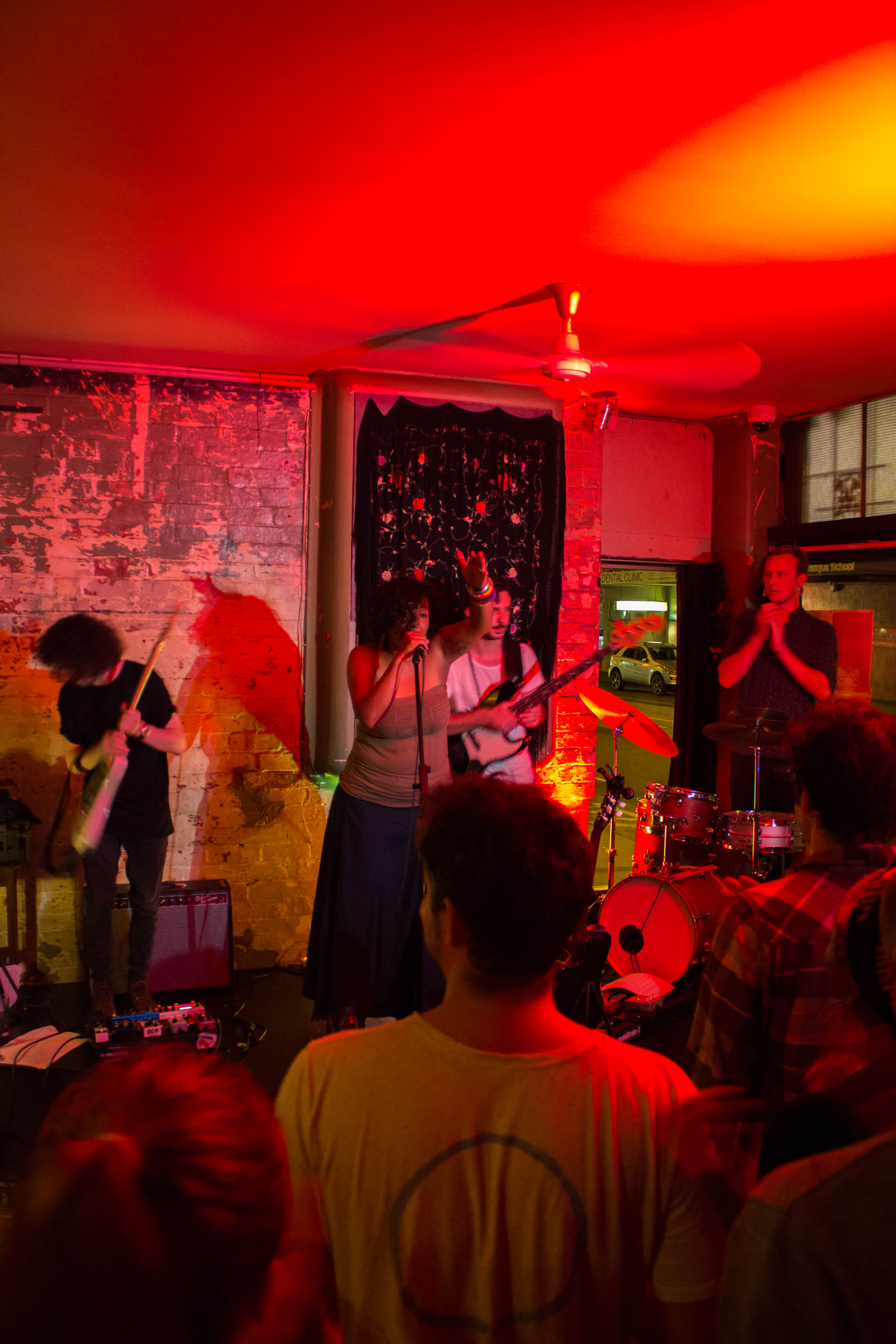
Image 1: Before post-processing

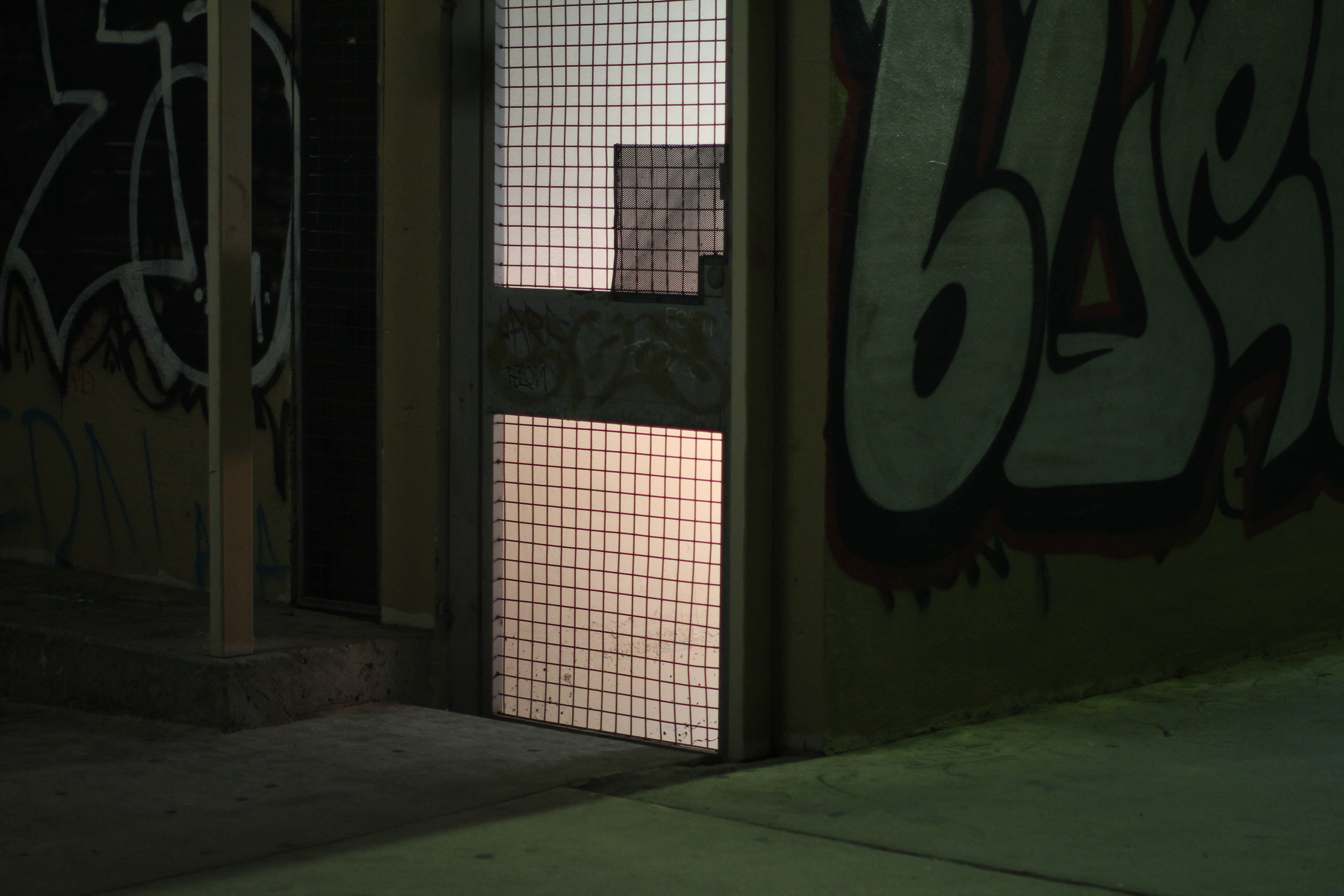
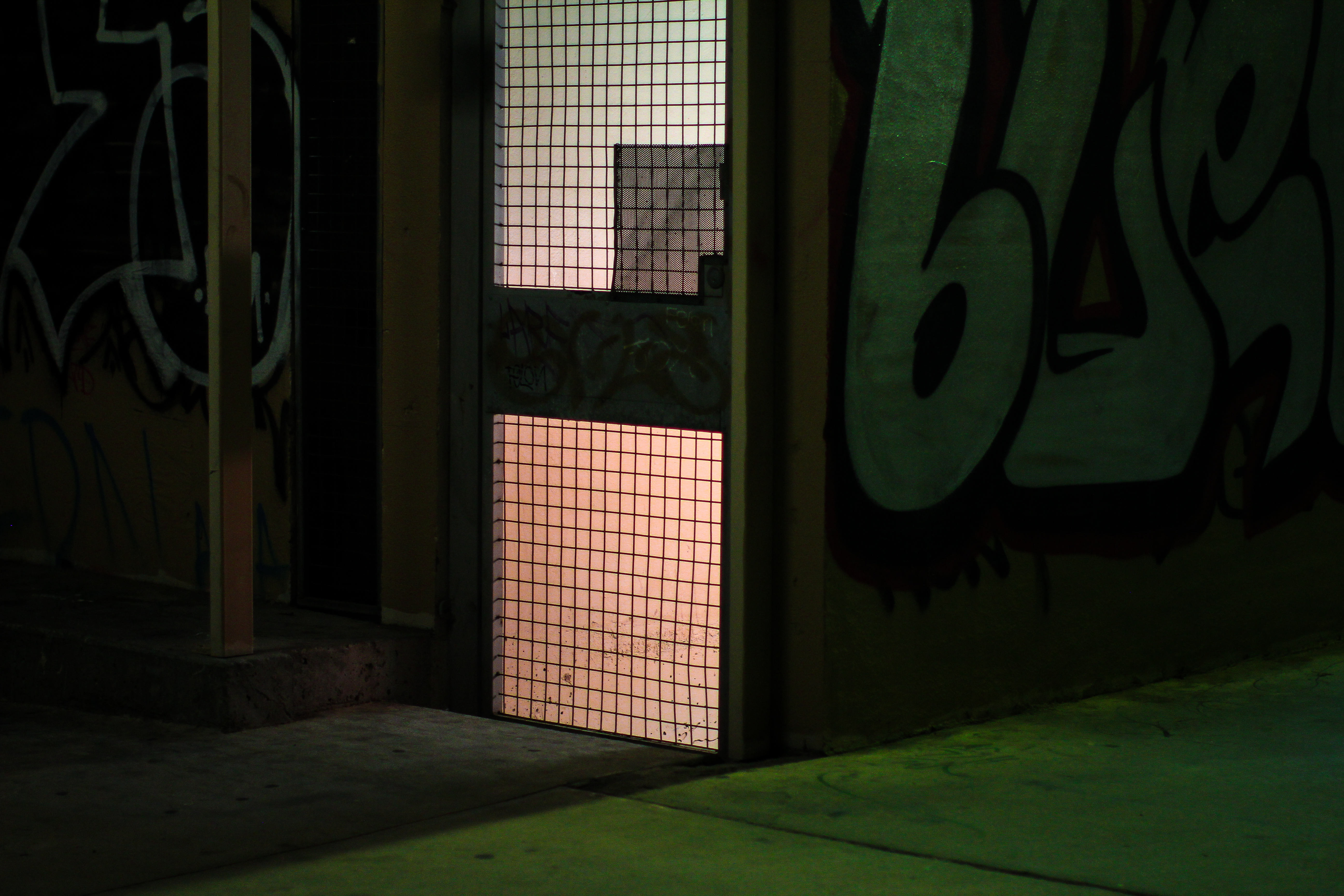
Image 1: After post-processing


Post-processing applied to this image:

I reduced the shadows to -35 to make the patches of black appear darker, this made the image appear more textured, dynamic and gloomier. I increased the whites to +39 this is confusing, but essentially it helps make the image appear ‘brighter’ and clearer overall without making the image appear less ‘gloomy’ and dark. It also really helped to bring out that brightness of the doorway, and the shafts of light on the ground, without appearing oversaturated, like an increase in highlights might do. I reduced the blacks to -5, this just helped make the blacks appear starker and more opaque adding some more depth and gloominess to the image. I adjust the hue of orange to -50 and the hue of yellow to -50 this made the colour within the doorway appear a more pinkish colour, rather than a coral/orange colour which I didn’t really want. I also adjusted the hue of green to +7 this gave the green a more bluey-green tone rather than a yellowy-green tone which I think works better in this image. I increased the saturation of yellow to +30 this helped bring out the yellow splashed on and around the doorway. I increased the saturation of green to +30, this really brought out the green, especially that on the concrete floor, making the combined colours within this image really clash, and appear super bright and dynamic. I also increased the luminance of yellow to +10 to  make that doorway light feel slightly brighter.

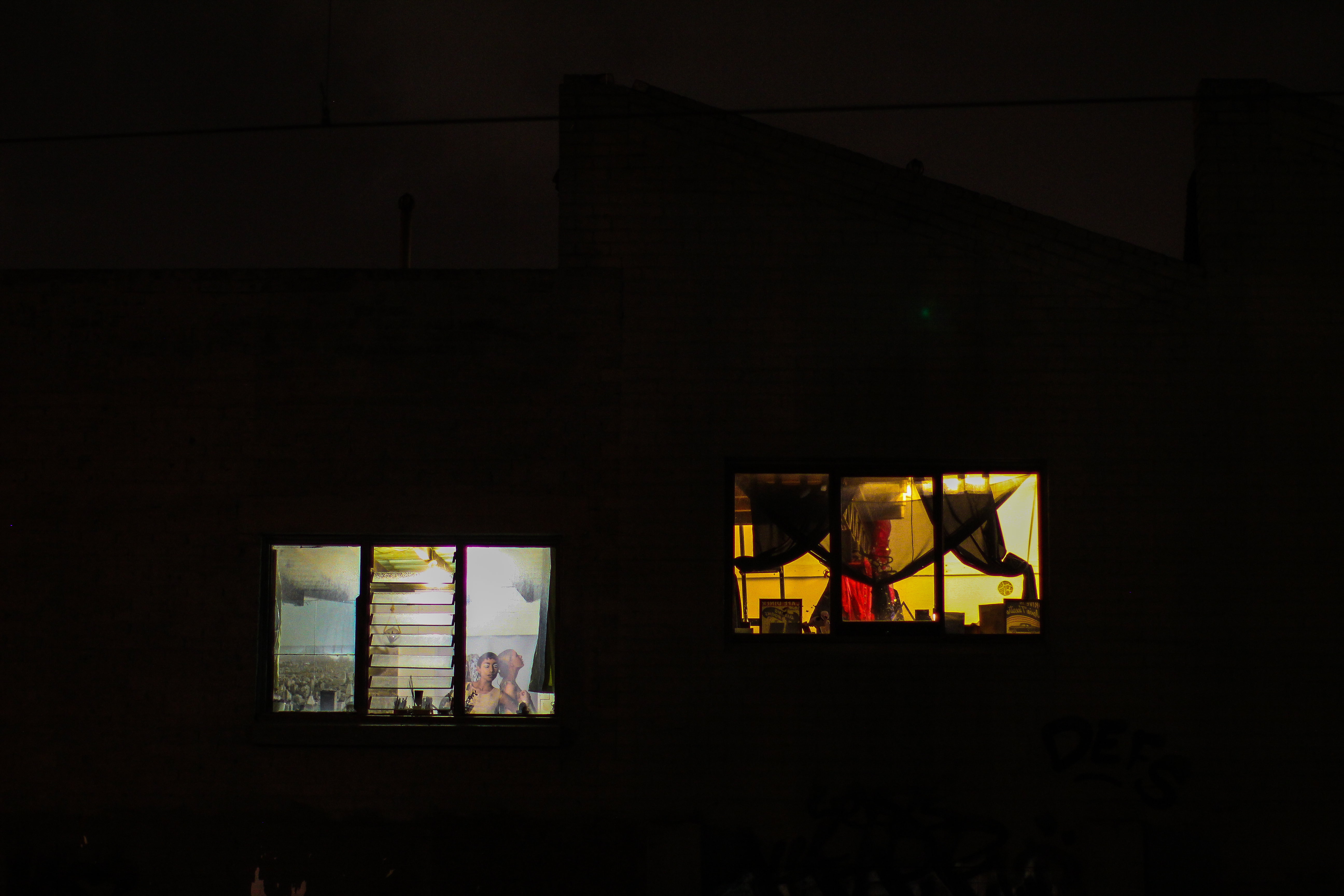
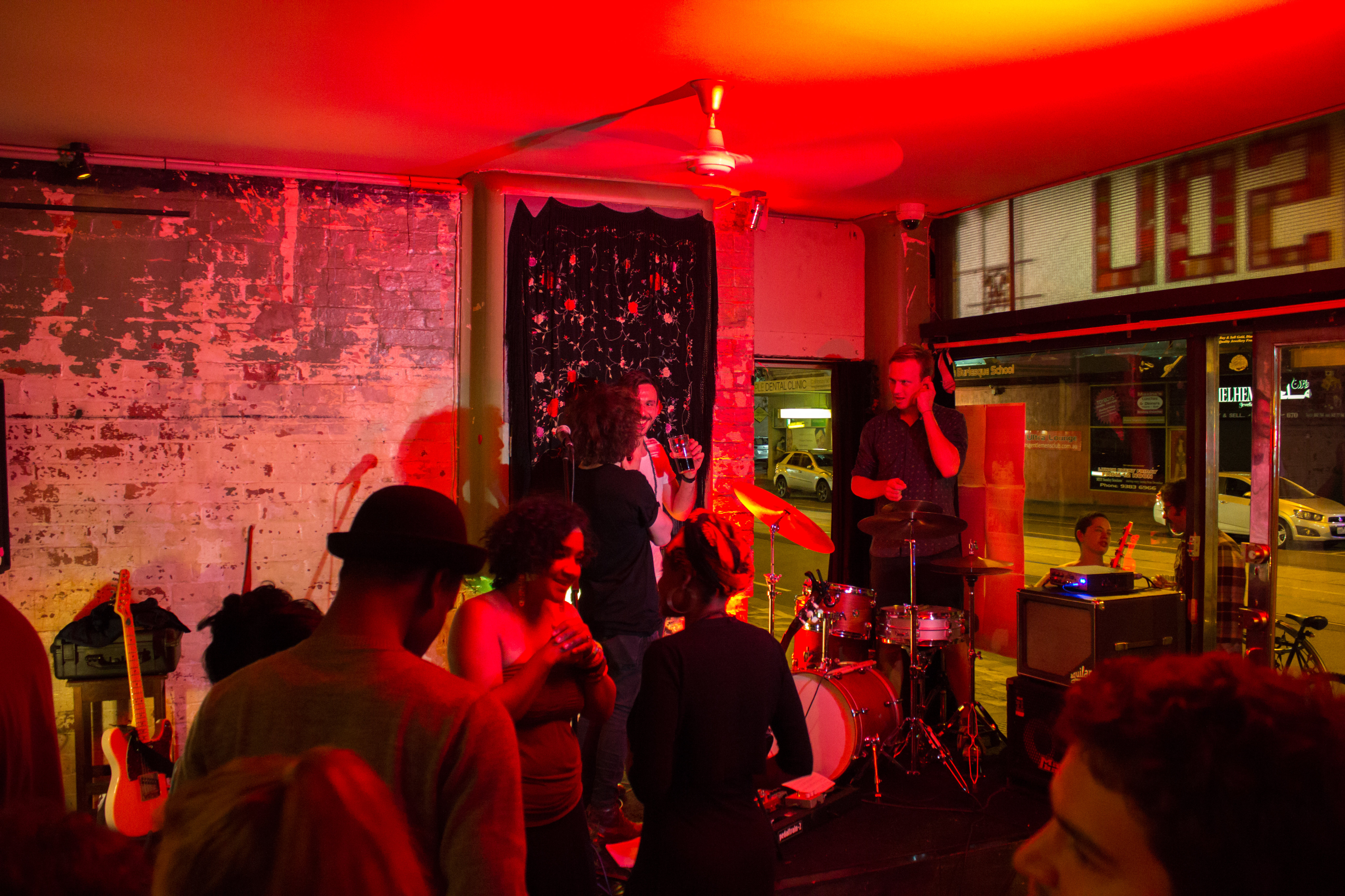
Image 2: Before post-processing

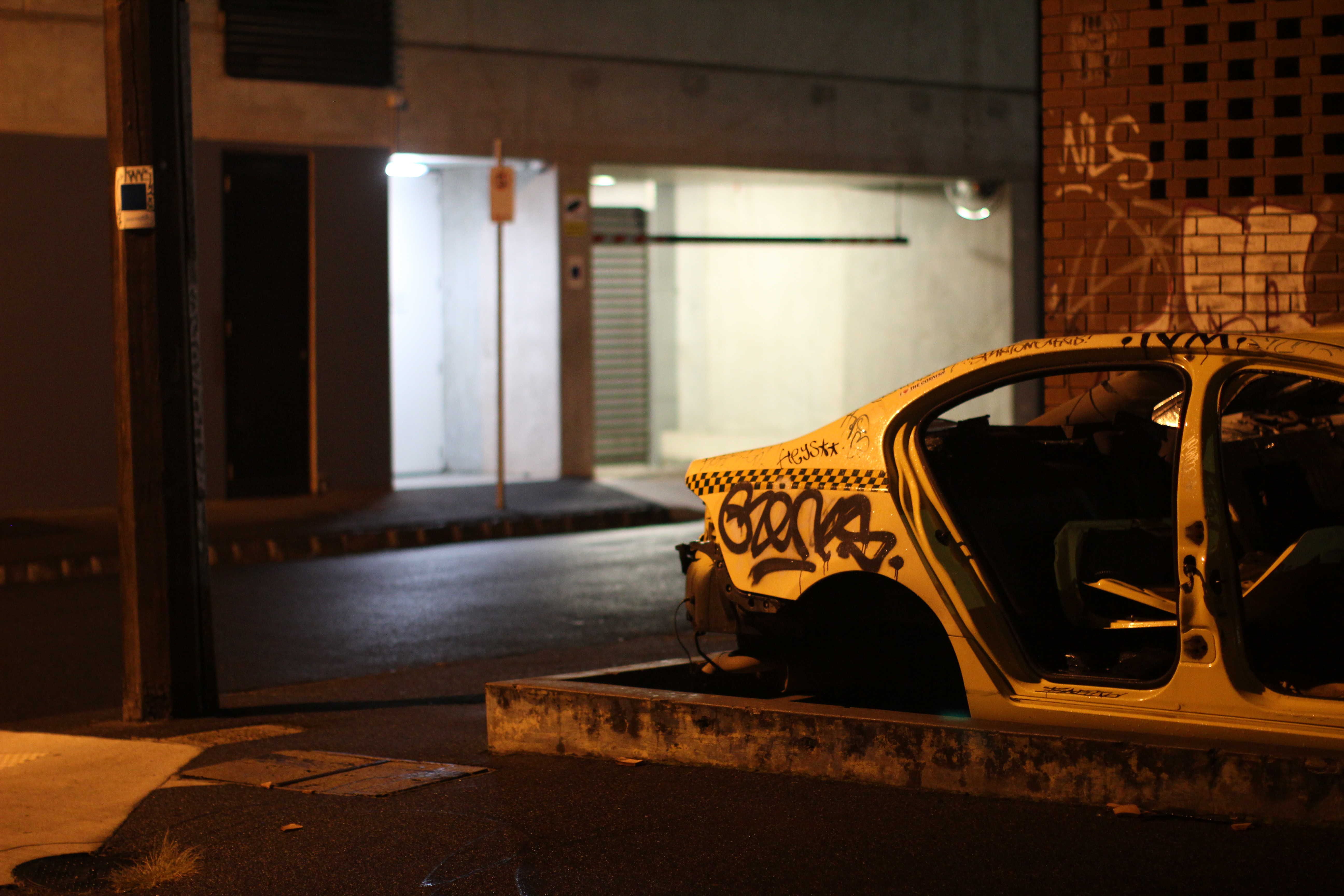
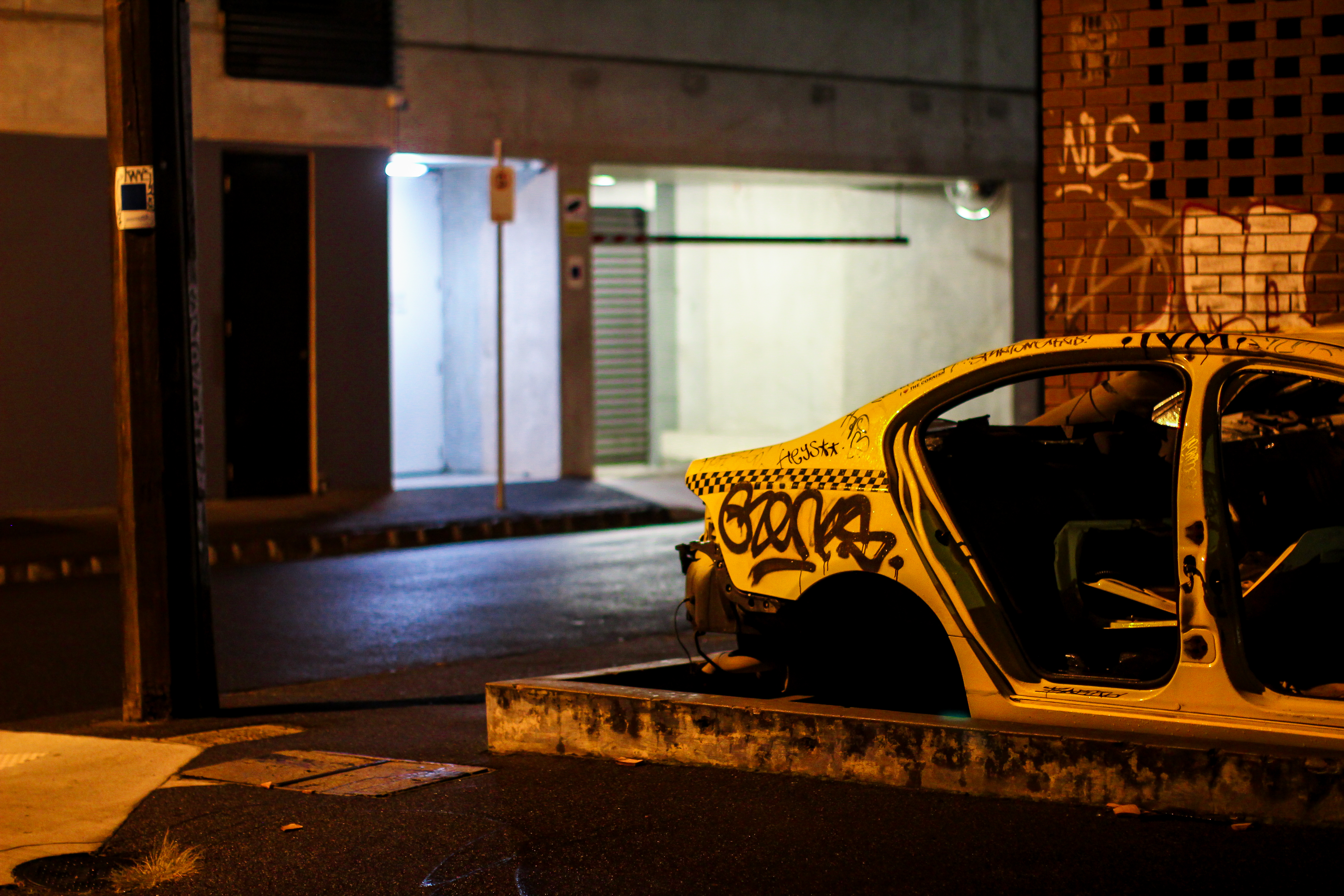
Image 2: After post-processing

Post-processing applied to this image:

I reduced the temp of this image to -8 and increased the tint to +5. This was an attempt to compensate for the yellow caste that was present in this image. A lot of the images I shot had similar yellow castes to them (from nearby streetlights), I attempted to reduce these caste’s so that these images would assimilate with the other images I shot that didn’t have these yellow castes. I increased the shadows to +5, so I could regain some detail lost from the darkness of this image. I increased the whites to +40 to make the image appear brighter overall. I reduced the blacks to -26 to make them appear starker and more opaque. I then adjusted the hue of red to -30 to help the bricks retain their red tones, without being too yellowy. I increased the hue of orange to +15 and yellow to +16 to change the orange caste over this image from a red/pink-orange to a more yellow/green-orange. I then increased the saturation of red to +70 to bring out the bricks behind the taxi as well as the graffiti on the bricks. I also increased the saturation of green and yellow to bring out the colour present in the two lights of the apartment in the background of this image. Bringing a higher number of colours out makes the image look fuller, more dynamic and helps to balance the extremeness of certain other colours present such as orange or yellow.

Before beginning this studio I had never used Lightroom before and I had never post-processed any images. I was actually extremely intimidated by the idea of editing images, it seemed like a complicated and overwhelming process that I wasn’t particularly keen to get into. After beginning to use Lightroom within this studio I realised that editing images does not have to be hard and the benefits, when comparing before and after photos, are insane. Editing an image really allows you to maximise the beauty of an image and to ensure that the image on screen appears how you saw it in real life. I’m at the point now, where I’m using Lightroom almost everyday and there’s rarely a time when I post an image online or send it to someone without editing it using Lightroom first.

Until next time,

Louise Alice Wilson

Week 11 – The Shoot & Key Creative Decisions

Over the past few weeks I’ve done about four seperate shoots. The first two shoots focussed on capturing aspects of Brunswick’s grit at night, the third focussed on capturing aspects of Brunswick’s gentrification during the day and the fourth focussed on capturing both grit and gentrification at night. I’ll give you a taste of each seperate shoot by providing five photos from each shoot below, then I’ll go into detail about each shoot.

The First Shoot – Brunswick’s ‘Grit’ at Night

Shot 1: Carpark

Shot 2: Abandoned Taxi

Shot 3: Pedestrian Overpass

Shot 4: Windows

Shot 5: Brunswick Bath’s

Shoot 1: I went out on my first shoot the night before we were presenting our compendium ideas because I really wanted to have some actual shoots to present to the class and the panel so I could get some solid feedback. For this shoot (and the rest of my shoots) I rented out a Canon 50mm prime lens with a low aperture so I could get some awesome low light shots. The prime lens was amazing, because not only does it allow you to capture images you otherwise may be unable to capture but it’s got amazing optics which just seem to make the image look BETTER. I really loved all the photos from this shoot, a: because I felt inspired but b: the sky was super bright that night and the sky had turned a kind of purple-y colour, which looked awesome in some of the shots and gave the street scenes a really interesting colour palette. In this first shoot I was just trying to photograph anything ‘gritty’ that I came across, I wasn’t particularly looking for a certain thing. So it acted as a kind of ‘appraisal’ of the entire area.


The Second Shoot – Brunswick’s ‘Grit’ at Night

Shot 1: Railway Tracks

Shot 2: Warehouse Window

Shot 3: Bike Path

Shot 4: Alleyway

Shot 5: Delivery Trucks

Shoot 2: On the second shoot I already received feedback about my first set of photos, i’d already viewed the first set of photos I’d shot and I’d also done some post-processing to them to see how they look. So I spent much of the second shoot trying to ‘recreate’ or at least mirror the images in the first shoot I did. One major thing I noticed in my first series of shots is that a lot of the images has this yellow caste to them because of the yellow streetlights they were situated near. So I purposely captured images that had these particular colour tones so they would look cohesive with other things i’d shot. I also tried to get more images of the backstreets, hence the alleyway shot and images of the industrial food warehouses around Brunswick, hence the shot of the truck. I do like these images but they felt slightly less inspired to me.

The Third Shot: Brunswick’s Gentrification at Daytime

Shot 1: Recycle Boutique

Shot 2: Cafe

Shot 3: Sunday Clothing Store

Shot 4:

Shot 5: Real Estate Development

Shoot 3: For the third shoot (after receiving feedback about how to capture the ‘gentrified’ aspects of Brunswick) I went out during the day to capture gentrified aspects of Brunswick. This shoot was particularly hard for me because it felt extremely uninspired. When I shot the gritty images I loved everything I was looking at, I thought all of it was beautiful. The process of walking around Brunswick’s backstreets and visually searching for something that you ‘particularly’ liked or something that ‘touched’ you and photographing it felt super creative. Walking around Brunswick looking for new buildings, cafe’s and bar’s and then trying to photograph them felt dry and stale. Essentially this just involved me walking around Brunswick trying to find creative ways to shoot various ‘products of gentrification’. This was quite hard as people don’t really like you taking random photos of their cafes and bars etc. and it’s hard to make a photo of a gentrified cafe or a bank look visually interesting and still be intellectually valid. I wasn’t sure how I felt about these shots and I wasn’t sure how i’d blend them in with my ‘gritty’ shots. I tried creating a collection set on Lightroom and blending them in together, but something felt non-cohesive about it, and not in a good way.


The Fourth Shoot: Brunswick’s Grit & Gentrification at Night

Shot 1: Parking Sign

Shot 2: Godfather’s Pizza

Shot 3: Apartment Construction

Shot 4: Chemist Warehouse

Shot 5: Restricted

Shoot 4: After receiving feedback from Bella I felt a lot more confident about what to shoot this time round. Essentially I showed Bella my ‘gentrified’ shots and she said that rather than focus on taking photographs of the products of gentrification such as banks, cafes, etc. that I should shoot the division caused by gentrification. Such as my last shot in the previous series of the real estate development sign and the second photo from my compendium ideas presentation of sidewalk construction. She said she really liked both of these images and that I should shoot more of this stuff, she also suggested I shoot the gentrified photos also at night time so the photobook looks more cohesive. So for this shoot rather than focussing on taking photos of grit or gentrification I decided to take pictures that spoke of both. The first photo features a parking sign covered in various artistic stickers with a construction crane looming in the background, the second photo shows the cultural background and history of the area, the third features apartment buildings being completed, the fourth showcasing mass consumerism and artistic protest and the fifth showing attempted governmental/council restrictions being placed upon the area. I really loved this shoot because I felt I could explore my original topic more deeply and it shows the way that grit and gentrification blend, often seamlessly to the eye, but very inharmoniously.  This shoot provided a number of images that really helped round off my photobook so that it not only makes more sense but it has more intellectual depth and validity.


Until next time,

Louise Alice Wilson


Week 10 – Reflections on Critique

I’d say that 89% of people don’t like presenting, at all, to anyone, about anything (this fact is 100% made up). However, presenting to Dan Binns, Pauline Anastasiou and Brian Morris (plus the entire studio) today wasn’t actually that bad, if anything I kind of enjoyed it. This is most likely because i’d been super excited about shooting for this project, so was pretty keen to share the work i’d done so far on it. I even rented out a Canon 50mm prime lens from RMIT’s AV department for the shoot. This way I could capture some super clean, low-noise night shots and they turned out pretty great! This is what I ended up with:


Shot 1: Abandoned Taxi


Shot 2: Sidewalk Construction


Shot 3: Train Tracks


I entitled my presentation “The Grit That Remains” which Pauline seemed to really like, suggesting I should use that as the name of my photobook. The basic premise for my compendium so far is to shoot anomalies of gentrification in Brunswick. Aspects of Brunswick which have not yet been converted or engulfed by gentrification, the ‘grit that remains’. In general the panel seemed to quite like my idea and I think they quite liked the photos I had shot so far, which was good to hear! They did question why I chose to shoot Brunswick at night, and I really just did it because I love the look of Brunswick at night. I love the way the streetlights add different castes of lights to the images making them look more romantic and surreal. So I thought this would work great for my photo series as I’m attempting to showcase these non-gentrified aspects of Brunswick (which I love), in an aesthetically pleasing way.

The two questions that decided to ask the panel were:

  1. Should I shoot the new, shiny stuff to serve as a comparison? Or shoot an entire series of grit?
  2. If I shoot the new stuff should I shoot new things that are informed by the old, such as industrial/hip bars and cafes? or the truly gentrified new bars and cafes?

The panel suggested that I should definitely shoot gentrified aspects to serve as a comparison, maybe shooting gentrified aspects of Brunswick during the day to make the gentrified and non-gentrified aspects appear visually distinct. They also suggested that I shoot the newer, more gentrified aspects of Brunswick to make the comparison quite visually distinct. I thought this was great advice so I’m gonna head out and shoot some gentrified aspects of Brunswick during the day sometime this week, which is pretty exciting! Overall I’m keen to see how this project turns out, I hope I manage to have an interesting series of images for my photobook!


Until next time,

Louise Alice Wilson


Week 9 – Bella’s Books

Bella’s Books

This week we had (Isa)Bella Capezio come round and give us a great mini presentation on photobooks, bringing with her a number of beautiful examples. One of my favourite photobook’s from the selection that Bella brought in was about a young man who moves to Korea and dates a Korean woman and his father that ends up following him over there and doing the same thing.

When you first look through this photobook it just feels like a loose collection of images about urban life in Korea. However at exactly halfway through the photobook the images begin to visually repeat themselves. Once you realise the images repeat themselves you start flicking back and forth between pages trying to match up images. It then becomes clear that the images are visual mirrors of one another, with the main difference being the people within the images. The first set of images feature the young man and his young partner. The second set of images then feature the man’s father and his same-aged partner replicating the poses and themes of the original images. It becomes clear that this photobook is actually about this young man’s relationship with his father and the ways in which their lives intertwine and mirror one another.


A photobook is a unique medium, in the way that it allows the artist to create a sense of shock and bewilderment with it’s audience. As the photobook medium allows you to precisely control what the viewer sees and when. Photobooks also lend themselves to a process of looking at an image, then turning to another page and comparing it to another, then looking back at the other image. Which is exactly what the artist, in this context, wants the audience to do. He wants the viewers to be surprised by their revelation, and then begin this process of matching imagery.  In this sense the audience is engaged in active exploration of the artist’s work and its thematic issues (such as the artists relationship with his father and the way their lives mirror and oppose each other). Much like the way in which the artist himself through living his life would’ve begun to notice and explore the ways in which his own life mirrors and opposes that of his fathers.


Until next time,

Louise Alice Wilson

Week 9 – What is a photobook?

What is a photobook?

According to the holy grail of internet knowledge – Wikipedia:

“A photo-book or photobook is a book in which photographs make a significant contribution to the overall content. A photo-book is related to and also often used as a coffee table book.”

Not only is that definition extremely vague, but it is also verges on devaluing the medium, specifically the section that states “it is often used as a coffee table book”. In an age whereby one of the defining features of a photo book is it’s aesthetic addition to your furniture, how do photo books remain culturally valuable?


What’s unique about a photobook?

As our world begins to swap more and more physical objects for a virtual counterpart, what importance do physical objects retain? A photobook is a physical object and with being so, comes a number of unique properties beyond it’s readiness as a beautiful prop for your Instagram feed.

(Isa)Bella Capezio gave us a great mini-presentation on photobooks today that explored the unique properties of photobooks, highlighted by some great examples.


Piece of Text

As Gerry Badger reinforces, a photobook is a piece of text, therefore the presumption is that a photobook can be ‘read’ in order to access it’s intended meaning. The meaning of the photobook lies within it’s reading as a text and as a book, rather than reading the meaning of individual photographs. Therefore, once someone decides to present images within a photobook,  the meaning of the images will be distorted by the physicality, layout, structure and stylistic elements of the book itself, as well as cultural understandings of what a photobook is, and how we should interact with it.


Layout

The simple act of choosing a book means that only certain images can be seen at any one time and that relationships can be created in the singling out, pairing, or grouping of images on a page, or on opposing pages. For example:

Singling out: allows the image to stand alone and to be read in and of itself, within a series of images.

Pairing images: allows you to create a mirror between two images, where the reading of one informs the other, this could either be one of great contrast or of strong similarity.

Grouping images: allows you to create a relationship between a group of images, which can potentially make thematic or stylistic relationships more obvious and evident.


Structure

Choosing to present images within a photobook automatically creates a narrative in the way that the images unfurl themselves to the reader, even simplistic ordering of images will construct a narrative and create relationships between images. As a photographer it’s invaluable to be able to control the order and way in which the public will consume your work. It gives you ultimate control over the context surrounding each image and can encourage certain emotional reactions (shock, happiness, sadness, fear, horror) from the audience depending on the images placement in the series.


Stylistic Elements

Photobooks allow, based on the layout of images for motifs, reflections or mirroring to be created, for example:

Motifs

Repetitive elements presented throughout the photo book, that may include:

  • Similar framing
  • Same subject material
  • Similar formatting of the images themselves upon the page, i.e. position of the photograph, within the frame of the page.

Reflections

Presenting images on opposite pages, or on ensuing pages that causes the viewer to read the image with the opposing or ensuing image in mind.

Mirrors

Utilising similar elements within a photograph to mirror aspects present within another image, can create comparisons or relationships between the images.


I hope to utilise the unique aspects of photobooks within my own creation of a photobook to add another dimension to my work and hopefully bring it to life!


Until next time,

Louise Alice Wilson


Week 8 – Post-Production & Final Selection

Post Production

An example of the post production I applied to each of the images within my series is shown below.

Image 8 prior to editing:

Image 8 after editing:

Adjustments made:

Temp: +600
Tint: -44

Contrast: +8

Highlights: -100
Shadows: -3
Whites: +29
Blacks: +13

Hue orange: +3
Hue yellow: +2

Sharpening: 12
Noise reduc: 20

At the start of my PB3 I wrote:

Musicians exist within a strange place in space and time. When a musician enters a venue, they leave aspects of themselves behind: their dayjob, their problems, their partners, their friends, their fears, their insecurities. Musicians put on the mask of performance and they become more than human, they become an object, an idol, a thing of beauty, a thing that is objectified, a thing that is desired, a thing.

The lights, they encourage us to view musicians in this way, they enhance the experience of performance, they enhance the separation between musician as more than human and audience as meer viewer. The musician is splashed with colour, their features distorted and intensified. The stage, the instruments, the outfits, the energy they only seek to enhance this separation and way of viewing musicians.

We look at them, we watch them, we sing along with them, we love them, we adore them, we appreciate them in this moment. But when this moment is over, when this moment is done, the musician leaves and takes off the mask of performance.. The musician unceremoniously coils their leads, the stack their cymbols, they zip away their mics and they go home, back to their lives, back to being just a human.


My final series:


Until next time,

Louise Alice Wilson

Week 7 – The Shoot

For Maia Von Lekow’s shoot at Bar Oussou I really wanted to create a strong sense of narrative, but one that doesn’t exist purely in the realm of ‘the performance’. Therefore I decided to create a narrative that starts at the beginning of the bands performance, but rather than finish shooting when the band ceased to play, I kept shooting until the band had packed up and left the bar.

I’m attracted to this narrative because most gig photography focusses purely on ‘the performance’ and the most visually obscure, interesting or energetic moments that occur within a performance. For me, this feels quite selfish, shallow and one-sided. It’s easy to focus on what WE get from musicians and the grandiose things that performers do to entertain an audience, but is it really tapping into the art of musicianship and the connection that artists create with their crowd?

With my narrative I wanted to draw attention to the way in which the musician serves the audience. The way that musicians, through music, connect with an audience, how they bring energy and light to a room, how they create something of beauty and rhythmic harmony, how they inspire people to laugh, clap and dance, but most importantly how they leave this sphere and return to their ‘everyday’ life in a somewhat thankless way.

At the start of my PB3 I wrote:

The lights, they guide me, to look at you

All alone, but in a room full of people

I wonder who you are? And why you do what you do?

I think of me, and wonder, what do i mean to you?

All alone, but in a room full of people.

Who are you to me? And what do i mean to you?

With this small poem I really wanted to draw attention to the fact that being a musician is, in a way, quite a lonely and thankless task. Musicians are just regular people that essentially live somewhat generic modes of existence, but for that small moment of time, each week, where they perform, they become something else. They give themselves over to the room, and they give themselves up for the sake of the performance. They take on characteristics and modes of being and moving that please the audience, that amp up the energy in the room. They loosen their bodies, they go with the rhythm and they move unselfconsciously all in the name of art, all in the name of connection and all in the name of entertainment. Then, once the performance is over they exist the stage and in a mundane why they go about coiling cables and unscrewing drums, whilst the audience stands around talking and drinking, then they drive on home. That’s what I really wanted to capture in my narrative and thats what I really wanted to focus on throughout my shoot.

Personally, I thought the shoot went really well. I generally always love shooting because there are so many gems that appear before your eyes, so many great moments that unfurl themselves, that if your lucky you can capture. Throughout this shoot I captured a many number of these moments and hopefully have managed to construct the narrative that I set out to create.

Until next time,

Louise Alice Wilson

Week 6 – Pre-production Planning

After doing some research on photo essays over the past week, I’m keen to start my pre-production planning for my upcoming photo essay for PB3. I contacted my partner Irene to get some information about the person she has chosen to supply me for PB3 but didn’t hear back, so I’ve decided to go with a friend of mine Maia Von Lekow. Maia Von Lekow is a Kenyan singer and multi-instrumentalist who has an upcoming gig in Brunswick at Bar Oussou. I’d love to shoot her gig in the style of Hungarian photographer Anna Dobos, whose work I covered in my previous blog post.

Equipment:

  • Canon EOS 60D DSLR (my personal camera)
  • Canon EF 50mm f/1.2L USM Lens
  • Stage Lights

For this shoot I’m gonna use my Canon EOS 60D and Canon 50mm prime lens rented from RMIT’s AV Loans. I’m keen use a prime lens because it’s a better quality lens, with higher quality glass and better optics than my own Canon 18-55mm lens.  It also has a very low aperture so I can capture fast moving people (such as musicians whilst performing on stage) in low light conditions without having to pump the ISO too high, which would make the images super grainy and less sharp.

Subject:

  • Maia Von Lekow performing her latest album with her Australian band

Maia Von Lekow usually resides in Kenya but she’s coming to Melbourne to build up her Australian fan base and perform her latest album. Maia will be performing with her Australian band, which essentially means the people she plays with whenever she’s in Australia. Her Australian band consists of James Davies on drums, Troy Downward on guitar and Chris Frangou on bass. All of these musicians are good friends of mine, the last name mentioned being that on my partner, which is how I originally came to know Maia.

Location:

  • Bar Oussou – Sydney Rd, Melbourne

Bar Oussou is a quirky bar on Sydney Rd that has a rotating roster of diverse musicians. The bar features a front room, with a small stage (which is where Maia will perform), bar and standing area, a middle room and a beer garden. I’ll be taking photos of Maia whilst she performs in the front room. The front room has a cool setup for photographers: because the stage is in one corner of the room, and is surrounded by two large windows there are multiple viewing angles of the stage. I hope to utilise a lot of different angles for Maia’s shoot, hopefully getting some ‘through the window’ shots which should look pretty cool.

Time:

  • 9pm – 12am

As this gig is on at night this shoot is going to have really interesting lighting and super saturated colours. The stage at Bar Oussou will offer super saturated coloured lights, that will caste over the performers and the room.  The various buildings, bars, streetlights and cars nearby will offer a number of different coloured lights in the background of the images, or perhaps reflected off the glass windows.

Goal:

  • To capture my subject in their natural environment.
  • To frame the setting as it’s own character, informing the narrative surrounding the subject.
  • To construct a narrative throughout the photo essay, consisting of a beginning, middle and end.
  • To act as a ‘fly on the wall’ capturing images, without informing what the people do within the images.
  • To have a final product that feels as if it accurately represents my subject and their environment.
  • To create a narrative that is engaging visually and intellectually, promoting thought within the viewer.

Until next time,

Louise Alice Wilson


Week 5 – PB2 Inspiration

I’ve been getting really into gig photography lately so thought I might seek out a rad gig photographer as a starting reference point for my PB2. After searching through many a gig photographers online portfolio’s one photographer stood out in particular: Anna Dobos. Like Cecy Young, Anna often shoots fashion photography but she also has an impressive catalogue of gig photography, some examples are shown below:


Fashion Photography:


Gig Photography:


Anna’s photography tends to be quite experimental, she’ll often choose an abnormal crop over an atypical one, focussing on obscure details within a shot or leading the viewers eye in an odd direction. It also tends to be highly saturated and utilises colours that clash such as bold reds and greens. The experimental nature of Anna’s work lends itself to creating these surreal, wacky looking scenes wherein the ‘beauty’ of the subject is less important than the mood of the image and the capturing of a moment.

For my PB1 I’d love to recreate these aspects of Anna’s photography by capturing some gritty gig scenes that utilise abnormal crops, saturated colour and various experimental techniques to truly capture ‘the moment’ in an interesting way.


Until next time,

Louise Alice Wilson


Week 4 – Post Production & Final Selection

Older posts

© 2024 Everyday Media

Theme by Anders NorenUp ↑

Skip to toolbar