For the shoot I decided to ask my friend Nazz to be my model as Nazz has previous experience modelling and is looking at getting into the industry. I’ve never worked with a model before when taking photographs, and working with a friend made it extremely easy and relaxing. Nazz also, to my surprise, completely changed persona’s when in front of the camera, they had hundreds of various poses, a great awareness of angles and kept adding their own insight into potentially cool spots to shoot at.
I decided to do the shoot at this run-down, old school looking laundromat near my house in Preston. I chose this laundromat as it has a number of different textures and colours, which looked very similar to various locations that Cecy Young had used in her photos, such as the one linked below:

The laundromat location that I chose, has many similar aspects to the location that Young chose above, such as: dilapidated materials, old-school patterns/prints, earthy red-tones, vintage sign typography, interesting intersections of lines and patterns and various colours and tones present within a small amount of visual space. You can see some examples of these in the images I shot below:
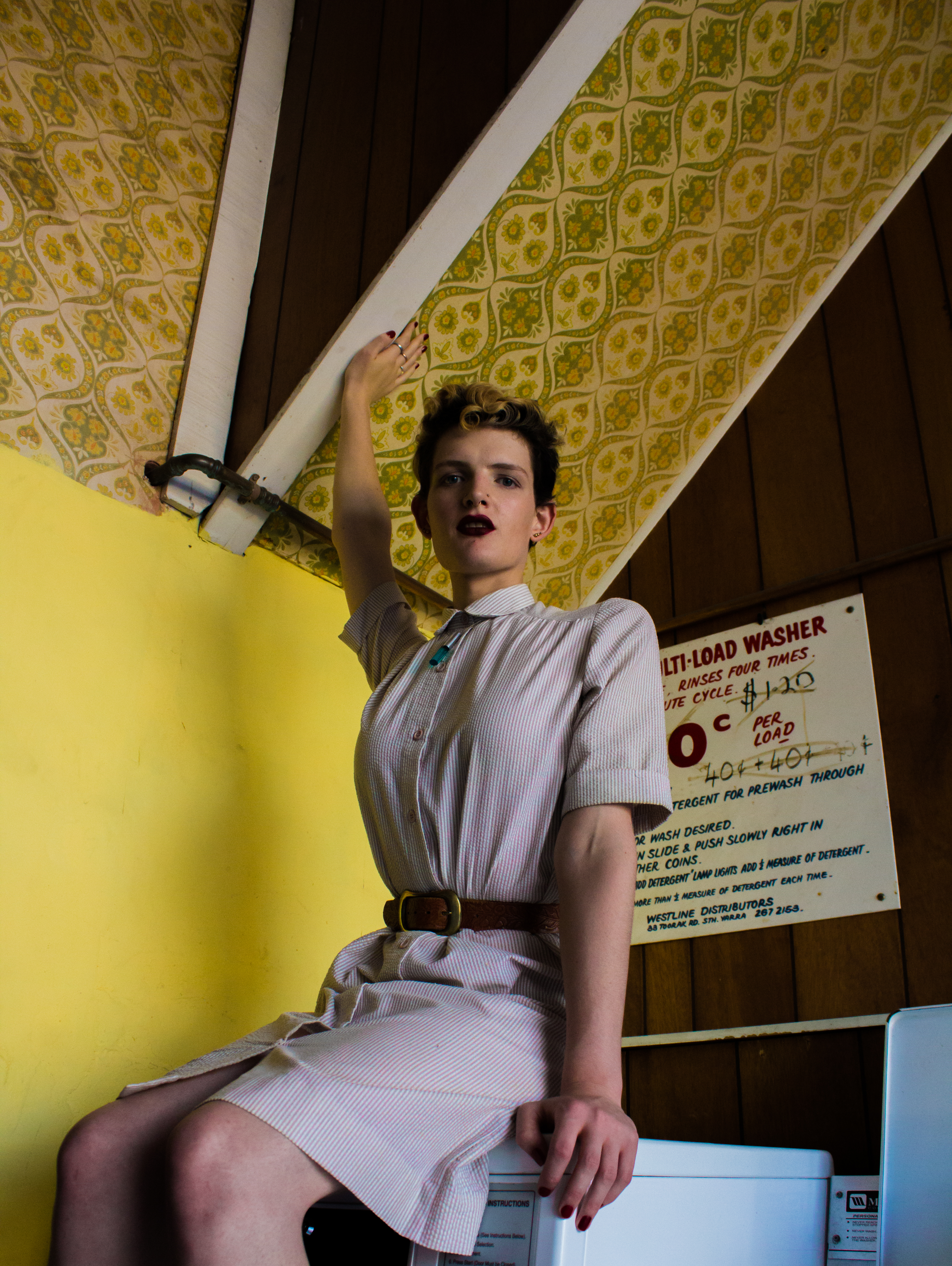
When shooting Nazz, I tried to pick positions and angles that maximised the interplay of shapes, textures and colours, in order to reference Young’s images. In comparison to Young’s model, Nazz’s dress is relatively toned down, but still manages to stand out in comparison to the busyness and boldness of the colours surrounding them. I really like how Nazz’s hand is touching the roof in the first image, spreading Nazz’s body across the entire length of the frame and acting as a leading line, drawing the viewers eye to look up towards the clashing of textures and lines above Nazz’s head.
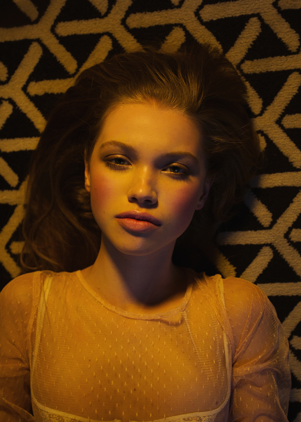
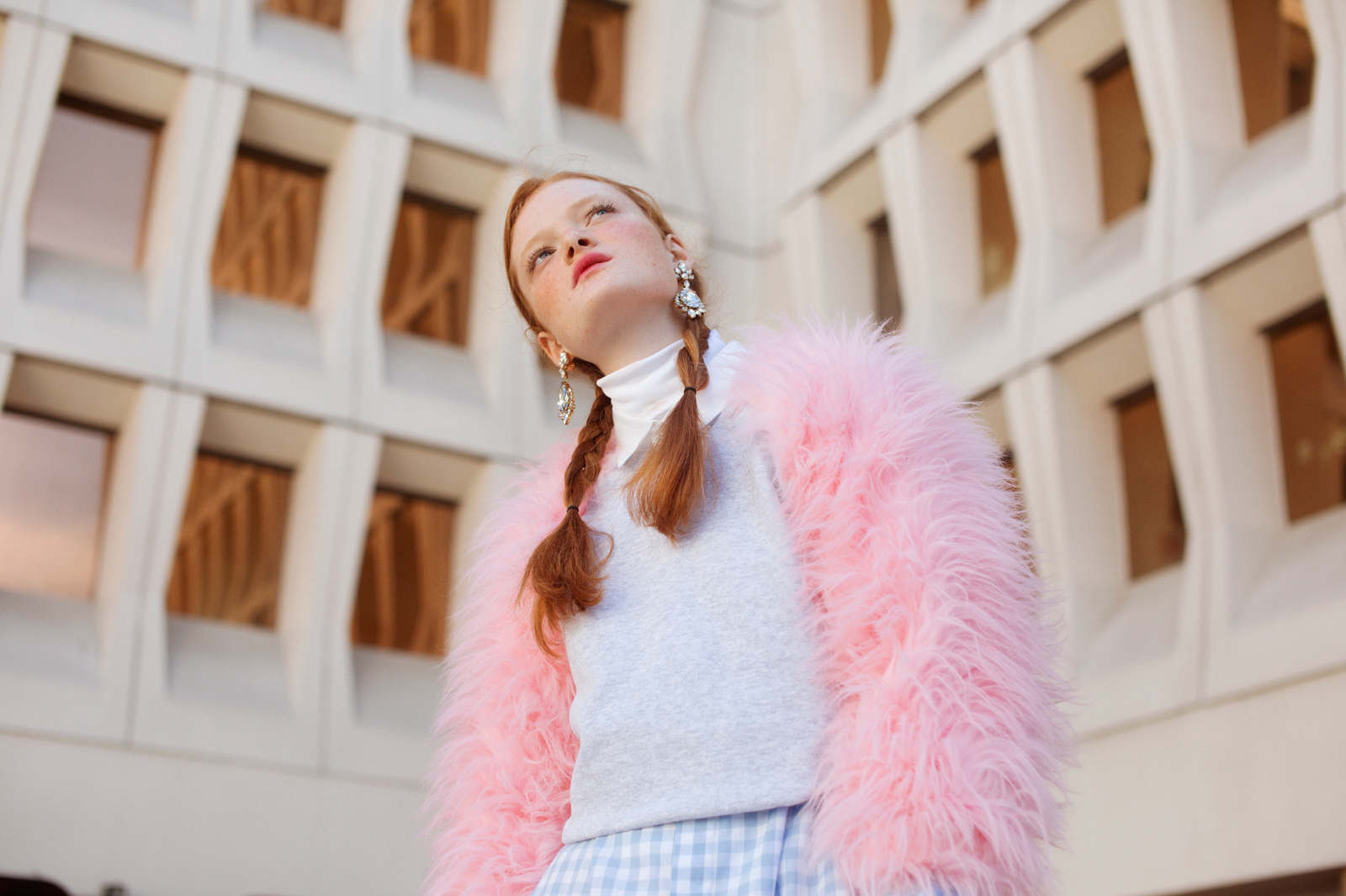
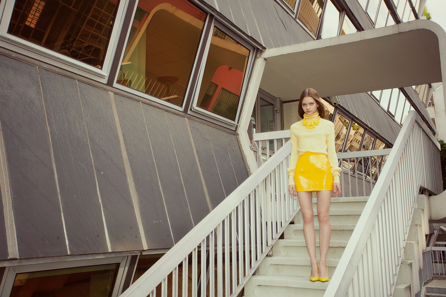
Across Young’s work there is an strong focus on colours, whether that be the clashing of colours and textures or the sympathetic harmony created by the combination of certain colours. Young often focuses on one or two colours and uses that across the entirety of the image, such as the one below that focusses almost exclusively on yellow and dusty pink. An example of one such image can be seen below:
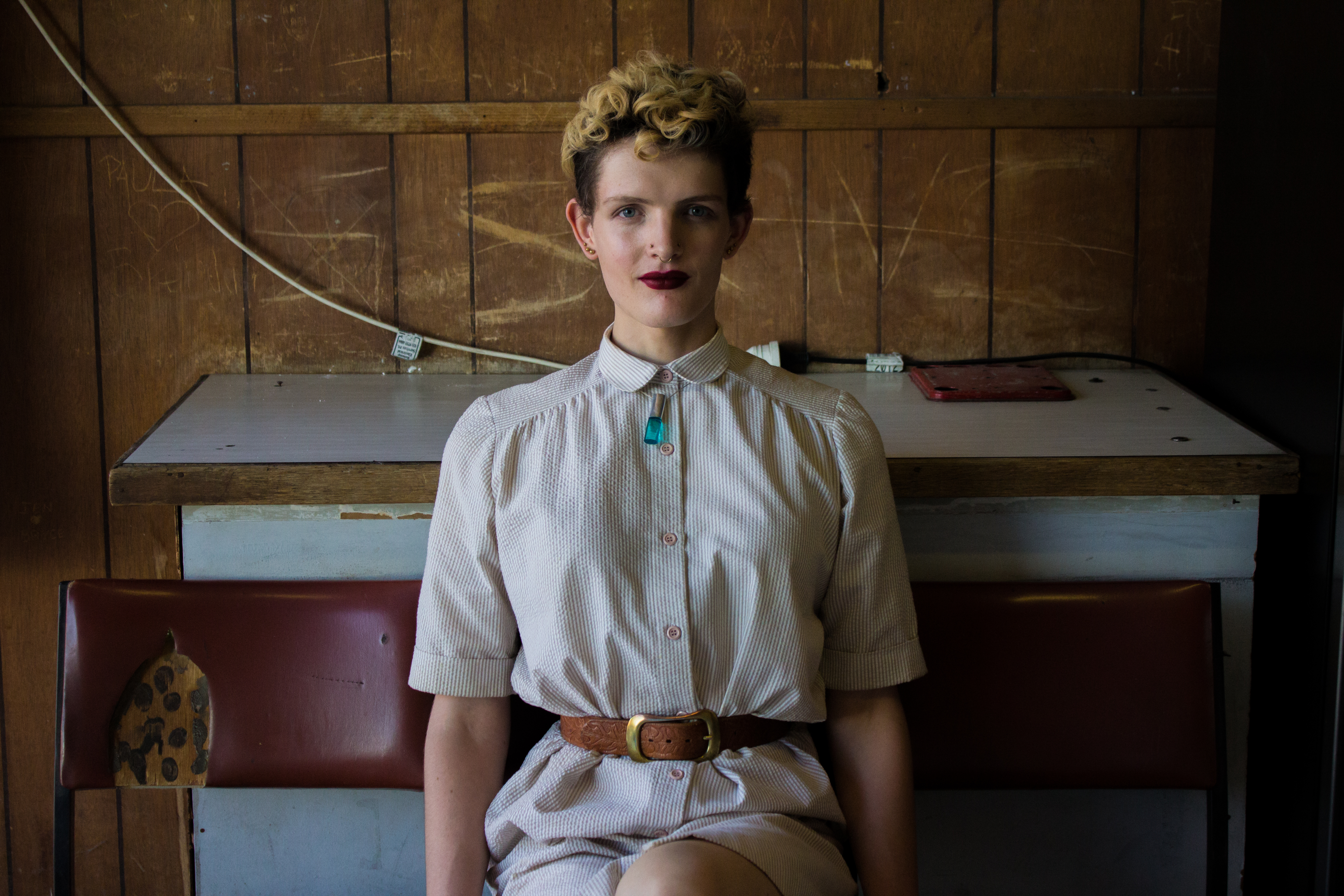
I really enjoy Young’s use of colour and would’ve loved to have the option to play with coloured light castes, but didn’t manage to sort some out before my shoot was scheduled, so decided to do a more natural homage to Young. The versions I did below are much more toned down, matching vintage whites, browns and reds:

I really love how the vintage whites, browns and red’s meld seamlessly together, making the image feel really harmonious. Taking ‘fashion photography’ is always quite difficult because you want to create something thats visually exciting and makes the clothes look good. This is often a difficult task, because you don’t want things to clash too much, but you don’t want things to feel boring. I tried to combat the simplicity of the colour palette (which can lend itself to being boring), by upping the contrast, vibrance and shadows of these images (as well of the rest of the images in the series). This makes the photos look more dramatic by enhancing any colour differences, bringing out shadows – adding depth, and adding a warmness to the image. It also helped make the images go from looking like a home job, to looking like a semi-professional magazine spread. It’s amazing what a bit of tweaking on Lightroom can do!
Young often utilises locations that are obscure and visually complex, causing the background to compete for attention with the foreground, sometimes even winning that battle. This is relatively rare in fashion photography as most backgrounds are purely used to enhance the foreground. I think Young does this, to re-establish the background as being an equally important component in fashion photography. As well as discourage fashion photographers from using generic background landscapes, such as the atypical concrete wall (insert other walls here: brick, studio, white washed), the atypical field (daises, wheat), or the atypical watery paradise (lake, beach, sea). An example of this in Young’s work can be seen below:
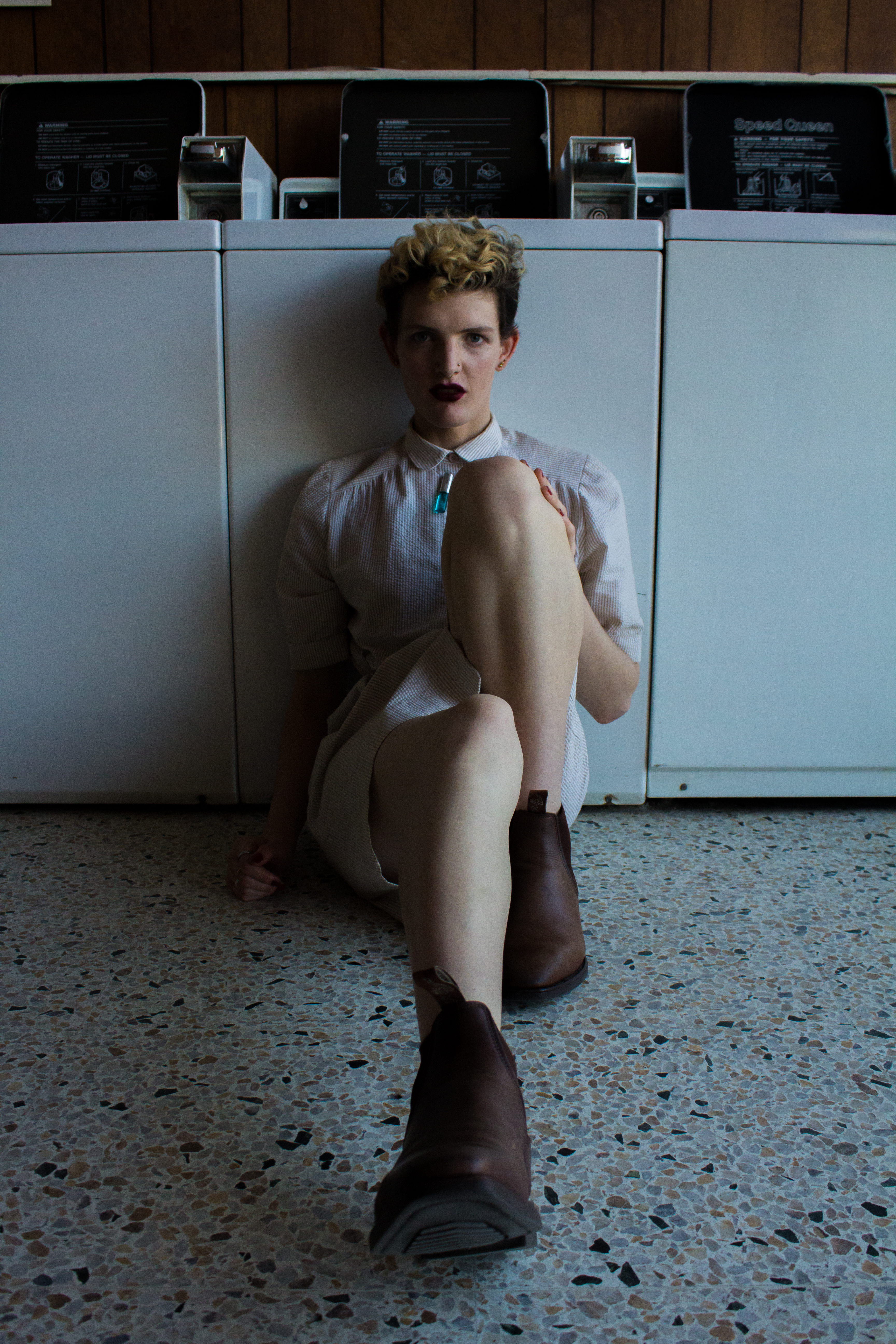
I tried to find a background that would compete for visual attention and I think the huge coin laundry window works perfectly, as seen below:

Not only does the window have that that beautiful bold red lettering, but it’s also reflecting the complicated landscape of the scenes surrounds: a strong blue sky, emerald green trees, black leading lines on the power poles, fluffy white clouds and dense collections of brick and concrete, which all compete for your attention. Not to mention the interior of the coin laundry, such as the maroon chairs, the speckled black and white linoleum, or the white leading lines of the washing machines, daring you to look inside.
Overall, I don’t think my work reads as carbon copies of Young’s, but I think they do manage to explore some of the fundamental principles behind her work in a less obvious way. The process of completing this shoot taught me how to: take better photographs, be photographically literate, read light and think about my work thematically.
Until next time,
Louise Alice Wilson


Recent Comments