Everyday Media

An everyday blog about media by everyday blogger Louise Alice Wilson.

Tag: Editing

Getting Rough

This week I’ve managed to finish my rough cut, the only thing left to do now is to complete the colour grading of the shots and to make Claire’s voice more seamless by taking out any long breaths or umms and ahhs, that appear sporadically throughout the audio. I’ve attempted to make my artist portrait match the aesthetic vibe of Claire’s work by filling the entirety of the frame with visually rich, colourful images. I’ve also colour graded the piece so that it is quite high contrast and relatively saturated. This adds a great vividness to the piece and allows Claire’s paintings to ‘pop’ like they do in real life. Showcasing physical artworks via the medium of film is quite a hard task, but hopefully I’ve managed to display the true visual qualities of Claire’s work.


Catch you later,

Louise Alice Wilson

The Edit

Editing has been going well, I’ve managed to pick out what footage I want to use for the three-minute narrative. Now I’ve begun colouring the piece with various associated footage that myself and Riah shot at Claire’s studio. Originally when we shot at Claire’s studio I felt like we had shot A LOT of footage, almost too much if anything. As I go through my piece and begin colouring shots in, I realised that I’ve used almost every shot that we got, so I glad that we shot the amount that what we did. I’ve tried to match the shots of Claire, her studio and her works with the statements that Claire is making throughout the piece. As Claire speaks of the influence of Climate Change on her works I’ve used shots of her paintings that reference this topic. Or as Claire speaks about working on new projects I show shots of her painting or moving around her studio. It’s really enjoyable to be able to use footage to bring Claire’s story to life and to allow the viewer to literally see what Claire is speaking of or referencing.


Originally I intended to get my partner Chris Frangou, to write a piece of music specifically for Claire’s artist portrait, but his intense tour schedule is making it almost impossible for Chris to have enough time to write any new pieces of music. I have however managed to find a really nice piece of music, that I think fits in with Claire’s artist portrait. It’s called ‘Weird World’ and it was created by ‘Colored Mind’, who provides the track free of charge, for public domain via their Sound Cloud. So far it’s coming along really well, I’m looking forward to watching the entire finished piece.


Catch you later,

Louise Alice Wilson

My Work In Progress

My video on Claire Bridge is coming along pretty well, so far I’ve managed to have a look at the footage and start compiling the ‘narrative’ of the piece, which is essentially just a three-minute compilation of all the audio with matching visuals that I want to use. Like friends of mine who are currently editing their portraits I’ve been finding hard to decide what makes the cut or not. I would really love to delve deeply into Claire’s process, but it seems that in a 3 to 5-minute video that it’s hard to fit in everything your artist has talked about.


I originally asked Claire six questions and had planned to use the best 30 secs of each question to compile into this 3-minute narrative, that I would later colour with other footage, music and editing. However, I should have known that there are some answers which go for say 45 secs, where everything is gold, which has meant that I’ve had to drop some questions out completely. I do think though, that my artist portrait has a clearly defined narrative and that’s extremely important to me, so that people, after watching feel like it makes sense and that they’ve understood everything Claire speaks about.


Catch you later,

Louise Alice Wilson

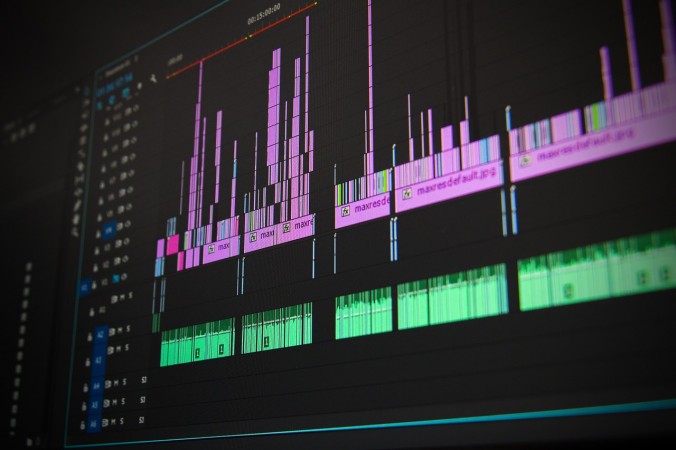
Premiere Pro Is A…

Premiere Pro is a… great editing program? annoying as all hell? brilliantly made? annoyingly formatted?

I think i’ve thought all of these things about Premiere Pro and probably all within the same editing session, but here’s hoping that me and Lynda can make it through. And by Lynda I don’t mean my imaginary friend, but rather a helpful online learning tool that provides video tutorials guiding you through almost any topic you can imagine.

For the last three weeks during the Media 1 workshops we’ve had to use Premiere Pro to work on our current project briefs. Originally this started with me struggling through the download process, but then getting it, then struggling with the first stages of sequencing, then getting it, then struggling with the first stages of editing, then getting it. So hopefully if I continue on with this trajectory I will slowly get everything about Premier Pro even if it’s an arduous process at first.

Currently I’m attempting to delve deeper into colour correction so as to further enhance the visual beauty and balance within my shots for Project Brief 2, I have a rough understanding of it, but could definitely be a whole lot better. It seems like each of the people within my workshop understand a different thing about Premiere Pro, maybe thats means if we all combine we can make one good editor?

Hopefully by the end of this year we’ll make twenty three good editors rather than one?

Catch you later, Louise Alice Wilson

Holes, Spaces Between And Gaps

Editing is a process of leaving ‘holes, spaces between and gaps’. Jeremy Bowtell suggests that deep engagement comes from the audience having to do the work for themselves, especially in relation to film narrative or key elements of the plot. You can see the effect of this more extremely in works like Donnie Darko, Mulholland Drive or Inception, where the film gets to live on within online realms for years after its release simply due to clever narrative ambiguity.

Creating meaning is also a key element of the editing process; editors manipulate the content to steer the audience in a particular direction simultaneously encouraging viewers to complete the argument in their head. Eisenstein, a soviet filmmaker of the 1920’s was a pioneer in the theory and practice of montage and juxtaposition. He believed that films should be “a tendentious (argumentative) selection and juxtaposition”, thus influencing the audience in a desired direction. Most films do in fact seek to string the audience along a particular line of reasoning as it’s one of the main facets of narrative film, it’s just that they throw enough confounding material in to make you believe you had to conduce it for yourself.

Edward Dmytryk, a Canadian-born American film director, who is known for his 1940’s film noir’s believed that you should never make a cut without a positive reason. He believed that if unsure about the exact frame to cut on, you should always cut long rather than short. Bowtell states that to cut short is often to obvious and startling to the viewer, thus making longer shots preferential. Dmytryk also believes that filmmakers should prioritise substance over form; think about what you are trying to say, rather than how you are going to say it. It’s easy to get caught up in form, but ultimately form alone won’t make a great film.

Walter Murch, an American film editor and sound designer focuses on three key elements in regards to editing: emotion, story and rhythm.

  • Emotion: Does the cut reflect what the editor believes the audience should be feeling at that moment?
  • Story: Does the cut advance the story?
  • Rhythm: Does the cut occur at a moment that is rhythmically interesting and ‘?right?’?

The three key elements mentioned above can be seen in the scene from Martin Scorsese’s ‘Casino’ edited by Thelma Schoonmaker called ‘When Sam Meets Ginger’. The scene shows the casino manager Sam (Robert De Niro) as he is first introduced to Ginger (Sharon Stone). Within the scene juxtaposition occurs between the chaos of the chips flying and the statuesque Sam and his face as he watches, the chaos caused by the blonde bombshell Ginger.

In terms of emotion: A love story has blossomed by the time De Niro has gotten to the casino floor.

In terms of advancing the story: There is no dialogue, but all of the story is told through Sam and Gingers eye-contact and the timing of these edits; cutting long rather than short.

In terms of rhythm: The scene flows through a series of high intensity, excessively energetic shots with various jazz, blues and 50’s pop soundtracks, to completely still shots comprising no audio at all, leading up to a crescendo as the couple first meet.

This scene alone, was enough to make me fall in love with the film Casino, which is a testament to the power of editing, without great editing a film can fall flat on it’s face. However editors like Thelma Schoonmaker are often the unsung heroes of the film industry, firmly placed behind the scenes, but times they-are-a-changing…

Catch you later, Louise Alice Wilson

Blood In The Gutter

Scott McCloud’s ‘Blood in the Gutter’ is a great comic and probably one of the best descriptors of editing that i’ve ever read. Blood in the Gutter does inherently focus on editing within comic books, but it’s easily applied to film form.

McCloud introduced me to four key elements involved in the editing process: closure, gaps, transitions and interpretations. Closure is our brains ability to observe the parts but to perceive the whole, completing that which is incomplete based on past experience. An example would be our brains additive reaction when seeing an image of baseball in a persons hand, then seeing an image of a baseball in the air. Our brain naturally inserts the images of the baseball reaching the point in mid-air in order to maintain continuity, or to achieve ‘closure’.

Expressions of Closure:

  • Intentional: Deliberate inventions of storytellers to produce suspense or challenge audiences.
  • Automatic: Automatic process requiring minimal effort.

Forms of Closure:

  • Simple: Mere outline of a shape or newspaper image.
  • Complex: Continuous, largely involuntary and virtually imperceptible. Film is shown at 24 frames per second or a television, which is a single point of light racing across the screen.

Gaps are just as important as images perceived as it allows the audience to construct their own scene or chains of events. Within comic books the gaps are the literal gaps between the images, nicknamed ‘the gutter’ for film these gaps are a little more complex. Within films gaps can be left purposely such as not showing a murder on screen, this way the audience decides how hard the blow was, who screamed, who died and why. Each reader or viewer commits that murder in their own style (i.e. ‘blood in the gutter’), this invites audience participation and allows the story to be customised by and to the individual.  It also allows for off screen discussion of the text, such as much of the hype that existed around Donnie Darko, that was created through off screen audience discussion surrounding ambiguities in the films storyline.

Transitions are an extremely important element within comic books and also very important within film. In relation to comic books, McCloud states that there are six forms of transitions: moment-to-moment, action-to-action, subject-to-subject, scene-to-scene, aspect-to-aspect and non-sequitor.

Moment-to-moment transitions: Are instance to instance shots with very little closure required.

  • Uncommonly used within American and European comics.
  • Sometimes used within Japanese comics.

Action-to-action transitions: Features a single subject in distinct action-to-action progressions.

  • Most common type of transitions within American and European comics.

Subject-to-subject transitions: Taking us from subject to subject while staying within a scene or idea.

  • Second most common type of transitions within American and European comics.

Scene-to-scene transitions: Transports us across significant distances of time and space.

  • Third most common type of transition within American and European comics.

Aspect-to-aspect transitions: Bypasses time and sets a wandering eye on different aspects of a place, idea or mood. Often used to establish mood or a sense of a place when time stands still. Encourages the reader to assemble a single moment using the scattered fragments presented.

  • Very uncommon within American and European comics.
  • Highly common and integral within Japanese comics.
  • Within Japanese comics, dozens of panels are often devoted to portraying slow cinematic movement or to setting a mood.

Non-sequitor transitions: Has no logical relationship between panels.

  • Often used within experimental comic books, like those of Art Spiegelman.

Interpretations are often guided by the artist of filmmaker, however the less guidance given the more elastic interpretations can be. Some artists are deliberately ambiguous, only giving us a small piece of the puzzle. Sometimes, this ambiguity can lead to something wonderful happening in the spaces left between, for there is nothing more imaginative then never ending possibilities.

Catch you later, Louise Alice Wilson


References

McCloud, S. (1993). ‘Blood in the Gutter’, Understanding Comics: The Invisible Art. Northampton, MA: Tundra Pub.

© 2024 Everyday Media

Theme by Anders NorenUp ↑

Skip to toolbar