Blog Post for Week 6
This week during class we were asked to compile a series of images that inspire us. I decided to make it more specific by picking a bunch of images that inspired me specifically for the shoot we have coming up.
For our upcoming shoot the main themes are:
- Shooting at Night
- Suburbia
- Australiana
- Vintage Vibes (More specifically 70’s Australia)
- Surrealism
The images below are shots that relate specifically to our themes and could be used as inspiration or guiding material as to how to include or utilise these various themes within our own shoot.
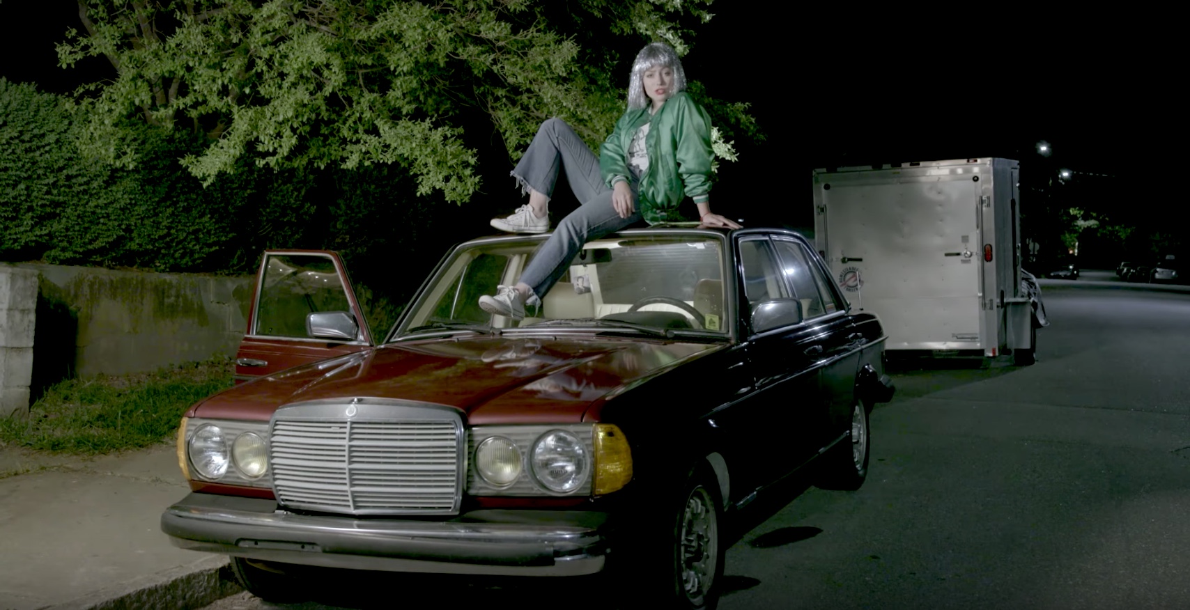
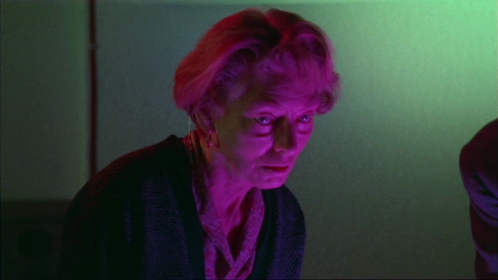
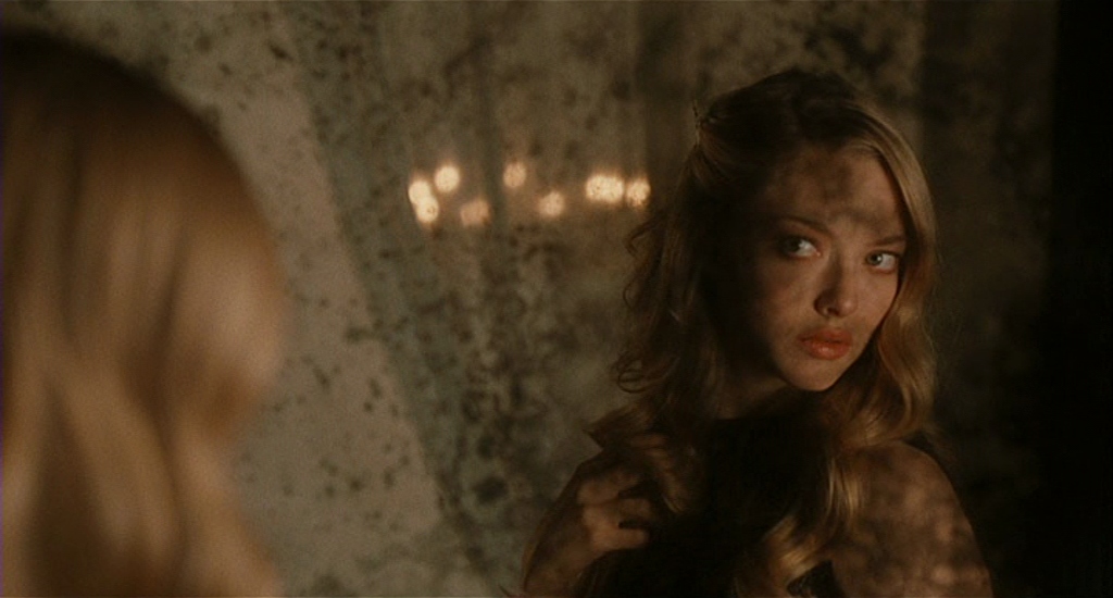
Angel Olsen – Shut Up & Kiss Me (Music Video)

This image of Angel Olsen ticks all of our theme boxes.
Shot at night – check. This shot seems to utilise some kind of large white light, plus the locations streetlights to create a blanketing of white light over the whole scene.
Suburbia – check. There’s something about blanket white lights that just scream suburbia, maybe its their association with Coles and 7-Eleven.
Australiana – not a specific check, but it does feature the Americanised version of this – Americana. The oak trees, the wide roads, the 80’s Merc, the large blocks.
Vintage vibes – check. Old school car, sparkly wig, 3/4 flares.
Surrealism – somewhat check. Music videos always seem to feel somewhat surreal. I guess thats because the rules of that world are often quite different to the ‘real world’. The obscureness of this shot, lends itself to ideas of surrealism. Her sitting on that car, the random truck behind, the sparkly wig. The logic isn’t directly obvious.
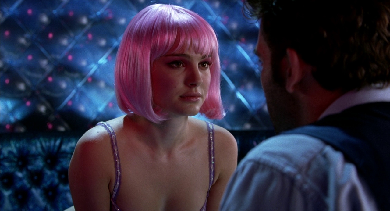
Arcade Fire – Sprawl II (Music Video)
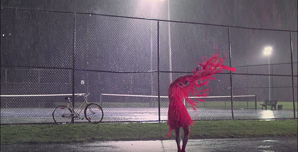
Shot at night – Check. This shot also utilises blanket white lights to caste a bright white light over the whole scene, as well as utilising the tennis courts spotlights.
Suburbia – check. Nothing more suburban and family orientated than a tennis court, field and a bike.
Australiana – check. This is an American video clip, but tennis courts can read as being super Australian, as sport is a massive part of our identity and youth culture.
Vintage vibes – somewhat check. Tennis courts and sports in general are often seen and pitched as being vintage. I think it’s that association with a time gone by, youth and nostalgia.
Surrealism – check. Pink avant grade dress, random dancing in the rain. Like Wuthering Heights but the more modern, depressed version.
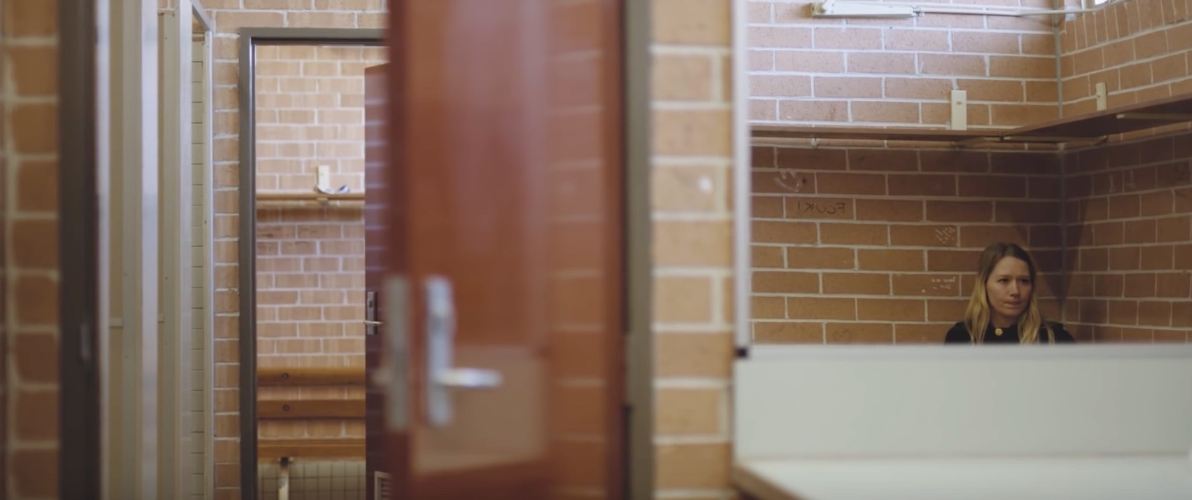
Julia Jacklin – Leadlight (Music Video)

Shot at night – nope.
Suburbia – big check. Nothing more suburban than a local high school that exists purely in shades of vintage brown.
Australiana – big check. Julia Jacklin is quite literally the queen of Aus-core and all of her videos revolve around exploring a uniquely Australian aesthetic.
Vintage vibes – big check. I assume this local high school has barely changed since it was built in the 60’s. It’s quite reminiscent of the place we’ll be shooting: The Thornbury Bowls Club.
Surrealism – somewhat check. Julia Jacklin’s videos often featuring her dancing through nostalgia places, like she’s walking through a dream, or exploring a memory. That in itself feels surreal, or at least toys with some surrealist notions.
Julia Jacklin – Pool Party (Music Video)

Shot at night – nope.
Suburbia – mos def. Julia Jacklin grew up in the Blue Mountains and she seems to shoot all of her videos there. I wouldn’t be surprised if this was her own house, or the house of a relative. This house screams 1970’s Australian suburbia.
Australiana – big check. Definitely, see above.
Vintage vibes – big check. Definitely, see above. Plus, she’s wearing a plaid skirt and calf length white socks!
Surrealism – Somewhat check. See above.
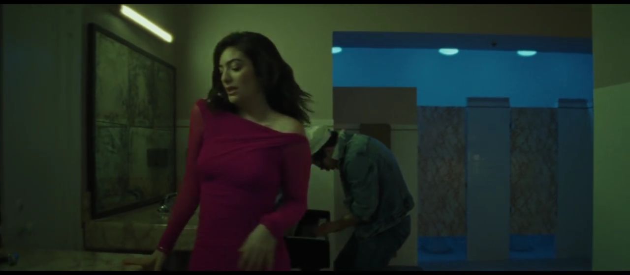
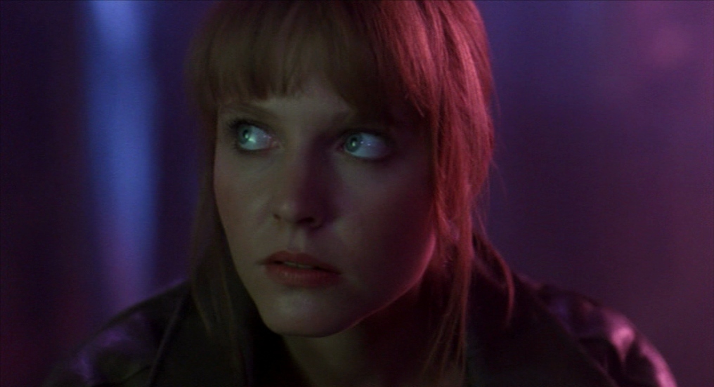
Lorde – Green Light (Music Video)

Shot at night – Yup. Though it’s not evident in this shot, this music video was shot at night and makes great use of the gilded city streets and neon lights that appear post 6pm. I love the lighting setup of this shot. The front room lit with a green light, like a fluorescent bulb but to the extreme. And the back lit with some kind of blue light. These two colours bounce off of each other and Lorde’s pink dress, to create an interesting interplay of colour.
Suburbia – this is most definitely urban, it’s shot in Los Angeles to be exact. Even though this music video has an urban setting I do feel that the way that it explores the setting is very similar to the other videos. You have this character walking around somewhat lonely streets bathed in light. Inciting feels of nostalgia, exploring themes of youth and the effect of space on actions.
Australiana – nope. Though that dude in the background does look pretty janky.
Vintage vibes – nope. This video feels more timeless than vintage, like a clip that could be from the 70’s or from the 2010’s.
Surrealism – not really. This video feels more real than some of the others. There’s something about a large city that lends itself to feeling more real than the suburbs. Like the suburbs could be a dream or a delusion, but a city is large and bustling and linked in to everything else that it must represent reality.
Lorn – Acid Rain (Music Video)
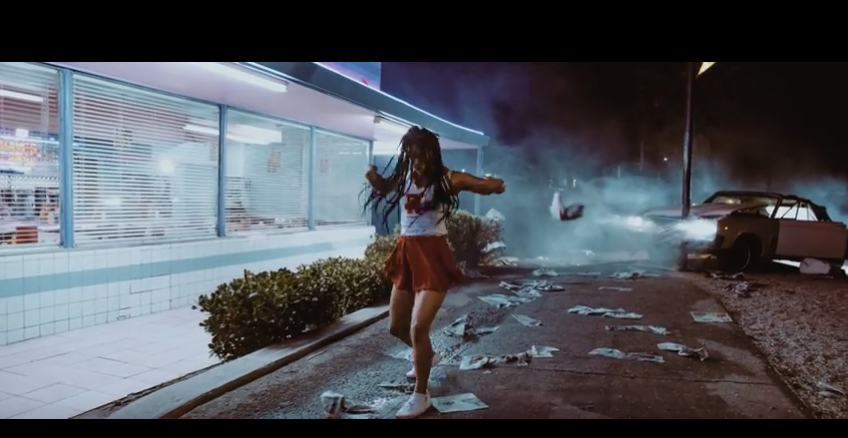
Shot at night – yup. This shot, similar to the one above, features a girl dancing around at night, bathed in neon lights, streetlights and headlights.
Suburbia – yes? Some kind of 50’s America kind of suburbia, where cheerleaders would be hanging out at the local diner.
Australiana – not at all.
Vintage vibes – Yes. That 50’s diner and cheerleader outfit says it all. This clip is certainly playing with nostalgia as well as old school archetypes.
Surrealism – Yes. I’m pretty sure the premise of this film clip is that this cheerleader crashed into that pole and is imagining this entire scene while she sits unconscious inside the crashed car. The whole film clip feels like Michael Jackson’s – Thriller, but reimagined with a female lead and a 50’s time stamp.
Sticky Fingers – Gold SNAFU (Music Video)

Shot at night – hell no. Shot during the afternoon with no UV filter and totally blown out images.
Suburbia – The Sydney version of it.
Australiana – Yup. Who else has an influx of these 70s’ 80s’? 90s’? concrete box structures, that we decide to use as shops.
Vintage vibes – For sure. The whole video has a 70s’ vibe to it. With characters wearing matching caramel two piece suits and silver aviator reading glasses.
Surrealism – Nope.
Tame Impala – The Less I Know The Better (Music Video)
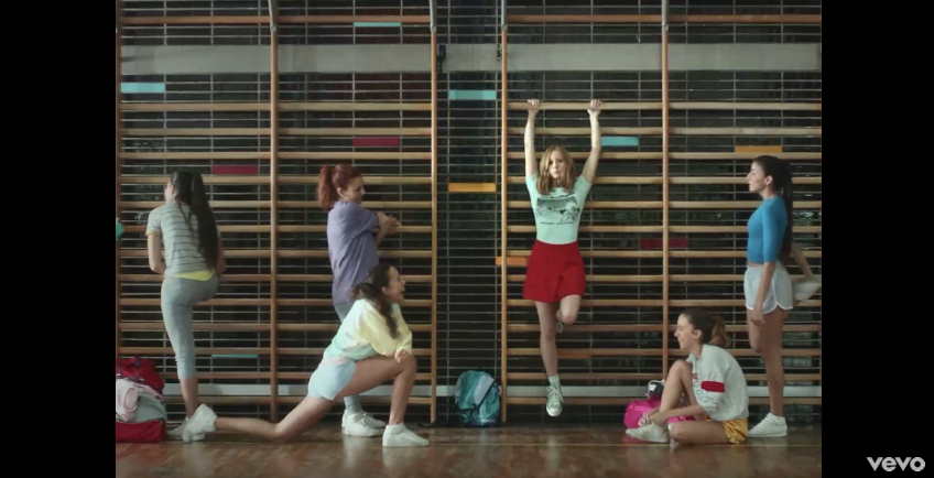
Shot at night – nope.
Suburbia – potentially? There’s something about high schools that always feel suburban. Unless we’re talking about one of those New York City high schools…
Australiana – nope.
Vintage vibes – Yup. Cheerleaders in colourful outfits always feels a little vintage.
Surrealism – Yes. This shot is not surrealist at all, but later there are shots of giant monkey hands reaching down and scooping people up, which is pretty trippy.
The Knife – Pass This On (Music Video)
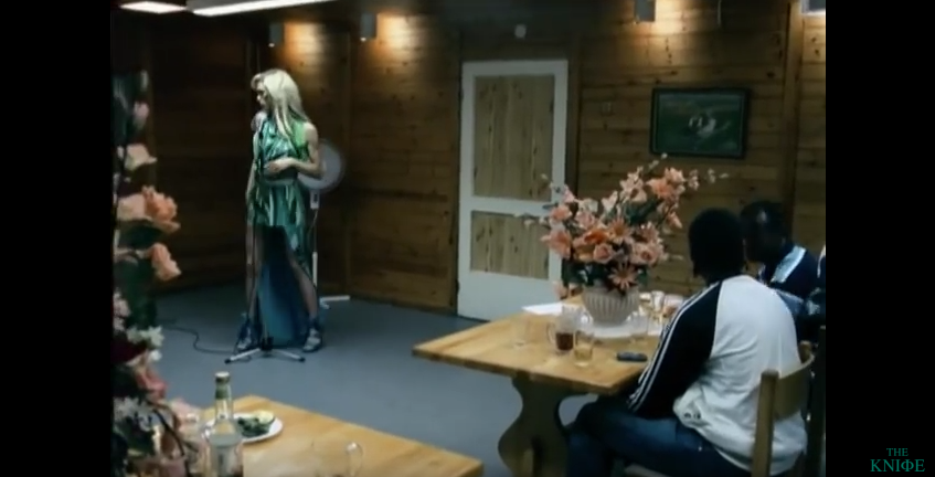
Shot at night – Yes.
Suburbia – Some kind of strange European version of it.
Australiana – Nope. But those wood panels wouldn’t look out of place at a 70s’ RSL.
Vintage vibes – Somewhat. This clip feels like it’s been set in the modern day, but is happening in a space that is vintage.
Surrealism – Somewhat. This singer trips me out, she feels like she’s somewhat metaphysical.
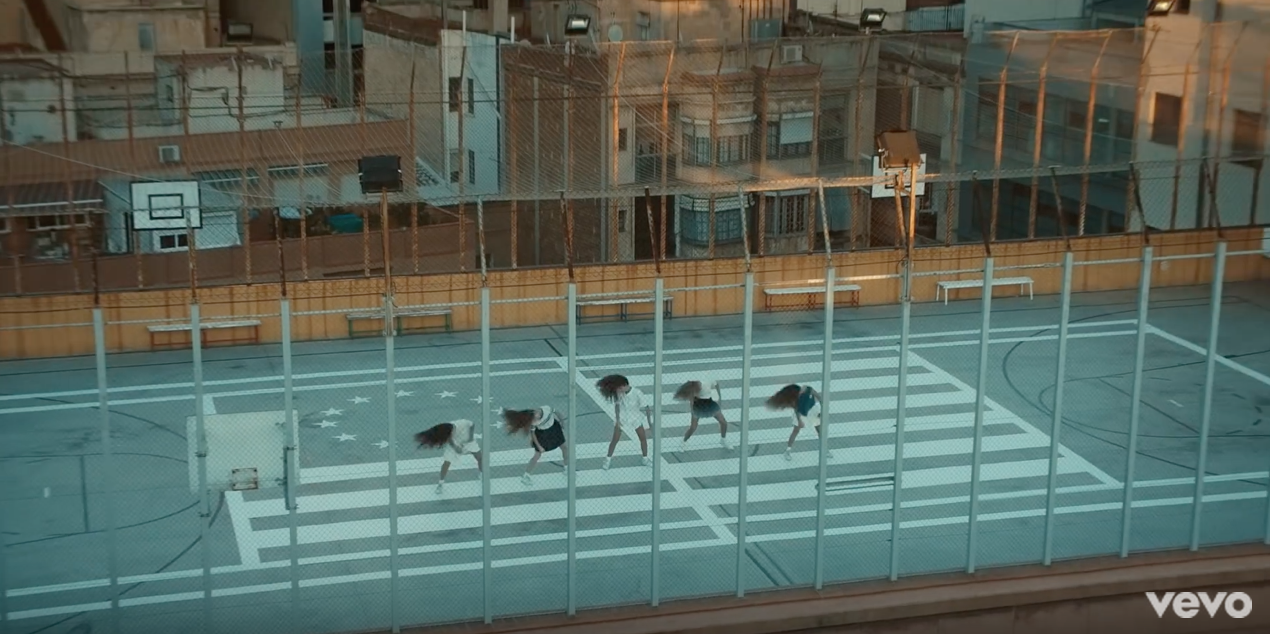
Yall – Hundred Miles (Music Video)

Shot at night – Yes. And they make masterful use of this rooftop basketball court, with the dilapidated buildings in the background.
Suburbia – Yes, but he Barcelionian version of it.
Australiana – Nope.
Vintage vibes – not really. But these girls do feel a little ‘Virgin Suicides’ with their long hair and matching tennis outfits.
Surrealism – not really. Why does people dancing always feel a little surreal though? Is everyday life that restrictive.
Until next time,
Louise Alice Wilson


Recent Comments