Blog Post for Week 5
This week we completed a lighting exercise where we had to make use of lighting present within the natural environment. Soon we’ll begin shooting our own projects, so i’m keen to investigate lighting further in preparation for that. Thats why i’ve decided to search through Film-grab.com to find some lighting setups that I really like, and perhaps take inspiration from.
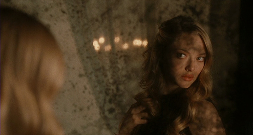
The Sorcerers (Michael Reeves, 1967):
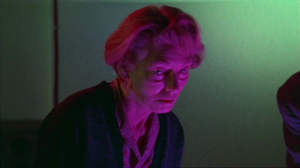
In this shot it looks like they’ve used a three point lighting setup to light this character, utilising three differently coloured spots. The backlight looks like a deep red colour, whilst the fill is a green colour and the key light is a deep magenta. The use of these three lights adds a great amount of depth to the characters face, whilst accentuating her wrinkles and eye bags with their strikingly hard light. The three colours however obvious they seem upon initial viewing, meld seamlessly into normality after a good few seconds spent staring at this image. This woman strikes me as an interesting mix of frightening, curiosity inducing and mournful. Overall it’s a really interesting lighting setup that i’d be keen to imitate one day.
Silver Linings Playbook (David O. Russell, 2012):
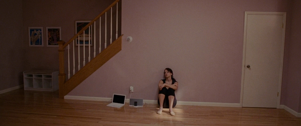
This lighting setup seems relatively simple but who knows? It seems like they’ve used a large soft white light to light the room and used a white spot with barn doors to create a directional light that hits Jennifer Lawrence directly, highlighting her in this relatively flat image and scene. The flatness of this scene is the most impactful thing about it. I’m sure they could have used multiple lighting setups to light the staircase, room and doorway to add more dimension and interest. But the flatness works well to dull the room and add weight to how Lawrence’s character is feeling in this drab environment.
Prison (Ingmar Bergman, 1949):

The soft focus on this characters face is interrupted by the clarity of her eyes also highlighted by a directional spotlight. Nowadays such an obvious effect may be considered gaudy but it’s highly effective. The spot does well to direct the viewers eye to look directly into that of the characters and to distort the rest of her face into a shadowy mass. In this scene we get a sense of the characters soul, hidden behind the eyes, disconnected from the physical body as we stare into her depths. I’d love to sneak this into a shot and hopefully get away with it.
Love (William Eubank, 2011):
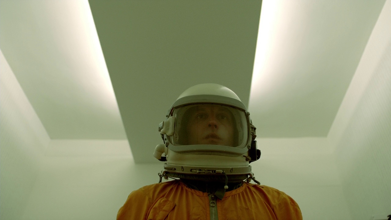
Supposedly Stanley Kubrick paved the way for ‘Practical Lighting’, which is the utilisation of lighting visible within the frame to light the scene. William Eubank makes great use of practical lighting in this shot, casting a soft glow over the entire room. Presumably there is another, or perhaps multiple soft lights that are also helping to light the characters face. I also really love the green caste over the entire frame, but presumably this was an effect done in post. I must experiment with this.
Paul (Greg Mottola, 2011):
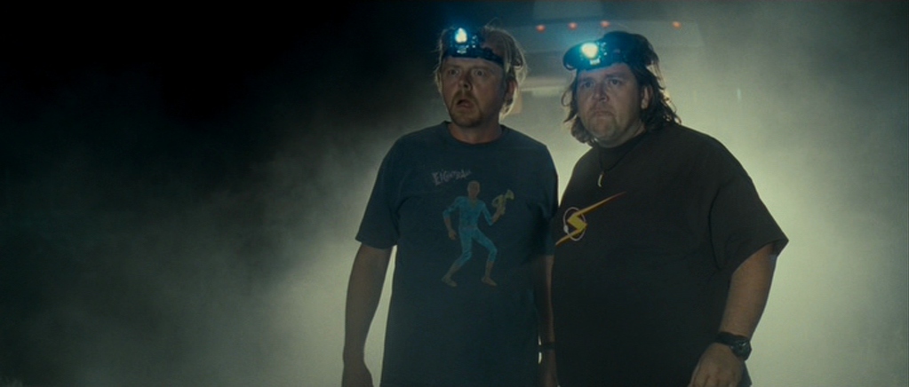
Lawrence Sher also makes great use of practical lighting in this scene; to caste an ominous glow around his two lead characters. The daggy headlights are great also, I just wish this shot was framed differently. Stacking them right in front of the truck (or whatever it is behind them) makes the image look messy, especially with so much blank space on the left hand side of the screen. Maybe if the truck had been more to the right hand side of the frame, leaving a smaller amount of ‘talking space’ on the left hand side of the frame. These characters are also lit front on by some kind of soft light.
Chloe (Atom Egoyan, 2009):
I’m a big fan of mirrors in film and this shot utilises this antique mirror well. We get a dirty over the shoulder shot of Chloe as she looks at herself. Her face lit on the right hand side by a soft white light, exposing half her face and leaving the left hand side in shadow. Cleverly the de-silvered parts of the mirror also caste various black shadows over Chloe and the frame itself. Chloe is also backlit by a soft light, allowing the back of her head to still look bright and blonde within the left hand side of the frame. The bokeh lights in the background adds dimension and intrigue to this shot. I looked up the cinematographer and of course it’s Paul Sarossy ‘Canada’s most prolific and awarded cinematographer’.
New Nightmare (Wes Craven, 1994):

Mark Irwin makes great use of a hard white light to turn Freddy Krueger into a black silhouette. Utilising that hard light he creates ominous black shadows streaking out from each of his fingers, reminiscent of the blades he has on his left hand. There are also some practical lights viewable in the frame lighting the crowd of people. Assumedly they were also lit with a seperate light.
Closer (Mike Nichols, 2004):
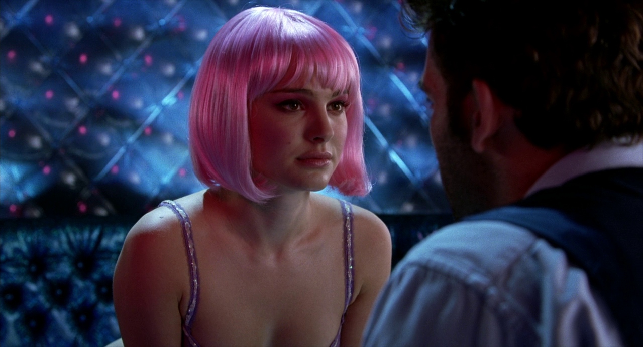
This scene is visually one of my favourite in all of cinema history, is that bad? I dunno. Many others love this shot also, as i’ve seen it recreated by multiple artists. The lighting setup seems relatively simple. Natalie Portman is lit via a simple three-point lighting setup. With a white light for the back and fill light and the key light is pink. Clive Owen seems to be getting some of the spill from Natalie’s pink key light, then his back is also sit with another white light. Then the wall behind them is also separately lit.
Deep End (Jerzy Skolimowski, 1970):

Relatively simply lit, using a soft white light to illuminate the right hand side of the characters face and the window in front it. The soft lighting makes this shot and the character look somewhat dreamy. Though I mist admit that I’m more into this shot because of it’s composition than the use of lighting. Having those bright red and green buttons, out of focus, on the right hand side of the frame add interest and intrigue to this shot.
A Nightmare on Elm Street 4- The Dream Master (Renny Harlin, 1988):
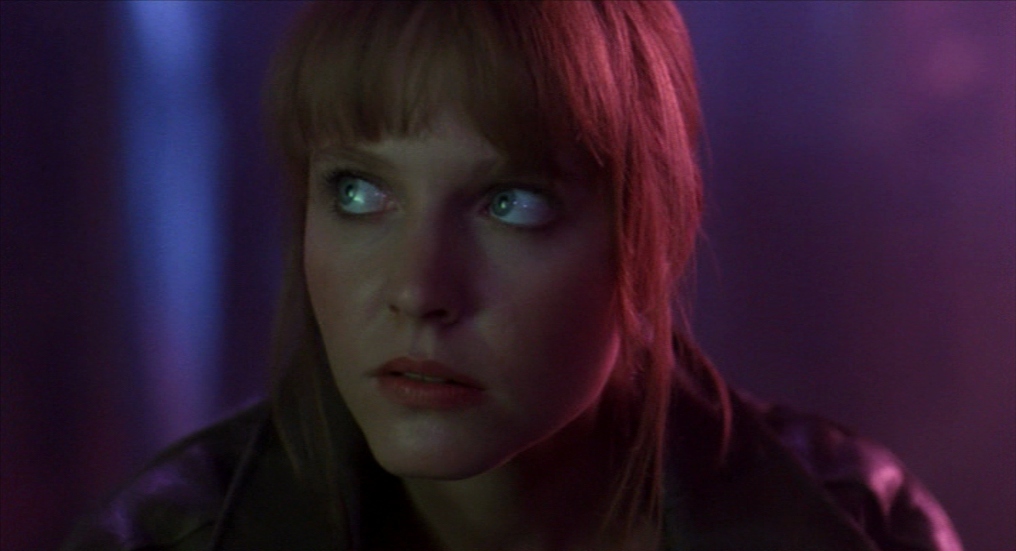
Another great use of three-point lighting and coloured gels. This character is front lit with a green-ish light, the key light is purple and she is backlight/almost side lit by a pink light. The neon colours add dimension to the image and make it a lot more visually interesting. Horrors are a great genre to push the use of coloured lights, as it seems to fit in with that ‘world’ easily. And adds to the sickening but enjoyable vibe of the overall film.
Until next time,
Louise Alice Wilson

Leave a Reply