participation contract

CONTRACT:

1. read at least two of the allocated readings per week
2. write about at least one of the readings in the blog
3. complete the constrained tasks for the week, write about/reflect on them
4. turn up to the tutorial every week
5. participate in class discussion/actively critique others’ work

week 2 (5/5)
1. yes
2. yes
3. yes
4. yes
5. yes

week 3 (3/5)
1. -yes
2. yes
3. yes
4. no
5. no (wasn’t in class)

week 4 (5/5)
1. – yes
2 – yes
3 – yes
4 – yes
5- yes

week 5 (5/5)
1. yes
2. yes
3. yes
4. yes
5. yes

week 6 (5/5)
1. yes
2. yes
3. yes
4. yes
5. yes

week 7 (4/4)
1. yes
2. yes
3. n/a
4. yes
5. yes

week 8 (5/5)

1. yes
2. yes
3. yes (completed brainstorming for k film)
4. yes
5. yes

week 9 (5/5)

1. yes
2. yes
3. n/a
4. yes
5. yes

week 10 (4/5)

1. yes
2. no
3. n/a
4. yes
5. yes

week 11 (4/5)

1. yes
2. no
3. n/a
4. yes
5. yes


FILM TV 2 Test 5 Evaluation

This semester I had the vision to ‘get more’ out of the subject than I did Film TV 1. I aimed to really throw myself in and immerse myself in learning, particularly in terms of becoming proficient with equipment. I wanted to create a film that I was proud of about a topic I was interested in – documentary being my ‘forte’. This semester was exceptionally challenging due to sickness in my group and other personal problems outside of class which prevented me really ‘throwing’ myself into the project like I’d hoped.  I definitely did make a big effort to become more proficient at using the equipment and made the effort to do a lot of the technical work on set – setting up and recording sound, troubleshooting camera issues etc. I learnt a lot of things the hard way (for example, recording the sound incorrectly on one of the shoots due to my bad set up and also about ingesting footage from the cameras) and these were invaluable lessons and mistakes that I now will not make again. Our film was largely a let down for both myself and Matt (my only other group member) due to the fact that neither of us were able to commit as much time and effort towards the work as we’d hoped. We did a lot of the shooting last minute and when it came time to edit we felt we were definitely ‘scraping the barrel‘ rather than having an abundance of good material to work with. In many ways I regret being in such a small group because it made life difficult when one of us was sick – if we were in a bigger group it would not have been such a big issue that one member was AWOL. Having said that, considering the constraints we had and the little time we actually had to put the project together, the final cut has shaped up to be less of a disappointment than we expected. In the edit of the rough draft, we were both exceptionally disappointed and even a little embarrassed with the result we’d produced. Feeling quite disillusioned, we had to abandon all ideas of the film we’d thought we were making and allow it to morph into something completely different instead.  I am very proud of our efforts to save the film and the final result – considering everything we have been through – is definitely nothing to be ashamed of. Adding a few elements we hadn’t anticipated certainly helped to shape the overall narrative of the film and give it substance. If I could do the course again without all of the personal issues and sickness that affected us this semester, the film definitely could have been a lot more poignant and certainly something to be proud of.


FILM TV 2 Test 5 Colour Grading

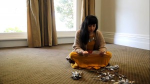
The first screenshot below is the original shot of the artist sitting in the room in front of her spoons.
1 original
Before beginning a colour grade I knew I wanted to enhance the contrast and brightness in the image as there was not a lot of definition on the artist’s face as it was cast in shadows. I also wanted to draw attention to her mustard coloured dress and make it ‘pop’ in comparison to the background and carpet which is in similar tones. I bumped up the contrast using a brightness and contrast filter and adjusted the levels so that the shadows and darker colours were darker in contrast to the lighter colours. This gave the image more depth and a more stylised look. I also opened the colour corrector filter (as I was using Final Cut) and as an experiment adjusted the colour to add more blue into the mix and highlight the blue tones more. This is the result –

1 darker blue tones

– The carpet appears darker and more subdued as a result and her dress ‘pops’ more. While I like the moody feel the higher contrast and the blue tones created, I decided it was perhaps too depressing for the film and decided to do the complete opposite for the next experiment – giving the image warmer tones, enhancing the yellows and removing some of the dark shadows. This is the result –

1 yelllow tones

– While I probably wouldn’t use this type of grading for a film unless I wanted that specific ‘warm tone’ or colour filter (for example, in films like Amelie, they have used green and yellow filter so everything appears whimsical and has that “European” indie film feel) it was still worth an experiment. As the curtains, carpet and the artist’s dress were all similar yellow/mustard tones, using a warming filter and enhancing all of the yellows gave the image a softer look as they wash into eachother and almost gave the impression that we purposefully chose yellow as a key colour in our production design.

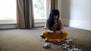
Without touching the contrast or brightness, I wanted to see what would happen if I went the opposite way and added more blues, subduing the abundance of yellows that were already present in the image. As a result,
1 blue tones

– happened. Adding little amounts of blue and green brought the yellow tones in the walls and curtains almost to neutral colours and allowed the mustard dress to stand out more. There is also a nice blue tinge in the artist’s hair where it collects the light but overall I still found this colour palette too bleak. –

1 balancedtones

– the next image is a result of carefully balancing the amount of blues and yellow in the image – also bumping the reds slightly – so you can still get the warmth of the yellow tones but not so you are overwhelmed by yellow. While in terms of white balanced it is not a properly ‘balanced’ image, it is aesthetically – in my opinion anyway – more appealing than the image where I’d balanced out the yellows using blues because of the warmer tones present in this grade. You still get the distinction between the dress and the room and the spoons on the floor still ‘pop’ but it is not bleak or depressing due to an overwhelming amount of blue. I kept the brightness and contrast at similar levels to the first grade I did on the image so the shadows (as previously mentioned) were just right.

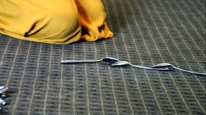
With the second image there wasn’t as many elements to work with, just the floor, a bit of the dress in the corner and the spoons.

2 original

The challenge with this grade was making it consistent with what I’d already graded in the previous shot so they flow well together naturally. Like the first shot, I adjusted the brightness and contrast using a filter so there was more definition between the floor and the objects and also so the image would correlate with what I’d done on the previous shot.

2 contrast brightness

This is the result. The next step was to experiment with the colour corrector again and the next screenshot is a result of bumping up the blues and greens –
2 blues

I think that this is more visually interesting than the effect of bumping up the blues in the last shot. The carpet becomes almost a grey colour and the artist’s dress stands out significantly. However, if I was to leave the shot in this grade it would not correlate logically with what I’d already decided to do with the grading in the previous image. The next experiment was to see what would happen in this image if I bumped the yellows and brought the blue tones down –

2 yellows

. The carpet becomes almost a green colour and the artist’s dress becomes slightly brighter. In my opinion, this grade didn’t stand out as much as the last (despite the fact that there wasn’t a noticeably huge difference between the two). This grade could also be a logical match to the previous shot and presents similar tones in the floor and the dress along with a similar contrast and brightness. As one last experiment, I decided to bump up the reds ever so slightly which gave the shadows in the folds of the skirt and under the spoons a little more colour (and therefore definition in an overwhelming amount of yellow).

2 reds

From experimenting with colour grading I have learnt just how many decisions you can make in relation to the aesthetics of your image and the overall ‘feel’ of your film from a visual perspective. You can certainly enhance or create moods or feels using only colour and a specific shot can have several different feels depending on how you adjust the colour balance and levels. I also learnt that you need to take into consideration all of the shots – rather than just a specific shot – and how the individual grading of each shot will relate to the next. What works great for one shot might not translate so nicely visually to the next and if you don’t find a common ground between the two, your grade will be imbalanced and visually jarring.


FILM TV 2 Test 4 Q 4

One of the points from the week 8 reading “Cinema Journal” by Reuoff that I found interesting and hadn’t considered previously was the difference in sound quality between observational documentaries and Hollywood films. Reuoff points out that without a clean and controlled studio space in which to record sound (and dually the highly candid nature of observational or location shooting) you have little authority over the type of sound you capture. You’re unable to control background noises which fight for attention and hearing what a subject might be saying o- r other key sounds you wish your audience to focus on – can sometimes be a struggle. While this creates technical difficulties with recording ‘good’ or ‘clean’ field sounds in an observational documentary, it also has its benefits. I suppose this quality is what sets observational documentary apart and the way the soundtrack appears raw, candid or uncontrolled is what gives a sense of the ‘truth’ or ‘reality’ of setting a scene. You are immediately placed within a landscape and setting without need for foley or audio effects. You are given a sense of who the subject is, their background and where they are in relation to the things surrounding them without even having to try. Like the example given in the reading of the couple having an argument in a restaraunt that is barely audible over their surroundings, it also can enhance the qualities or effects of the scene.

Another point the reading makes – which we have already encountered on filming our first interview for our documentary – is the way in which ‘real’ speech or dialect is not the same as scripted speech. People or characters in the real world do not speak in full or proper sentences and use a lot of ‘fluff’ language techinques or words to merely fill up sound space. When in an interview, interviewees tend to just answer a given question from whatever point they naturally see fit without grounding the topic, addressing the subject or rounding off their point so it can stand alone without introducing a question from an interviewer first. We realised this shortly after beginning our first interview and, as the reading suggests, had to carefully mould our questions so that the interviewee ‘states’ or question in her answer and we can use these grabs without them losing their context or worth.


FILM TV 2 Test 4 Q3

The first thing that struck me about “From a Distant Gaze” was the way the camera – despite panning or moving occasionally in the first few shots – appeared ‘static’ in terms of the shot size and framing. What I mean by this is that the shot is set up and objects (specifically cars) move in or out of the shot, completely envoloping the foreground of the frame and blocking what is in the background. There is no attempt by the cinematographer to avoid the obstructions and it creates an interesting visual effect as in the edit these cars serve as almost editing points to cut from one locked off shot to another, so we are able to jump from one setting to another without feeling like we have moved at all. I enjoy the fluidity of how the camera matches the pace and moves with one specific moving object – the legs of crowds moving in a direction, the baby in the stroller, the old lady, so on – despite all of the other movement and different paces that are occurring around it.  In the same way the camera matches the objects’ movements, it also matches their pauses and these short ‘stops’ or ‘pauses’ create for an interesting visual pace. This almost alludes to the next section which is much more static in the subject choices presented – the close up of the lady’s face, the man smoking a cigarette. Interestingly, the camera locks onto these static objects but still manages to find a ‘pace’ or ‘movement’ in the way it pans or moves across or up and down the subject. In many instances in this section, the camera appears static but this lack of movement never lasts for long as it appears it is always ‘searching’ for something which is moving to switch it’s attention to – for example, from the mid shot of the lady feeding her baby in static to pan across to the floor and follow where ducks on the floor are moving across the frame. This effect – accompanied by the constant and quick edits that never linger for too long on the same shot without at least a cut in or shot change – gives the sense of never being satisfied to sit and ponder one thing for too long. A sense of the ever searching ‘eye’ of the camera which is always curious to move on to the next subject.

FILM TV 2 Test 4 Q2

Speed/Duration…Cmd+R

Speed and Duration is a tool which is incredibly handy when it comes to creating quick and interesting visual effects through sped up or slowed down footage. In the speed and duration function window there is also the option to ‘reverse’ the footage which also creates interesting visual effects and can be used to demonstrate ‘rewinding’ or ‘going back’ in time. These are both invaluable visual cues which can be used to better demonstrate a narrative to an audience.

Mark In… I or Mark Out… O

The “mark in” tool (and additonally the mark out tool) is incredibly handy when selecting a segment of footage from the viewer to import into your timeline. It pinpoints the exact selection you want to drag into the timeline so you eliminate additonal time you would have had to spend trimming the clip or finding the section you want to leave once you’ve inserted it into your sequence.

Effects… Shift+F7

Bringing up the effects window easily has obvious benefits and improves productivity in the edit suite. The most obvious benefit is that you can instantly add visual enhancements which play with the dymensions, angles, speed, direction and many other qualities of your clip to warp, mirror or even distort the image beyond recognition. This is highly valuable when creating stylised films – particulary, in my experience, abstract or music videos – and adds another dimension to your visuals which instantly creates a more interesting or avant guarde film.

Ripple Delete … Opt+Del

Ripple delete is a function I’ve never used but I can imagine it would save me a lot of time in post-production. Ripple delete allows all the clips (including the audio) to snap up to the point before the clip you’ve deleted and saves time highlighting and dragging all of the clips that follow it to ‘close the gap’ of space you create once you delete a clip. It can be a great way of testing what a sequence would look like without a specific clip and is easy to undo as it is only a single step, rather than multiple steps as just described a normal delete would take.


FILM TV 2 Test 4 Q1

The soundtrack in this clip from Anna Browoski’s “Forbidden Lie$” features an array of diegetic and non diegetic sounds, the majority of which have been edited in post-production. In the first section of the clip – the karaoke video vignette – the basis of the soundtrack comes from the music track, which would have been recorded in a studio (specifically, the woman’s vocals and instrumental accompaniment). Other sounds have been created in a foley studio to mimic or heighten the sound of objects or events occurring on screen. The effect is an unrealistic, highly cartoon-like effect where the scenes shown appear clearly produced. This is due to the large amounts of reverb put on the sounds to give a larger resonance and presence. For example, when the lady walks away into the desert and her scarf flies in the wind, the sound of the wind is highly exaggerated and audible past the point of what you would be able to achieve from mere field recording. Other such sounds include bird noises when the couple are in the park and the repeated layering of the bird noises to represent the innocent, happy tone is reminiscent of a Disney movie. Another such instant is when the scarf flies from the back of the car and hits the ground – such a thing ordinarily wouldn’t make a sound at all, yet in the clip there is clear and audible foley of something being dropped. Additionally, ‘sound effects’ such as the whimsical harp – often heard in cartoons or other such exaggerated art forms – have been created using instrumental recordings and then post-production enhancement. In this case, the sound effect is created to match and facilitate the equally cheesy whirlpool transition that accompanies it and alert the viewer that they are entering or exiting a ‘dream sequence’ like state. Other sound effects serve to highlight this almost cartoon like style when the news reporter debunks the vignette – for example when the lady in black “dissolves” into sand after “this is not the truth” is said. The foley of a cash register when the cover of the book is held up again debunks or devalues the story as a scam and continues this unrealistic, cartoon-like style. The soundtrack when the newsreporter is introduced instantly reverts back to realistic documentary style – a voiceover narration and field recordings of her going about her daily activities. There are no sound effects (other then the same whimsical chimes every time the book is shown or mentioned or when Norma is shown reading the book and then ‘camera shutter’ sound that follows). Nor is there exaggerated or heightened foley additions or music tracks in accompaniment to create a stark opposition to the previous scene. In conclusion, the sounds (especially the sound-effects) used in this scene highlight exactly what the director wants you to believe as nonsense or fabrication by exaggerating the unrealistic.


film tv 2 reflection 3 question 2

The first point about the line between fiction and non-fiction was something I had already been contemplating earlier today and brought up with my tutor in regards to the film “The Diving Bell and the Butterfly”. There is much controversy surrounding whether the film is considered ‘documentary’ or if it even is based on a ‘true story’. It made me wonder where the line is between fiction and non-fiction and what is the difference that allows you to classify a film one way or another. As pointed out in the reading (and by Bill Nichols), there is a “blurred boundary” between the two. The reading also brings up the topic of reconstruction and reenactment in documentary and how this straddles the invisible line between fiction and non-fiction. The reading doesn’t particularly provide any answers regarding classifying films as fiction or non-fiction but rather explores the schools of thought that suggest such classifications in documentary. This is perhaps the biggest issue I have with documentary – if artists are able to take liberties, then what can be considered the whole, entire truth?

The reading also raises a valid point about representations of the same story or event and how choices can be deliberately made to portray something in a particular way. It uses an example of several different representations of an event and the way it is portrayed in certain films (i.e. Monster with Christina Ricci) to be self-conscious of the liberties taken and the ‘fictional’ enhancements or exaggerations or other films which claim to be pure documentary or ‘truth’. I honestly believe that the mere act of documentary making in itself is a mediation from an event or reality and that no documentary presents an objective truth because the act of film-making itself is a kind of fiction. You are constantly making choices throughout the entire process. What you choose to film. What subjects you do/don’t include. Stock footage that you deem relevant. A choice of soundtrack. The way the images and testimonies are arranged (why did you choose that order, what are you trying to say). I’m not sure if any documentary is really ‘truth’ or if one representation is more ‘real’ than the other, purely because it doesn’t openly admit that it is only ‘based’ on true events, rather than attempting to directly document them.


film tv 2 reflection 3 question 1

https://www.youtube.com/watch?v=SnX5-y6V5EY

The first decision I made when coming to this task was to let the sound dictate the images and not the other way around. I wanted from the beginning to abstract the images to a point where they represent the recorded sounds which are completely unrelated. The first sound I was instantly drawn to was the electronic sounds of the photocopier and lift. This informed how I would treat all of the images I had, which were quite limited and dull (several shots of a water fountain from different angles). Due to the limitations of number of shots I had to work with, duration of shots and variation (there wasn’t much at all) I knew I had to think outside the box with visual effects (particularly use of colour grading) and go a bit wild with the editing in order to make my abstract piece engaging. I wanted to capture the ‘electronic’ quality of the sound in my images and did this in the first section by desaturating, using extremely fast cuts in a strobe-like effect and using mirrors on all of the shots. From there, my natural progression was to treat the piece similar to a music video and finding a creative commons dubstep track was the next point of call. After finding a suitable track, along with sourcing some other sounds in my peers exercises (as I was away the day we did the sound recording) the piece practically created itself. I love abstract editing tasks because it allows me to experiment with editing and in particular colour, which is what I tried to do extensively in my 1 minute film.

film tv 2 reflection 2 question 2

Imagining Reality (MacDonald & Cousins)

Pawel Pawlikowski raises a valid point about documentary making, what constitutes a ‘documentary’ as opposed to just ‘recording life’ and ‘form’ which makes me consider some of the short bits of black and white film we watched in our tutorials last week. It was a little bit hard to not consider the vignettes shown to us as a “meaningless glut of images” and this is perhaps (although they were obviously edited together in an intentional and calculated way) the documentary was lacking in ‘form’ in the traditional sense that I have come to associate with documentary. Prior to studying film, I associated documentary ‘form’ (and always have, probably habitually more than anything) with interviews or personal testimony intercut with footage. The more I study, the more I learn that documentary ‘form’ doesn’t necessarily have to adhere to a particular stock standard mould (ie. interview and then cut to footage and then to re-enactment, so on and so forth). In fact, there are documentaries that are observational in nature that have zero interview or first person testimony at all.

I also found it interesting that the reading compares the types of things we see on television (for example reality television or 60 minutes type programs) with ‘documentary’. Mass-produced programs created to push a political agenda or to pull ratings. I’d never considered these types of programs to be ‘documentary’ in the past, and as Pawlikowski suggests – if this is the way ‘documentary’ is going, then the future looks dire. I agree with Pawlikowski that documentary has stopped being an ‘art form’ and perhaps this is why I struggle to consider documentaries such as the ones we watched in our tutorial as just that. Perhaps a resurgence into the verite era of documentary making is what is needed to inject some life into the future of documentary – and maybe a fresh generation of eyes will find some stories that are truly worth documenting.


film tv 2 reflection 2 question 1

My initial thoughts when watching “End of the Line” were the connections I made in my head immediately with “Wake In Fright”. I don’t know why my brain made the associations, perhaps the imagery of the outback, but I found it interesting that when I looked through the treatment later on that there was mention to “Wake in Fright” in the soundtrack choices. I’m not sure if this meant that the creators of the documentary intentionally wanted to evoke similar feelings as the cult film (being part of the thriller genre) because reading through the treatment the only intention seems to be to evoke the landscape through the soundtrack (and probably through the sweeping shots of vast, barren plains). Either way, the comparisons were evident through more than just the choice of soundtrack. The “contemplative tone” that was desired in the treatment was definitely achieved as was the slow pace of the film that allowed for viewer reflection. I’m not sure whether I came to the conclusions they wanted me to though (or contemplated the differences in lifestyle of the subjects) or whether I just lost myself in the images and transporting myself to the environment. I did, however, feel like the documentary evoked a sense of place extraordinarily well through all the components I’ve already made reference to – a combination between the choice of landscape shots, soundtrack and editing (or pace) really captured the environment they set out to portray.