FILM TV 2 Test 5 Colour Grading
The first screenshot below is the original shot of the artist sitting in the room in front of her spoons.
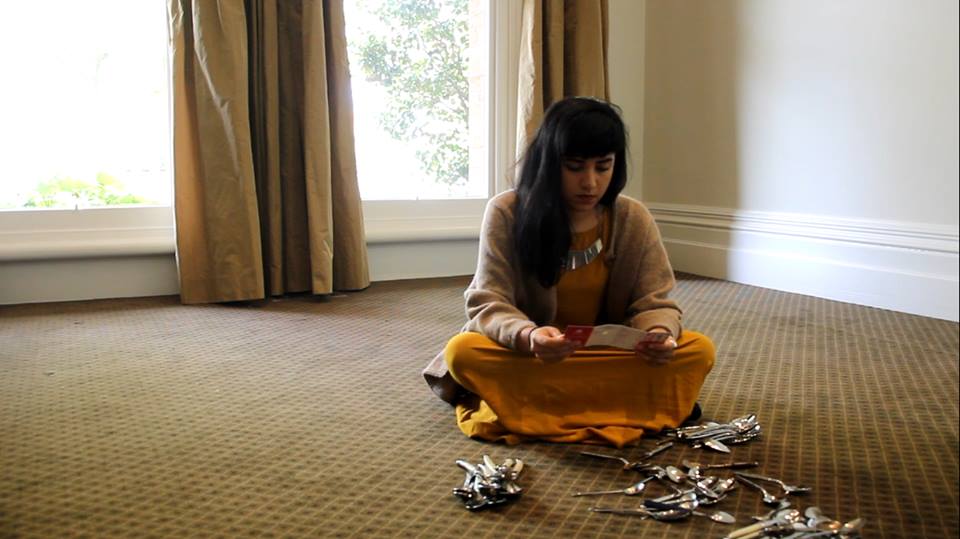
Before beginning a colour grade I knew I wanted to enhance the contrast and brightness in the image as there was not a lot of definition on the artist’s face as it was cast in shadows. I also wanted to draw attention to her mustard coloured dress and make it ‘pop’ in comparison to the background and carpet which is in similar tones. I bumped up the contrast using a brightness and contrast filter and adjusted the levels so that the shadows and darker colours were darker in contrast to the lighter colours. This gave the image more depth and a more stylised look. I also opened the colour corrector filter (as I was using Final Cut) and as an experiment adjusted the colour to add more blue into the mix and highlight the blue tones more. This is the result –
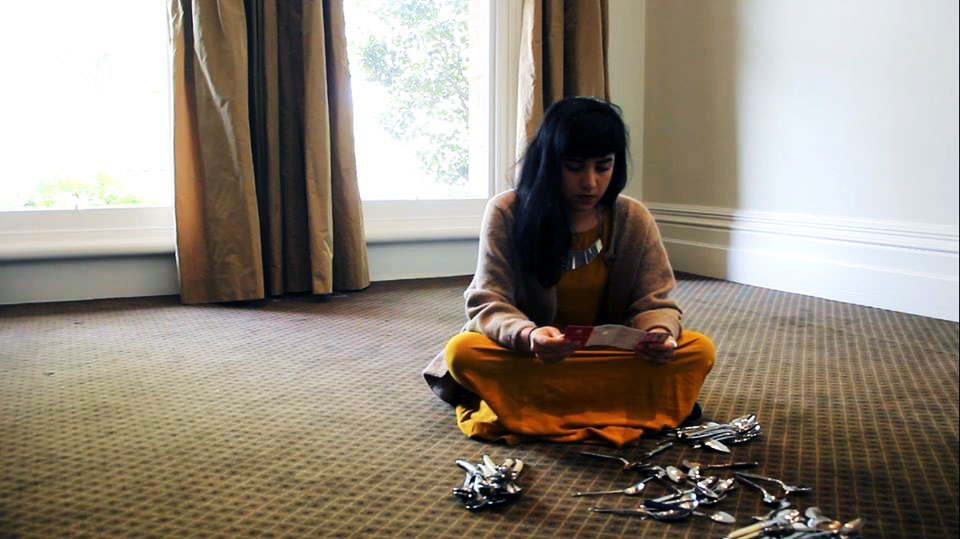
– The carpet appears darker and more subdued as a result and her dress ‘pops’ more. While I like the moody feel the higher contrast and the blue tones created, I decided it was perhaps too depressing for the film and decided to do the complete opposite for the next experiment – giving the image warmer tones, enhancing the yellows and removing some of the dark shadows. This is the result –
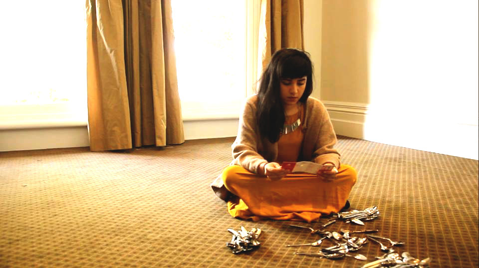
– While I probably wouldn’t use this type of grading for a film unless I wanted that specific ‘warm tone’ or colour filter (for example, in films like Amelie, they have used green and yellow filter so everything appears whimsical and has that “European” indie film feel) it was still worth an experiment. As the curtains, carpet and the artist’s dress were all similar yellow/mustard tones, using a warming filter and enhancing all of the yellows gave the image a softer look as they wash into eachother and almost gave the impression that we purposefully chose yellow as a key colour in our production design.
Without touching the contrast or brightness, I wanted to see what would happen if I went the opposite way and added more blues, subduing the abundance of yellows that were already present in the image. As a result,

– happened. Adding little amounts of blue and green brought the yellow tones in the walls and curtains almost to neutral colours and allowed the mustard dress to stand out more. There is also a nice blue tinge in the artist’s hair where it collects the light but overall I still found this colour palette too bleak. –

– the next image is a result of carefully balancing the amount of blues and yellow in the image – also bumping the reds slightly – so you can still get the warmth of the yellow tones but not so you are overwhelmed by yellow. While in terms of white balanced it is not a properly ‘balanced’ image, it is aesthetically – in my opinion anyway – more appealing than the image where I’d balanced out the yellows using blues because of the warmer tones present in this grade. You still get the distinction between the dress and the room and the spoons on the floor still ‘pop’ but it is not bleak or depressing due to an overwhelming amount of blue. I kept the brightness and contrast at similar levels to the first grade I did on the image so the shadows (as previously mentioned) were just right.
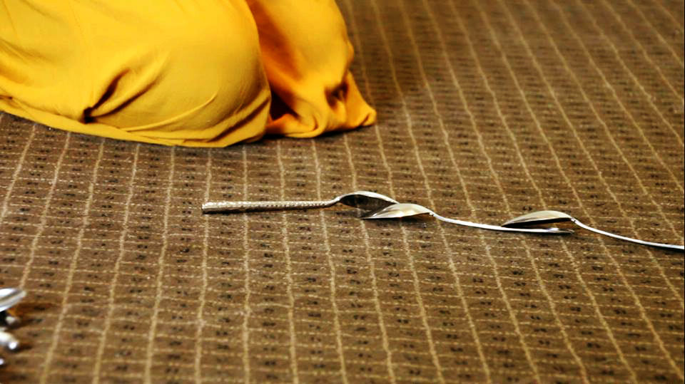
With the second image there wasn’t as many elements to work with, just the floor, a bit of the dress in the corner and the spoons.

The challenge with this grade was making it consistent with what I’d already graded in the previous shot so they flow well together naturally. Like the first shot, I adjusted the brightness and contrast using a filter so there was more definition between the floor and the objects and also so the image would correlate with what I’d done on the previous shot.

This is the result. The next step was to experiment with the colour corrector again and the next screenshot is a result of bumping up the blues and greens –
I think that this is more visually interesting than the effect of bumping up the blues in the last shot. The carpet becomes almost a grey colour and the artist’s dress stands out significantly. However, if I was to leave the shot in this grade it would not correlate logically with what I’d already decided to do with the grading in the previous image. The next experiment was to see what would happen in this image if I bumped the yellows and brought the blue tones down –
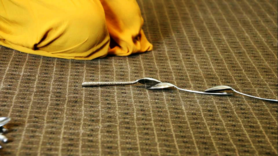
. The carpet becomes almost a green colour and the artist’s dress becomes slightly brighter. In my opinion, this grade didn’t stand out as much as the last (despite the fact that there wasn’t a noticeably huge difference between the two). This grade could also be a logical match to the previous shot and presents similar tones in the floor and the dress along with a similar contrast and brightness. As one last experiment, I decided to bump up the reds ever so slightly which gave the shadows in the folds of the skirt and under the spoons a little more colour (and therefore definition in an overwhelming amount of yellow).
From experimenting with colour grading I have learnt just how many decisions you can make in relation to the aesthetics of your image and the overall ‘feel’ of your film from a visual perspective. You can certainly enhance or create moods or feels using only colour and a specific shot can have several different feels depending on how you adjust the colour balance and levels. I also learnt that you need to take into consideration all of the shots – rather than just a specific shot – and how the individual grading of each shot will relate to the next. What works great for one shot might not translate so nicely visually to the next and if you don’t find a common ground between the two, your grade will be imbalanced and visually jarring.