Introduce your video work in relation to responding to the conceptual brief and the guidelines on form.
This week we dove into the wonderful world of Instagram Carousels. So here’s mine. My carousel is a take on the joke that is Melbourne weather. I’m from up north in Newcastle, a coastal beachy town – the weather is predictable and warm, just how I like it.
I like being able to predict (predicting events in time) the weather, so I can plan my day (knowing a space). My photos were all taken within 1-hour of each other, just in my courtyard. So this shows that Melbourne’s weather is barely predictable – it’s also a construct that is beyond me in my life. My everyday life is very much planned and controlled by me;
If I want to play guitar, I do.
If I want to play Playstation, I do.
If I want to go for a run, I better check with the weather gods first. I also hate the cold, so this influences my motivation and is a hindrance to me in controlling my everyday life.
What did you learn from the authoring and publishing process?
A lot this week! I’ve never made an Instagram carousel like this before. On my personal Instagram post, I’ve made 1 post in the last 3-years, so before that, I would generally just use the carousel feature to dump multiple photos at once for when I was travelling.
First I came up with my idea, and shot the footage – and then I had to learn how to make the Carousel. I have a subscription to Canva for my freelancing work so I used that to build the actual Carousel (I made a blank file at 8000 x 1000px) and then I chopped it up into individual squares in Photoshop (1000 x 1000px). I used this YouTube tutorial to find out how to do this.
So first, I created the blank file to add my photos and created a semi-gradient background. I then added individual vector elements that are included in Canva – The sun for summer, orange leaves for autumn, a snowflake for winter and sprouting crops for spring etc.. It looked like this;
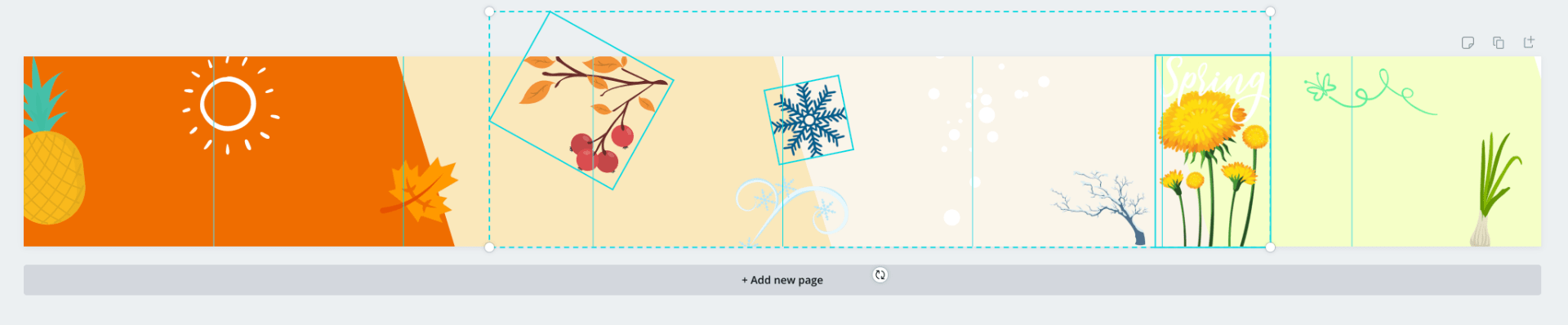
And then I added in my images, adjusting the rotation and changed the layers of the vector elements so that some would be on top of the photos and others would go under it.
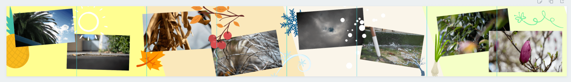
I then exported the file, which I now had an 8000 x 1000px JPG file that Instagram wouldn’t work with, so I then had to go into Photoshop. Open the file, I used the rectangle selection tool, locked to 1000 x 1000 px and cut the layer for each individual file, then saved them into individual photos.
![]()


I then uploaded everything to Instagram in order, and it just worked itself out so that when I scrolled the Images would blend in with each other.
What went well?
I liked the concept and story of the four seasons. I think the overall design is pretty good, I’m just not too sold on the way the photos sit on the background – which I’ll go into detail on the next question.
Considering this is the first time I’ve made a carousel of this type, I’m pretty happy with the end product.
What did not go well?
I found that the way the photos sat on it was pretty awkward. I really wanted to highlight the swiping on the carousel blending it, which meant I had to reduce the size of the images so that the background tied it all together.
Overall the thing was maybe a touch cluttered, I normally prefer a cleaner, minimalist style – but I was kind of actively overplaying with the effects for this exercise.
Being my first time doing it, it did take a while for the actual creation process of the carousel – So even though the end result I was happy with, I would like to understand the workflow a bit better.
What could you do better?
I took the photos first, before planning the carousel. I think next time I should plan the carousel, so I could play around more with the framing. Everything was shot landscape – but I believe the photos could have fit better on the carousel if I used some variance with portraits and square photos.
More planning overall, and playing around with the carousel frames – Even though all the shots were landscape, some of them I could have tried cropping to get the images to fit onto the frame much better.
How do the affordances of Instagram affect the way video content is authored?
I really enjoyed playing around with designing the carousel. I guess as I discussed before, that Instagram affords us the use of carousels but I don’t think they look overly interesting unless you integrate them properly. So whilst a great carousel is a great tool to use, a sub-par one (I guess sort of like mine) will just look sloppy, and I probably would have been better off just focusing on utilizing the 1-image/video post within Instagram.
By offering more ways to play around with Instagram features our skillsets are stretched, and in my mind quality over quantity in a skillset. It’s always great to understand the basics of more, but personally I would be sticking with what I know. My strengths lay more in videography (particularly landscape) and in video editing, so by extending myself into the realm of photography, graphic design, and vector elements – I (or any user in the same circumstances) can appear less professional overall.