Colour grading exercise
 Colour grading exercise.
To begin with I played with the grading on the shot of the dumpling baskets. It was the most obviously over exposed shot of our shoot to me and quite an iconic image for a story about dumplings and chinese culture.
I first wanted to warm the shot up and bring out the baskets so I drifted the master over towards the orange/yellow, section. Then I played with the brightness/contrast bringing them both down.

I think this has a nice effect and more accurately resembled what I picture of steaming baskets when conjuring their image in my mind.
To contrast with these warmer tones I was also curious what taking it to a cooler place and then amping up the brightness/contrast would do. I took the master of the three way colour corrector towards the cyan/blues and then, as i said, amped up the contrast. I was surprised to find that I actually like the look of the cooler tones on this shot. The contrast might be a bit extreme – I don’t want it to have an obviously edited look.

I then had a crack at another shot, this time with the dumplings in the basket out in the dining room – a vastly different lighting situation from the kitchen. This shot was taken in a much calmer setting so I think on a basic level the colours are pretty good.
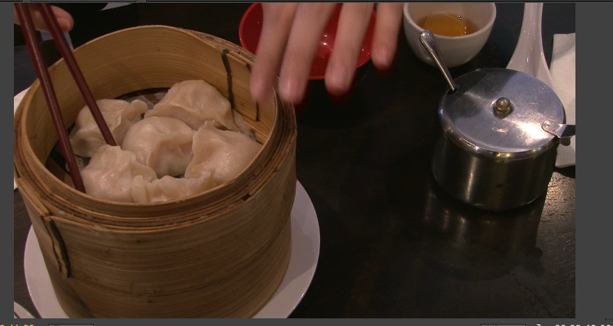 With the first attempt at altering I just brought a little more blue in to give the shot a cooler look. Again I was surprised that I liked the blue tones through the image. I had just roamed around the circle seeing what I liked and I think because the yellows and oranges were brought out in quite a true way with the original shot it was nice to have a hint of blue come in.
I then lowered the brightness a little and upped the contrast a schmick. I am quite happy with the result. I think it helps to focus the eye on the details a bit more.

Feeling confident using the master track, I decided to venture away from it in the second attempt and see what the effects were of bringing out the blue in the Shadows and highlights but bringing out a tiny bit of pink in the midtones. I decreased the brightness more so than the last attempt and hightened then contrast likewise.
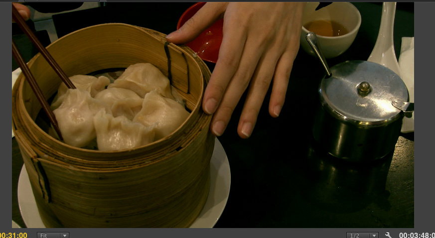 Similarly to the first attempt I think the contrast works well in highlighting more so the details of the image. I don’t think I like the greeny tinge to the image though so I think I’ll probably pursue the blues more in the final piece.
Going forward we’ll need to make a decision as to what kind of hues we want in the film. I think I am leaning a little more towards blue rather than orange/yellow now after this exercise. Time and time again in Film and TV I have learned that as soon as I actually take the time to give something a go, the task seems far less daunting and colour grading has been no exception! That being said, I think I wouldn’t want to underestimate the fastidiousness required to do a good job of it!