As per lecture – in a sequence you’ve called ‘colour’ you will have clips that are indicative of a particular colour or lighting state. To the right of that clip you will have the same clip repeated 2 or more times with different colour grades on it.
Take screen grabs of each clip then upload to you blog the series of stills that show us ‘before and afters’ of your colour grading. Provide a few different examples of at least two different clips – each with a description of what you did to the clip and why.
Having to deal with some of our shots coming out grainy due to a filer accidentally being left on during a shoot day, much of the colour grading in the editing stage was to match the aesthetic of footage over the whole documentary. In time we’ve come to accept the graininess of these earlier shots and believe they’ve become a key visual style of our piece, however colour grading will be used to bring the original shots to the best quality and add vibrancy to the colours of the world of Althea.
First Grade
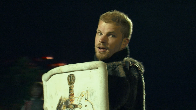
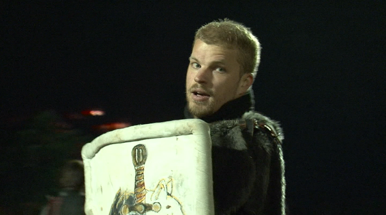 The original shot depicts a soldier with his shield ready for battle
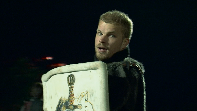 We darkened this second image by making the midtones more blue, emphasising the shadowing across the subject. We also reduced the output levels to reduce the brightness of the shot and made his face more skin like by making the highlights pinker.
This third image is a brightened version where we made the midtones warmer bringing them to orange, this gives life to the subjects face and adds a mystical glow around him. We also made the shot a bit darker by lowering the output and making shadows more blue. As orange and blue are complimentary colours they come together to give the finished shot a harmony, making the shot visually pleasing for the viewer.
Second Grade
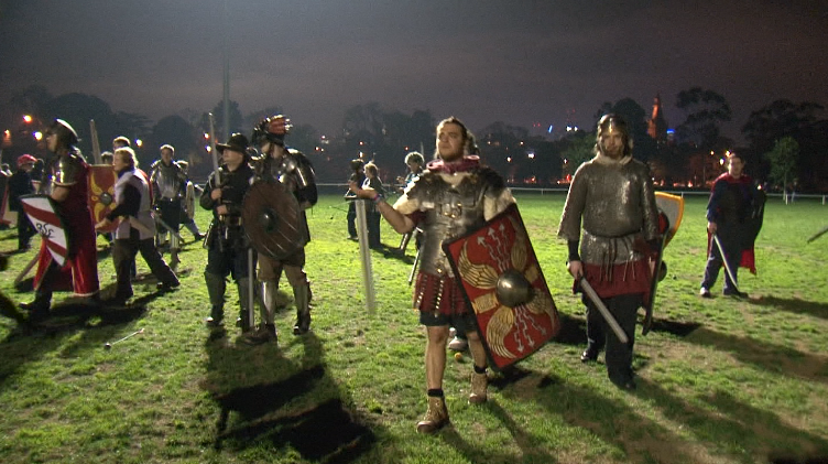
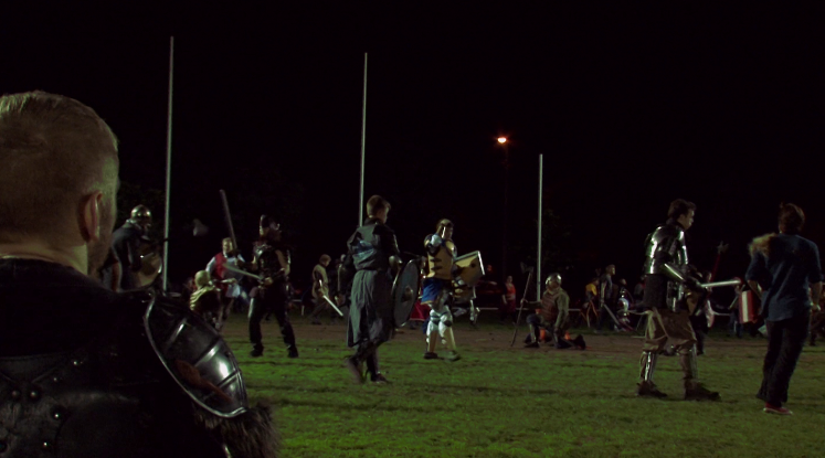
In the original shot we see a war-band advancing onto the field to fight
 This image was made darker by bringing down the output level and making the highlights greener so that it blends with the subjects better. The shadows are also a darker blue contrasting against the midtones at a light blue, developing the scene to look like a dark night and heightening visual impact for the viewer.
We brightened this shot from the original by raising the input levels to create more shadowing on the field. By making the midtones and highlights more green the grass becomes more vibrant and the reds also appear brighter therefore making the costumes of the participants stand out.
Third Grade
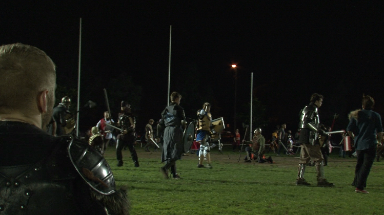
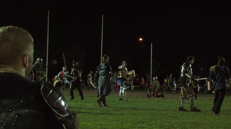
A battler sits and watches the battle waiting to re-spawn
This image appears cooler than the original by making the master a deep red for warmth in the mid-ground and green in the midtones to emphase the grass in the foreground. The highlights are also brighter with a light yellow/pink, giving a soft edge to the outline of the subjects.
By experimenting with brightness and contrast, bringing the brightness to -5.7 and contrast to -0.2 the shot appears sharper than the original. Also made the shadows warmer, midtones greener and highlights pinker to give that underlying warmth to the scene.
