As per lecture – in a sequence you’ve called ‘colour’ you will have clips that are indicative of a particular colour or lighting state. To the right of that clip you will have that same clip repeated 2 or more times with different colour grades on it.
Take screen grabs of each clip then upload to your blog the series of stills that show us ‘before and afters’ of your colour grading. Provide a few different examples of at least two different clips – each with a description of what you did to the clip and why.
Before & After 1:

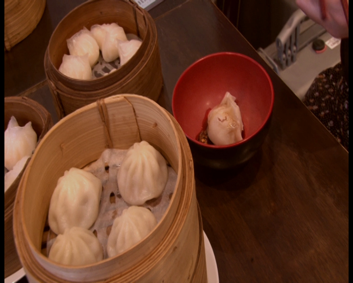
I decreased brightness as I thought the ‘before’ frame was slightly overexposed. I increased the contrast to darken the background and accentuate the colours of the bowl, the basket and the dumplings. I thought this was fantastic because it really directs the audience’s eyes to the dumplings now. I used the Three Way Colour Corrector to add a warmer hue to the frame because food appears more appetizing in warm hues. I specifically added a red hue because it accentuates the Chinese/oriental ‘feel’ of our doco.
Before & After 2:
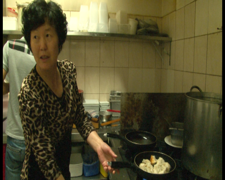
I used the Three Way Colour Corrector to add red-orange hues to remove the awful green tint. I then played around with midtones and adjust the Midtone Blue Balance to slightly reduce the warm hues. My main goal here was to ensure this kitchen scene was consistent with the others which didn’t have this green tint. I prefer the much more neutral tone it has now; it doesn’t look like a dingy kitchen anymore. I also lowered brightness and contrast slightly as the transparent plastic containers (that are ‘white’ in the frame) seem overexposed. But in hindsight maybe the slight overexposure was okay.