State Library Victoria Visit
Week 2, Location Reflective Blog Post
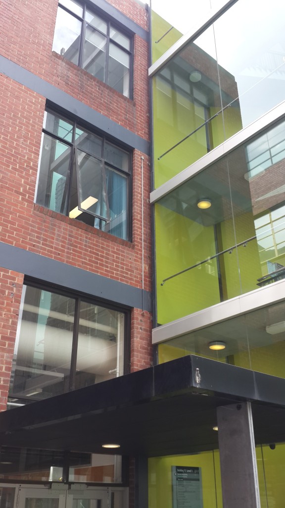
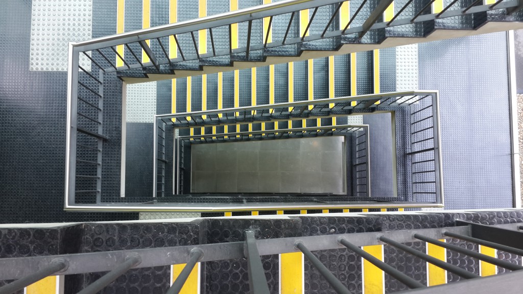
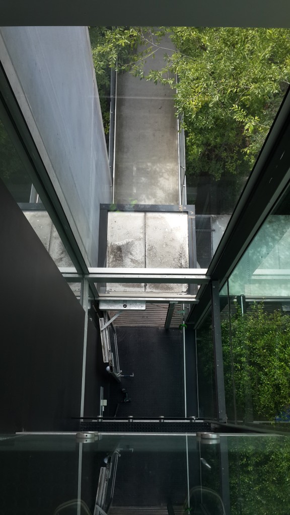
The first impression of Building 15 is the 5 storey glass facade stairwell facing the Alumni stairs that lead up to the Alumni Courtyard. It’s a very modern looking part of the building that feels very open and clean. From the outside the massive window displays one big reflection of Building 1 and part of the cityscape. The reflection of Building 1 is especially interesting, as this modern addition to the building literally reflects it’s historical roots. With all the windows it is a very clean looking part of the building, which also provides generous views outside of the building, as well as views from the top of the building to the ground, creating a sense of height as you wander up the stairs.
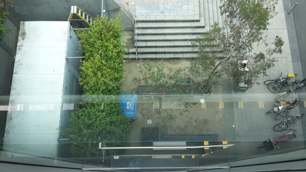
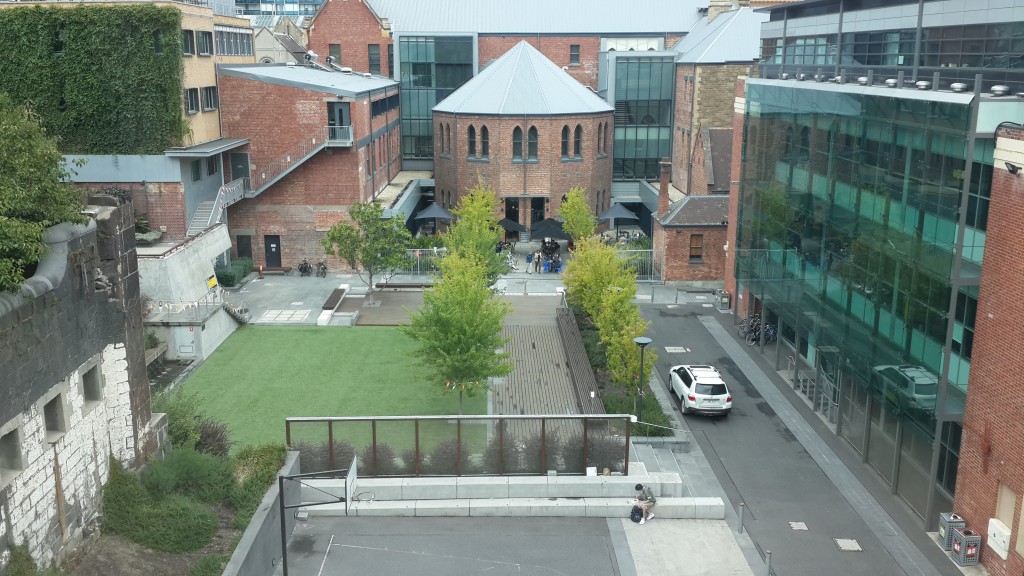
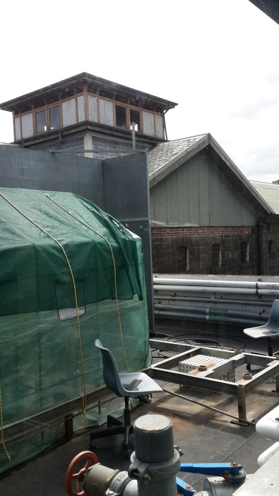
Walking into this stairwell it is quiet with many reflective surfaces, the floor and walls included. For what’s essentially a kind of antechamber, this creates a sense of spaciousness and along with the windows it feels incredibly open, almost as if it were outside. As you make you way to the top of the stairwell you can see down into the Alumni Courtyard, and onto the roof of the building and onto parts of the Gaol. However it’s not until you go into the original part of the building that you get a sense of it’s place in time.
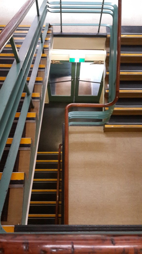
It’s interior is older, smelling musty and with noticeably more lino flooring and carpet in the offices. It feels very last century, and compared to the modern section; very dull. It feels like a place of work rather than spectacle. The stairs in this section have wooden hand rails complete with wear and scratches from years of use. The offices contrast those of the ones in the newer part of the building. Where these are designed with classic square cubicles in mind, feeling claustrophobic, the newest offices have high ceilings and wide angles cubicle spaces open to the rest of the room. It feels like the common theme between the two sections is the feeling of space. The older section is definitely more conservative and a lot simpler, where the newer section tries to encourage a feeling of wide open space.
The contrast between the very new and old parts of the building is what’s most interesting. While this is a common theme throughout Melbourne city, Building 15 shows a stark delineation of the two where glass meets brick and walking through one door takes you from clean, open design to older, closed hallway design. It’s almost a matter of form against function of a building that was originally built as an aeronautics school which focused particularly on the engineering and manufacturing aspects of the process. The original building was completed in 1945 in the latter years of World War II. While the building was used for classes it also housed a wind tunnel and dynamics laboratory for testing automotive parts.
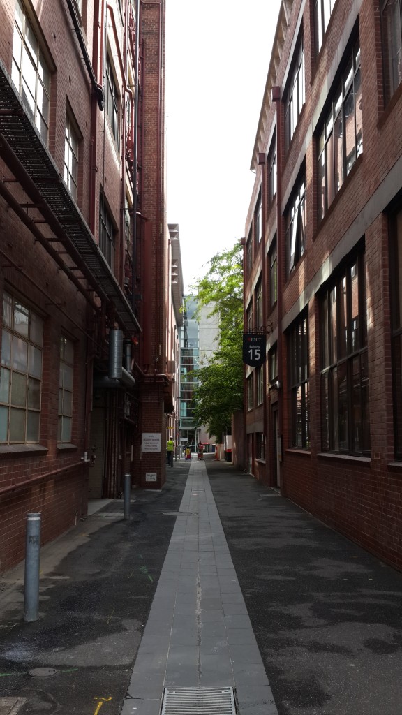
This original building is now all offices, serving a much less industrial function, but the simplicity of the building still shows it’s roots as an engineering one. Looking down the walkway the building is adjacent to, you can still see the square, squat design of the building and the original gridded windows. Overall it’s a very understated building, especially as it’s original section is hidden on all sides except for the walkway, which makes it feel more like a brick wall. In this sense it’s very much unlike some of the other, grander buildings on the campus.

Prior to Building 15’s existence, space used for Gaol, Mahlstedt’s (Vic.) Pty. Ltd, 1923, State Library Victoria
Kernot, Wilfred, ‘Engineering Education in Victoria’, One Hundred Years of EngineeringI, viewed 10th March 2015, <https://www.engineersaustralia.org.au/sites/default/files/shado/Learned%20Groups/Interest%20Groups/Engineering%20Heritage/EHA%20Victoria/Journal%20of%20IEAust%201934/IE%20Aust%201934%20-%201%20Public%20Services.pdf>
RMIT Website, ‘Building 15’, viewed 11th March 2015, <http://www.rmit.edu.au/maps/melbourne-city-campus/building-15/>
Analysis Reflection #5, Question 2
Overall I am happy with what I’ve learned this semester. The main thing I feel now is that I didn’t feel as inspired to make the documentary as when I started it, whether that came from the time constraint, the challenges involved, or the idea itself I’m not entirely sure. From the outset the idea was meant to be experimental and a little left of centre, so the chance to play around with ideas was definitely enjoyable. I think if I were to take something from this project it would be that I’ve learned how important pre-production is, particularly in terms of themes and visual direction. We had a good idea of these things, but I think we weren’t immersed in them enough to end up with a fully cohesive final product.
During the process though I’ve had plenty of ideas for other documentaries, lots of short ones that I’ll put together in my own time with some ideas I didn’t get to fully follow up on in this project.
Analysis Reflection #5, Question 1
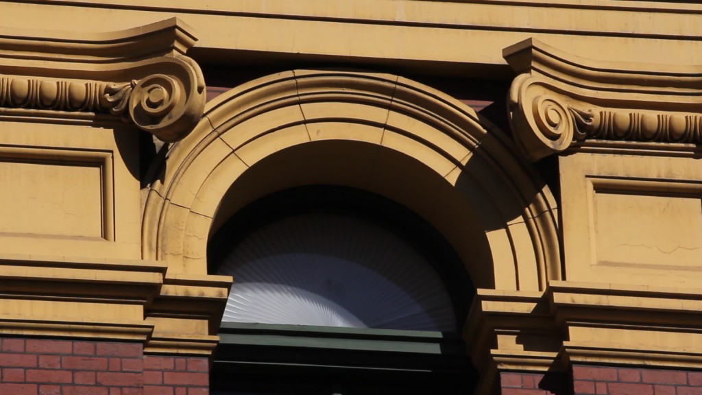
Here is the first still, of the upper half of a window on the Northern facade of Flinders Street station.
First I simply put a black and white filter on the clip. Like a lot of the clips in the documentary, it is a still one, and the purpose of the black and white is to draw attention away from the iconic colour of the facade to encourage focus on the shapes and lines of the image.
The second grade increased the saturation a bit, and mainly altered the lighting effects. Bolder, darker shadows help accentuate the lines, particularly the joins in the stucco, as well as the curves of the curly bits above the windows. The colour is preserved a slightly intensified to keep the iconic feel of the facade.
The intensity of the colour in this third grade was intentionally a bit over the top, just to see what effect it had. The red and the yellow stand out, but more interestingly, the green of the window frame becomes more prominent. Greens on the structure are usually connoted by the dome, but rarely other parts of the structure as the yellows and reds usually dominate, as they still do in this still.

Still 2, Original
This first grade, like the lighting grade in the first still, was a simpler one of making the shadows deeper and more pronounced, and while the saturation is increased I focused on bumping up the green in particular using the colour corrector to try and accentuate the patina of the dome.
Like the saturation increase in Still 1, this still was a bit silly but had some interesting effects. Unlike the yellow and the red of the facade, the blues and greens of this shot are brought out, and it acts as a refreshing contrast to the otherwise warmer colours of the other shots.
Analysis Reflection #4 Question #4
I liked some of the points in Jeffrey Ruoff’s essay on sound in Documentary. Even in the opening paragraphs he points out that location sound “makes discrimination between sounds difficult, if not impossible.” This is something I’m interested in experimenting with in the documentary I’m helping make this semester, and rather than relying on location sound I’m interested in building soundscapes that speak more to the thematic concerns than the visuals. So far, no location sound has been used at all. This works primarily because our documentary is one that is more concerned with the abstract.
The section on music also seemed very relevant to this. He explains how music “comments on the action, providing an editorial perspective for interpreting the images.” Music is a very powerful tool, especially when it comes to documentary and images that we can more readily identify with as real. Of course the copyright concerns can complicate things, but the option to network with independent musicians and producers is a fun option as it gives you a chance to explore music communities too.
We’re going to be using a friend’s track in our documentary, which saves any copyright issues, and has allowed us to learn more about local music producers which is far more interesting than simply paying for a copyrighted song.
Analysis Reflection #4 Question #3
This clip made me think immediately of Man with a Movie Camera. I noticed some recurring shots, such as the man handing out tickets to people. The editing seems fairly random, as is the footage which looks like it was shot on the fly. It’s interesting that people don’t seem to care as much about the camera despite looking directly at it, as people today would be wary of a camera filming them.
Like Man with a Movie Camera it seems to be getting at the rhythm of city life, or life on a particularly busy street. I think the camera was used with such abandon to depict the street as it felt, without much structure or direction, and with attention that darts around as much as the people do. The editing helps achieve this too, by cutting with no concern for continuity or spatial awareness.
Analysis Reflection #4 Question #2
The Ripple Delete option using Shift + Delete is very helpful when putting together a rough cut to remove chunks of footage without having to move proceeding footage around as it pulls everything in front of it backward to cover the area deleted.
I’ve found the use of the Arrow Keys andShift + Arrow Keys very helpful when fine tuning the positioning of a video clip or image in the preview monitor.
Control or Command + N is handy when a new sequence is needed quickly, usually if I want to experiment with an effect of clip layout without risking the original sequence.
Control or Command + U is helpful for saving edited clips in the timeline as separate clips to be used later on, as a way to save stages of edits in that particular part of a clip rather than hunting down for effects or part of a clip later.
Analysis Reflection #4 Question #1
In this clip there are 3 types of sound: music, stock effects, and sync sound. During the dramatisations music and sound effects make up the soundscape, where the sound effects match actions on screen.
The sound effects are generic ones that sound as if they were taken from a library of stock sounds – the same for the music – particularly the glittery sound effect. The music – with the lyrics in subtitles – is likewise generic romantic music. Both the music and sounds act to parody the actions on screen by accompanying them.
All of the dialogue in the clip is the sync sound recorded with the camera in the interviews and footage of the three subjects. Other footage is then layered on top of this. The audio here would have been recorded with a shotgun microphone as no microphones are visible.
Analysis Reflection #2 Question 2
The Leacock reading was really fun to read, simply because of it’s anecdotal style. Though a point that was really interesting for me was his recollection of working on Jazz Dance. I’ve always preferred real time filming, and to read about Leacock’s experience of that performance was exciting. With the prospect of making our own documentaries later this semester, filming like this in real time is something I’m considering using as part of filming.
The other point that connected with me was the paragraph on typical, contemporary documentary filming techniques where “four or five large men come busting into our tiny apartment with tripods, cameras, microphones, booms, and light-stands.” The idea of filming in such a static mode seems boring, if not distasteful; not lending itself to the potential for documentary to show an existing world rather than one constructed by a crew. That territory belongs to drama, and the risk of missing a moment or not capturing it quite right is part of the thrill of filming in real time.

