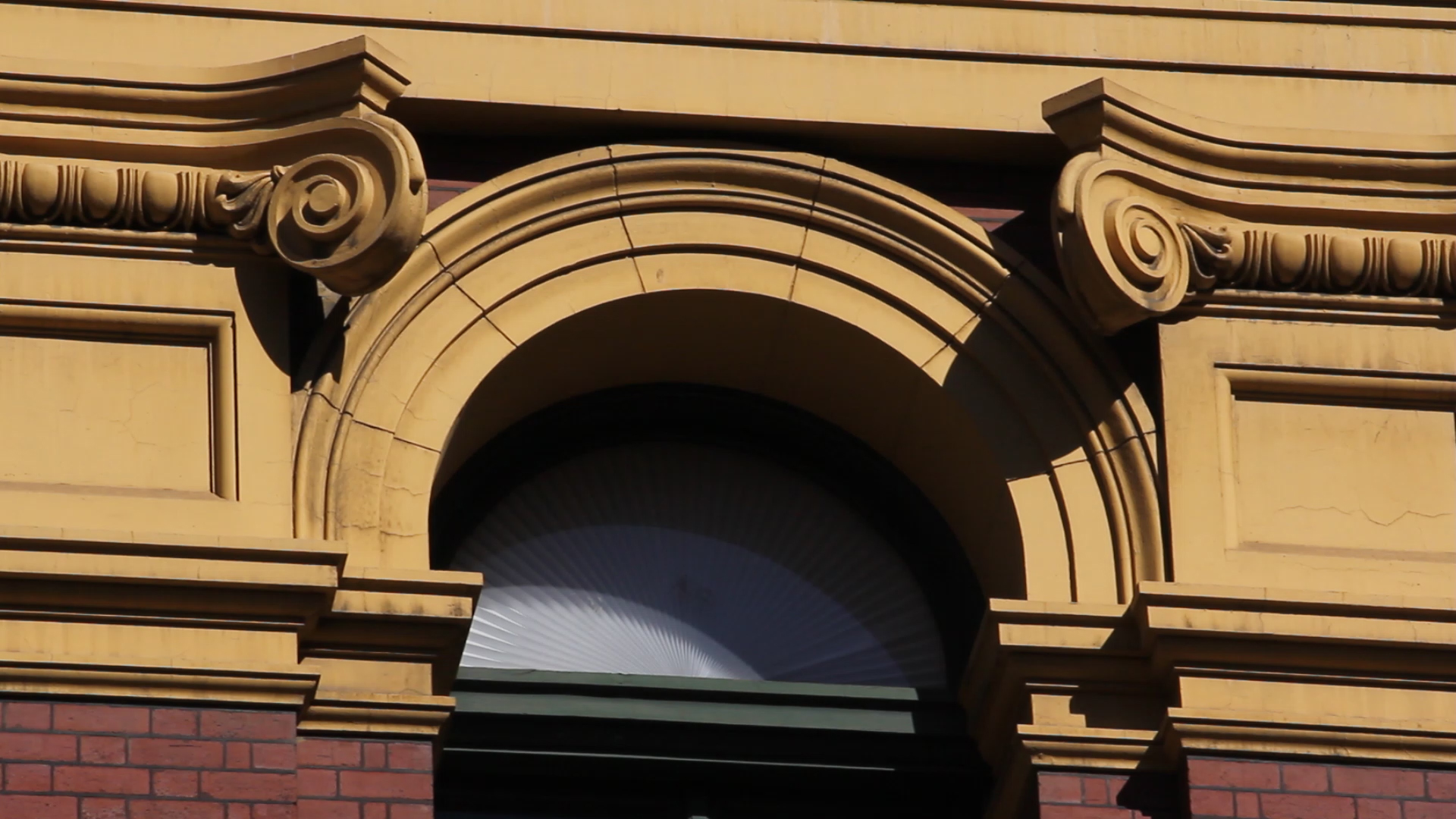
Still 1, Original
Here is the first still, of the upper half of a window on the Northern facade of Flinders Street station.

First I simply put a black and white filter on the clip. Like a lot of the clips in the documentary, it is a still one, and the purpose of the black and white is to draw attention away from the iconic colour of the facade to encourage focus on the shapes and lines of the image.
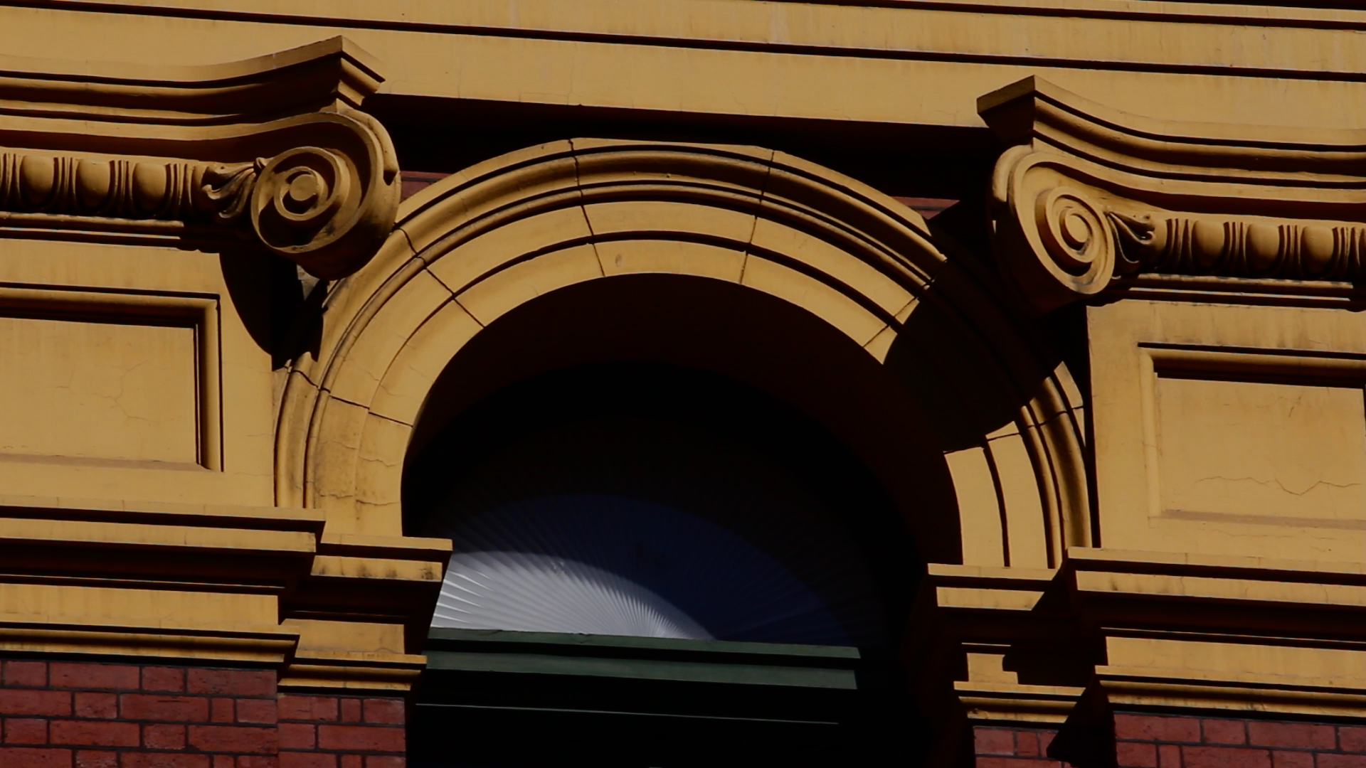
The second grade increased the saturation a bit, and mainly altered the lighting effects. Bolder, darker shadows help accentuate the lines, particularly the joins in the stucco, as well as the curves of the curly bits above the windows. The colour is preserved a slightly intensified to keep the iconic feel of the facade.
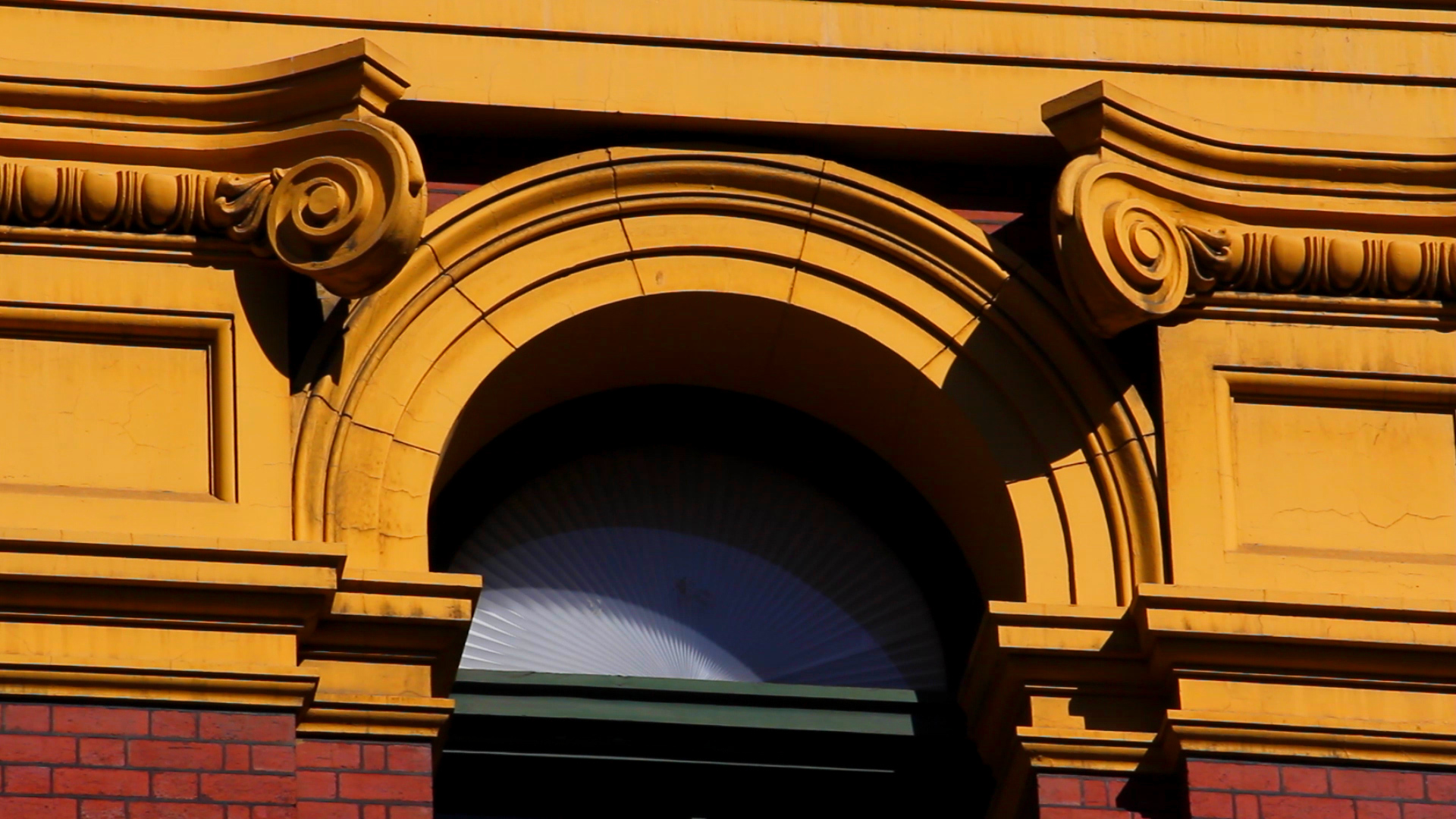
The intensity of the colour in this third grade was intentionally a bit over the top, just to see what effect it had. The red and the yellow stand out, but more interestingly, the green of the window frame becomes more prominent. Greens on the structure are usually connoted by the dome, but rarely other parts of the structure as the yellows and reds usually dominate, as they still do in this still.

Still 2, Original

This first grade, like the lighting grade in the first still, was a simpler one of making the shadows deeper and more pronounced, and while the saturation is increased I focused on bumping up the green in particular using the colour corrector to try and accentuate the patina of the dome.

Like the saturation increase in Still 1, this still was a bit silly but had some interesting effects. Unlike the yellow and the red of the facade, the blues and greens of this shot are brought out, and it acts as a refreshing contrast to the otherwise warmer colours of the other shots.