Blogs
Final Project Links
Individual GD – Lydia Cartledge
Media Factory – Lydia Cartledge
After a few weeks of hardcore baking and a million different setups, I’ve gotten all nine photos ready for post-production. One thing I’ve learnt from this process is that food photography or ‘commercial’ style photography is a lot harder than it seems. I think it’s regarded as a less artistic version of photography because there’s less room for creative license but I would have to disagree. I’ve learnt that it requires meticulous detail and keen sense of balance within the frame and that sometimes you need to try a hundred different lighting angles before you find the best one. I tried to incorporate all of the different techniques that help create more appealing food photography shots that I mentioned back in Week 6. In regards to shooting specifically for Instagram and maintaining a theme or aesthetic for a grid, I found the use of colour to be one of the most important aspects to be aware of but found as well that sometimes a subtle hint of colour is the better option.
I’ve edited all my photos in Lightroom Classic but really only altered the light effects to make them brighter and more vibrant. After editing a few different photos, I decided to actually make my own preset so that all the photos would be more cohesive and also speed up my editing time. I decided to keep the photos bright and summery to keep in the theme of an Aussie Christmas. Last week, I mentioned that I was interested in creating a stop motion video to create some movement on the grid, which I decided to go ahead with and made it on photoshop. I’m pretty happy with the result however it doesn’t play automatically when users are looking at the profile as a whole, it only plays when you scroll through the photos so that’s kind of defeated the purpose of it – but I’m proud of it so it’s staying!
Probably the task that took me the most amount of time in post what deciding on which order to post the photos in. On iPhones, if you add all photos to a specific album, you can move photos around to how they would look best next to each other as seen below. I found this to be a very useful tool before uploading to make my grid look as aesthetically pleasing as possible.
I added a fun little sentence to the start of each caption and then added the recipes underneath (with credits of course) to tie the whole project together. I also added a few hashtags to distribute it further across the network and see if it could generate any views or likes.
Overall, I’m pretty happy with my final project, there are of course little things that I would change if I was to shoot again and set ups that I think would work better but it’s a learning process and I can definitely say that this course has taught me a lot about the usefulness of photography.
Find my project at : coloursofchristmas
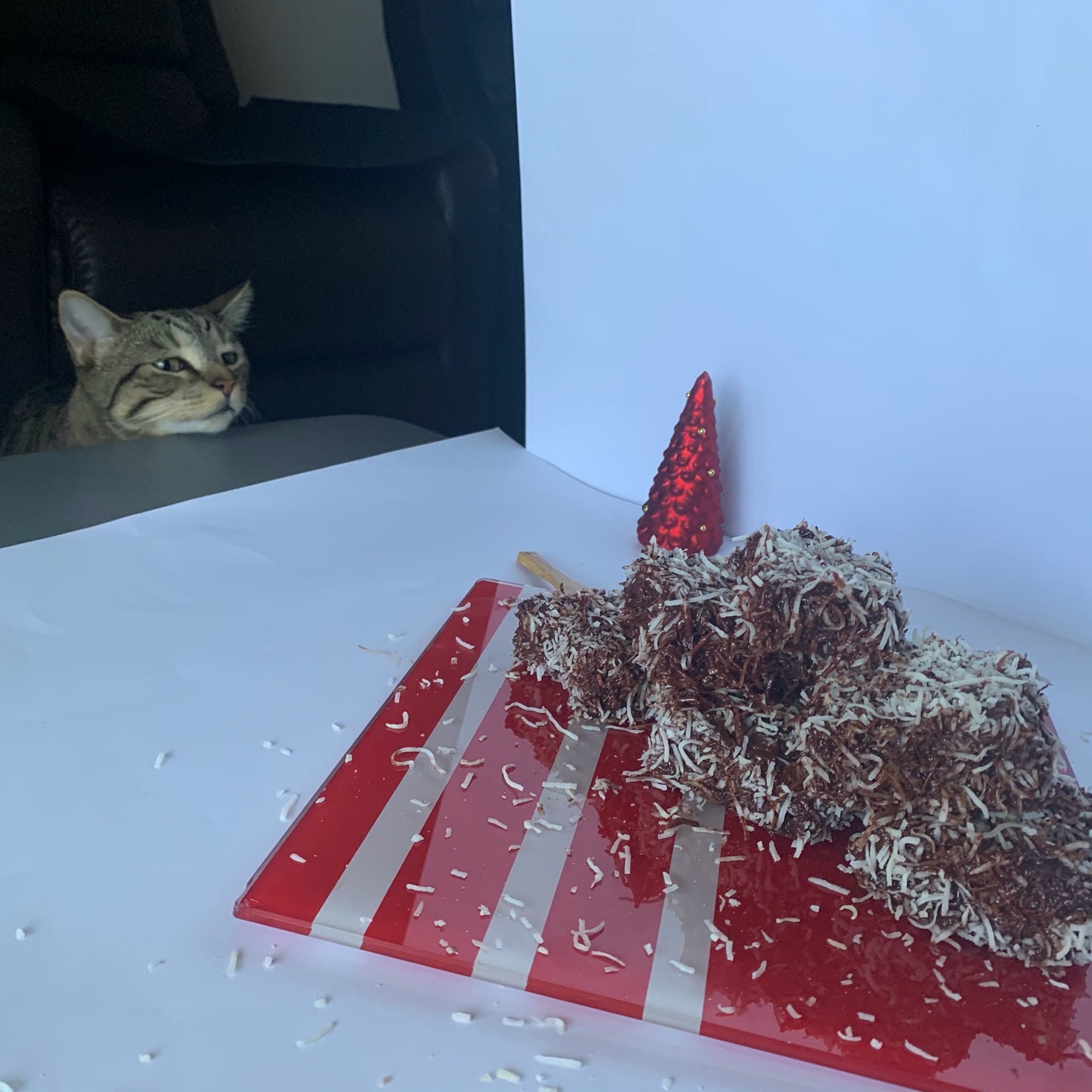
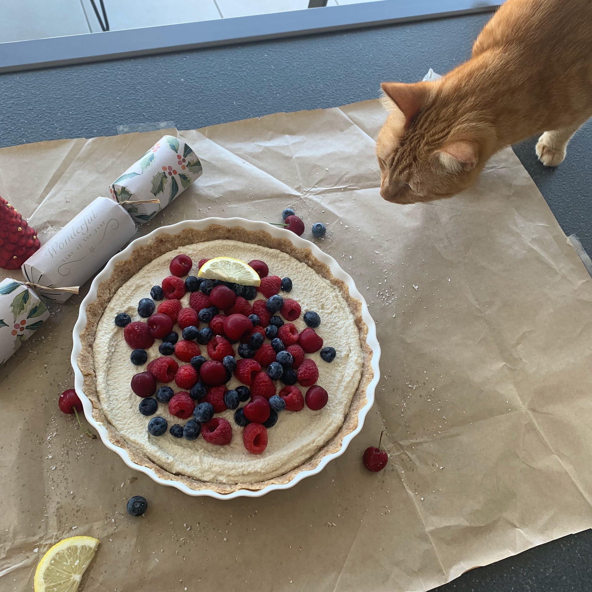
I’ve taken most of the photos now, only have two left to do! With a bit of unsolicited help…
I’ve found over the course of taking these shots that I’ve become more comfortable in my styling and shooting choices and I’m not second guessing myself so much. When I first began, I was spending a fair around of time on one shot and fussing over what props to use and where to put them but I’m finding now that it’s a more natural progression and I feel as though I understand what’s going to look good before I shoot. Once I’ve taken a shot I like, I’ve been experimenting a little more with lighting just to see how the shots might come up with a bit of crazy lighting choices – although my lack of equipment has made for some pretty abstract body shapes to try hold a camera and lamp and some sort of reflector all at the same time…but it’s been fun and educational!
I’m considering adding a bit of movement to the project in the form of a stop motion video for one or potentially two of the cocktail shots. I think that it would be a nice way to break up the grid a bit and maybe add a bit flair. I’ll just have to see how it looks in post-production and whether it works or not. I’m editing in Lightroom but would probably look at doing the moving image in photoshop. Will hopefully be onto post in the next few days which I’m looking forward to.
I think I’ll be taking a well deserved baking break at the end of this project, that’s for sure.
I’ve decided to follow a bit of an Australian favourites/plant based/sustainable desserts theme for the project but have decided to break up the grid a bit with a few cocktails (because it wouldn’t be Aussie themed without them, let be honest) and also to save my family from eating nine different desserts over the course of a week. I’m choosing desserts based on the colour scheme that I can play with from them and then choosing backgrounds and props based on what would balance out the grid, for example:
I mentioned in my Week 6 blog an article by Darina Kopcok that I found really helpful in choosing the best way to shoot different foods and have referred back to this article again for this project. I learnt last time though not to get to stuck on the details in the pre-production because when it comes to production, chances are I’ll probably change the whole lot!
The first photo I shot was of the Lamingons and I wanted to play around with selective focus and the rule-of-odds which Kopcok states is when photographing a group of objects and having an odd number of elements in the frame appears much more visually interesting than an even number of elements. However, after taking a few photos of my initial set up for the shot, I felt like it wasn’t working and played around with a few different backgrounds and props before I landed on a shot that I liked. I thin I will still pick a photo from each set up though and edit them as I’m interested to see if, in post-production, that is the shot that I still choose to use when it’s time to add them all to the grid or if one of the shots I felt like wasn’t working fits better with the aesthetic when put against the other shots.
References:
Kopcok, D. and >, M., 2020. 20 Delicious Food Photography Examples To Inspire You. [online] ExpertPhotography. Available at: <https://expertphotography.com/food-photography-examples/> [Accessed 6 December 2020].
This week we watched everyones presentations on their ideas for the upcoming project. I have decided that I’m going to be creating a photo series similar to commercial style food photography. I used food photography as my inspiration for the Mimesis project and learnt a lot about specific lighting techniques and how to style aestheically pleasing shots and want to continue along that path. I’m also really interested in photography specific to socials so have decided to utilise the grid funciton on Instagram. I think that the grid can be benificial in creating a unique and engaging set of photos by the way images look similar to one another which can appear quite aesthetically pleasing. I’ll be shooting 9 different shots in total and, considering is that time of the year and there’s props to use in every shop (reject shop, here I come!), I figured I would keep it Christmas themed and stick to desserts, which in turn means I’ll be using a red and green colour scheme.
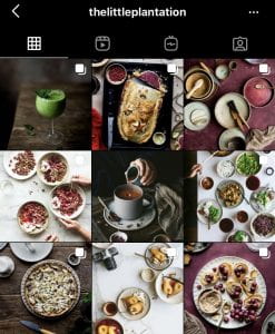
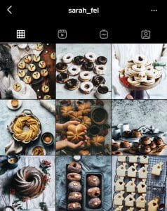
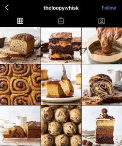
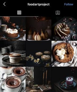
Below are some Instagram accounts that I’ve taken inspiration from. You can see that both accounts have specific themes and have organised their grids according to their aesthetic, the foodartproject sets quite a moody tone and thelittleplatation uses green and maroon as a reoccuring colour to tie their photos together. They both make use of lines, patterns, movement and motion and texture and close-up shots, selective focus shots and different lighting techniques. Heres some more examples that I’ve taken inspiration from. Theloopywhisk plays with different heights and close up shots and sarah_fel shoots a lot of flatlays and a cool blue undertone in all of her photos.
I’m going to spend the next few days researching different ways to style and shoot for food photography and also research more on different grid techniques to create a more aesthtic theme. I’ll also need to find some recieps and create a rough plan on what sort of backgrounds and props I might need to help tell a better story through the photos. I’ve given myself a week to bake and shoot all 9 shots but that could be extended due to not having to pay around with much in post-production and I think I’ll just be using the light effects to make shots brighter or enhance some of the red and greens. I am going to create a public Instagram account that I would make specific to this and use that for submission and use the caption as a recepie guide to tie it all together. Brian and Rohan both said that it would be a good idea to come up with a more specific theme so I’m going to go have a bit of a think about that before next week!
This weeks topic was pretty expansive but what I concluded from the end of the class is that expanded photography has been a term coined to represent the substantial increase in quantity of photographs over the last few decades that are available to the masses and how this increase has pushed the limits onto what ‘photography’ is and what genres those photographs might fall into. I think it also addresses the argument that this idea that originality or authenticity is somewhat lost when anyone could call themselves a photographer these days with their revolutionary smartphones. In The Truth of Experience: Notes on Expanded Photography, Cramerotti (2011) says, “photography may no longer be subdivided and talked about according to genres…it’s various categories have been reconfigured, blurring the boundaries”, in which I believe he’s referring to expanded photography transcending into this idea of new or contemporary media which is more experimental and perhaps strays away from a photograph being needed to be documentary and more conceptual.
We got a chance to see some previous years works for the major assignment and I found it really intriguing to see the different ways that people interpreted this idea of expanded photography. I loved the project ‘Astromood’ by Margo Tanjuto and the way she used colour and editing to tell her story and I also thought the the project ‘Movement of water’ by Zane Chang was really well done. I’ve documented over the last few weeks the shutter speed and me don’t play together very well…but I thought Chang nailed it!
For my project I think I’m going to stick to commercial food photography like I did for the Mimesis project, but maybe have a focus more on it’s place on Instagram and the technicalities behind the aesthetics specific for the grid.
References:
Cramerotti, A., 2011. The Truth Of Experience: Notes On Expanded Photography. (online) Digicult | Digital Art, Design and Culture. Available at: <http://digicult.it/digimag/issue-066/the-truth-of-experience-notes-of-expanded-photography/> (Accessed 30 November 2020).
I have always thought of photographs needing to tell a story as much a films do. Whether it be a commercial high-fashion shot or a flat-lay of a cheese board or a landscape shot off the Great Ocean Road – I find really captivating photos the ones that resonate thought or provoke emotion. It was really cool to see some examples of the way other photographers have created narratives through photobooks/essays/series. Was interesting to consider how photography in narrative form still needs to have a beginning, middle and end but not nessiarly in that order, similarly to film – Tracy Moffats, Something more, was one that stood out to me the most in relation to this. All photos follow the same ‘storyline’ so could really be placed in any order and still provide the same narrative of a young woman looking for ‘something more’. I think this example stood out to me because of the theatrics of the shots and how they all followed the same colour scheme throughout.
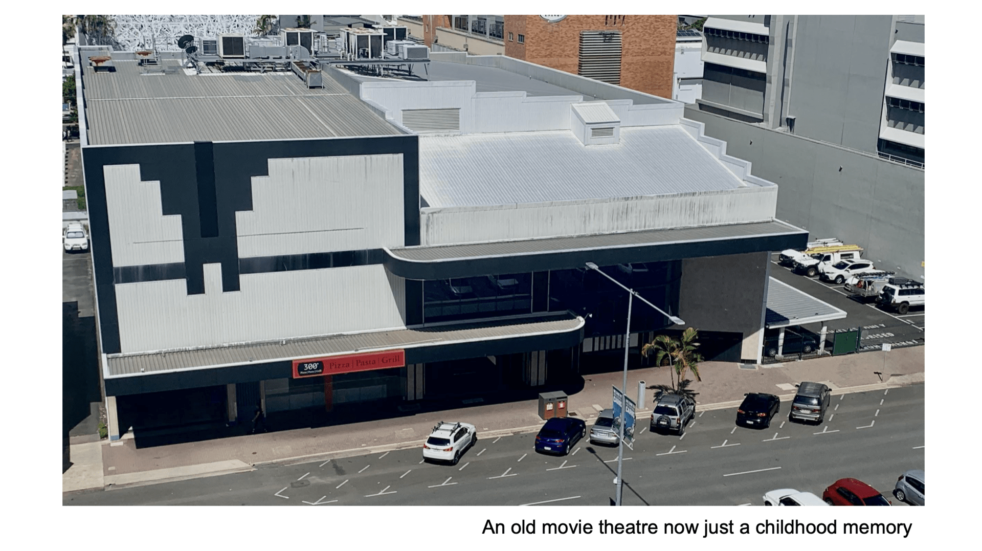
For the exercise this week, we needed to create a short photo series on the topic ‘passing time in my neighbourhood’. There is this really stark looking abandoned movie theatre across the road from my house that I thought would be a good example to use in relation to time past. Even though it’s quite an ugly looking building, I have quite a lot of fond memories of it from when I was growing up so I decided to add some poetic working to the photos to create more emotion.
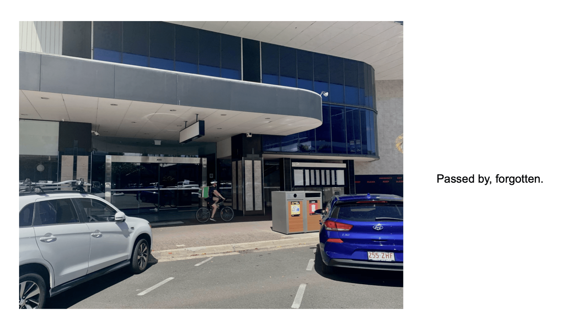
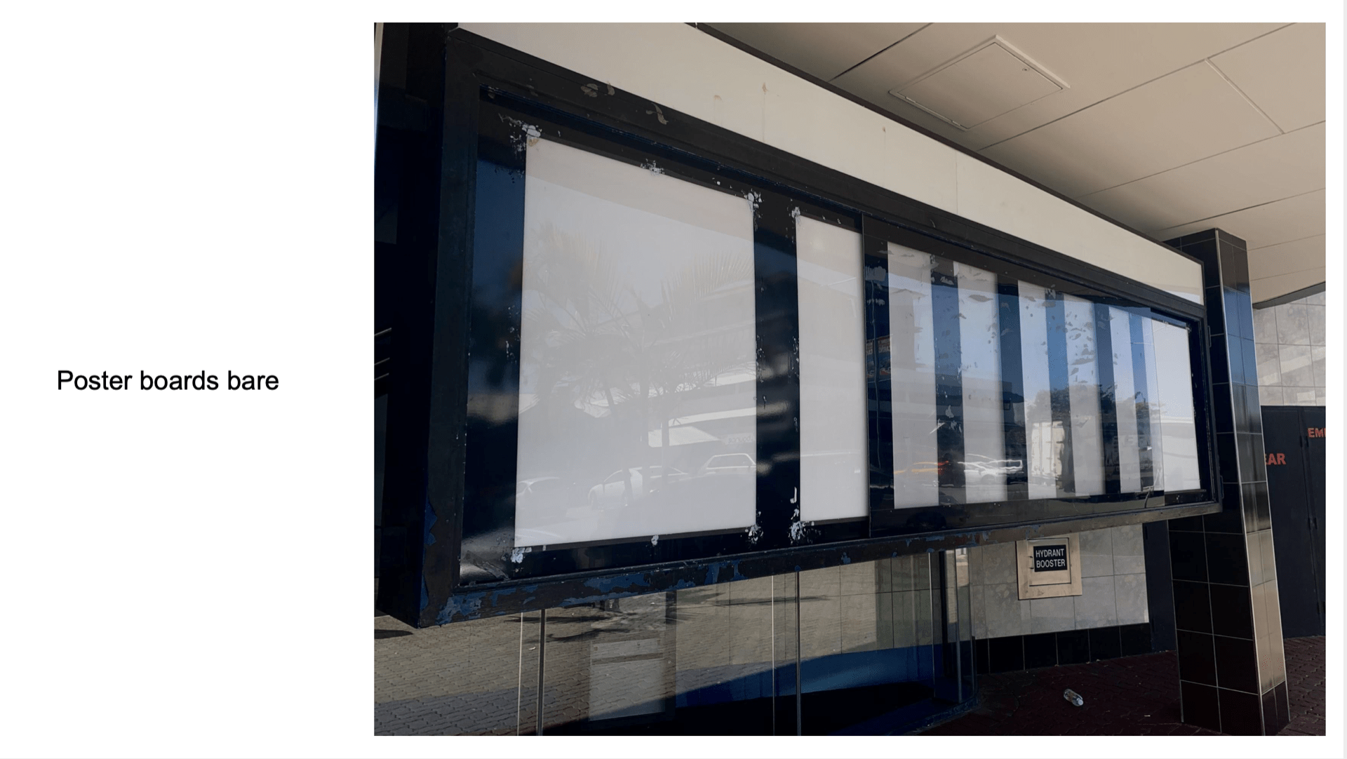
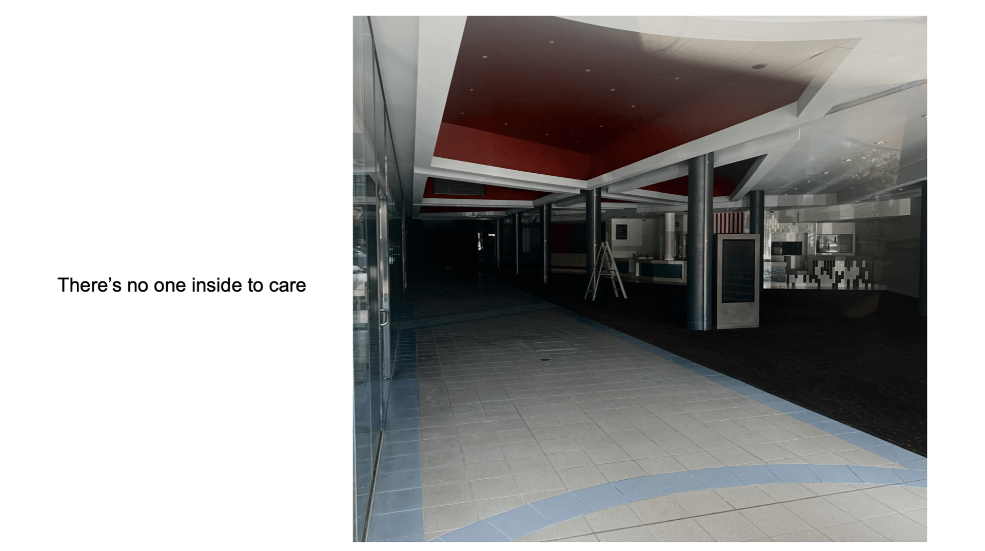
I played around with the exposure and brightness of the photos to create a more lonely and dark feeling and used the poster boards as my close up detailed shot. I quite enjoyed this exercise and being able to create more of a narrative through the sequencing of photos.
References:
Mca.com.au. 2020. Tracey Moffatt | MCA Australia. [online] Available at: <https://www.mca.com.au/artists-works/artists/tracey-moffatt/> [Accessed 24 November 2020].
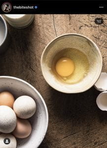
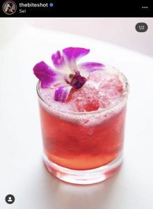
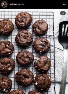
I’ve chosen Joanie Simon (@thebiteshot) as my photographer to imitate for the Mimesis project. As I mentioned last week, I’m pretty interested in food photography so I thought that I would give her a go. She photographs a bit of everything from sweets to cocktails to fruits and veg and she also has a YouTube channel where she gives advice on things like what lighting to use and what compositions are best. I also found this article that I often referred back to throughout this whole process which provides twenty things to consider when trying to shoot an interesting food photograph. They included mood, repetition, lines, patterns, balance, movement, motion, scale, texture, negative space, odd numbers, colour, human touch, shine, close-up, food portraiture, layers, selective focus, backlighting and flatlay. So basically a lot! Which was very overwhelming to begin with so I decided to narrow down my choices of photos I wanted to imitate and then go from there. These are the five I chose.


For the first two, I needed to create mood so I used two big pieces of black paper to make a box like set and then played around with different angles to create low-key lighting. I had put a piece of white crepe paper over the lamp to soften the light which I think made a massive impact and then played around with different objects so that I could get the light to only shine through a tiny crack to try and create a more dramatic effect. I think out of all my photos, these ones were the most challenging. I struggled to find a nice balance in my composition for the chocolate photo and they toyed around with added some foil to create a bit more texture to the photo but I don’t think I’ve succeeded. My photo with the beaters would have been a lot more dynamic if I could have capture the movement of the chocolate sauce using slower shutter speed however, I had decided to use my iPhone to take the photos and the app I downloaded to use for manual mode, Halide, did not take very well to the dark lighting and I struggled to adjust it. So to make up for my lack of movement, I decided to create more of a background with the use of sugar and a measuring cup.
I really enjoyed shooting the three high-key lighting photos however and I think my egg shot is my favourite of the five I’ve imitated. I used a dark chopping board and juxtaposed it with bright white bowls and directed my light to shine directly into the egg yolk to get a reflection. I also tried to balance the photo with the different shaped bowls. For the cocktail photo, I decided to work with green instead of pink because I had limes and mint to use up and tried to work with the negative space but found that my photos lacked depth. So to fix that, I added some cocktail utensils in the background and scattered some lime wedges and mint around to create a bit more of a story and create balance. For my baking tray shot, I made some blueberry muffins and worked with repetition and colour to create a better shot. It was initially a wider shot but when editing I decided to crop it to add tension so the composition. I edited in Lightroom Classic but only made small adjustments to the light effects to enhance the contrast and exposure and to with the highlights and shadows.
On reflection, I really enjoyed to process of taking these shots and playing around with different lighting techniques and composition layouts. One of the biggest challenges at the end of it was sifting through all of the photos to find the ones I liked and I though stood out the most.
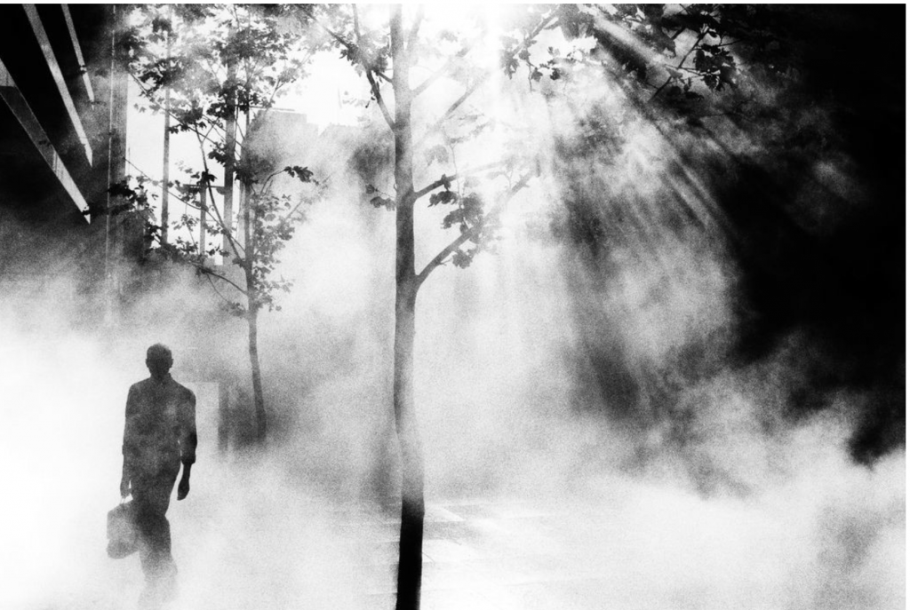
For my Pecha Kucha presentation back in week 3, I showed an assortment of shots by Trent Parke. One thing I found fascinating about Parke while researching his work was that he often uses light as his primary inspiration for his photos, as seen below. This week’s prompt: chasing the light – why and how does it matter?, reminded me of a quote of Parkes’ that went, “I am forever chasing light. Light turns the ordinary into the magical”. I really liked this quote because I feel like it emphasis how important lighting is.
I thought that the concept of lighting for photographs was pretty straightforward, but after completing the exercise for the week, I realised that it’s actually quite technical and requires a bit of thinking. I found the slides very useful and will be using them through the semester to reflect on.
I’m quite interested in food photography so I think that for my Mimesis project I’m going to sift through some of my fave insta photographers and chose one that will challenge me.
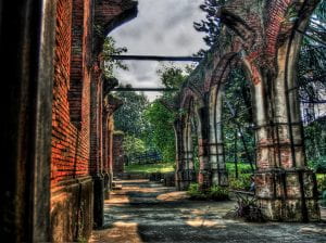
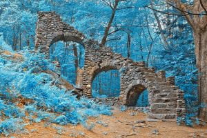
The reading this week introduced me to the term HDR (high-dynamic-range) and described it as a technique where, “the surfaces of the subject matter seem to glow, the tension between shadows and light intensifies, and colours somehow appear simultaneously more muddled and more vivid” from which I took that it makes photos look more luminous than a standard photo. The main idea of the reading was centred around photographing ruins and how using the HDR technique could be argued to provide a dynamic range similar to that of our own eyes if we were seeing them in the flesh which I would have thought would be ideal but Kushinski argues that this could do a disservice to the photo by making them look ‘more than real’. Which after doing some googling of HDR photos, I think I would have to agree with – they almost look like animation or photos from fairytale book. What I found crazy was that our iPhones have a HDR feature built into them so you don’t need to go out and buy a fancy expensive camera anymore to take there really visually interesting photos anymore. Our phones will take over the world one day!
References
Kushinski, A., 2016. Light and the Aesthetics of Abandonment: HDR Imaging and the Illumination of Ruins. TRANSFORMATIONS Journal of Media and Culture, (28).