The Two Brands I have chosen are:
Qantas & Air New Zealand
I decided to look at Video Ads for the both of them
Qantas- Feel Like Home Campaign
https://www.youtube.com/watch?v=x7XFafi4IGo
Air New Zealand- A Better way to Fly Campaign.
Background information about the brands you chose
Qantas

Qantas is an Australian airline that was founded in 1920. They were the third airline to fly a jet across the North Atlantic behind BOAC and Pan Am and have established themselves as one of the top airlines ranking third in the top 10 airlines for 2019. Having such a long history, the Qantas brand has evolved with launching more flight destinations, newer and bigger planes as well as different options for seating.
Generally, their reputation is excellent as far as customer service, food and drink options as well as flying experience and due to their history they are the most well known Australian Airline.
Air New Zealand
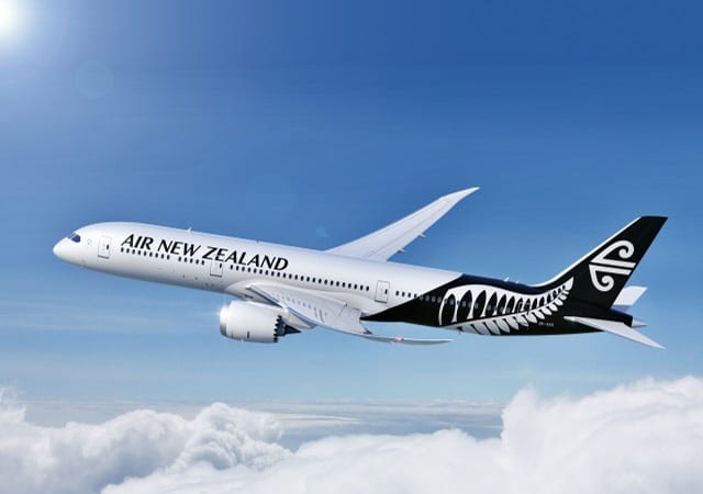
Air New Zealand was named the 2nd best airline in the world and originated in 1940. After being known for their less than great reputation, there was a change in the way that the company operated both internally and for its employees and flyers. Air New Zealand took away its first class and instead focused on creating a premium economy option for its flyers, proving to be less expensive, yet much more successful and liked by the public. Several employees were also interviewed about what they liked, didn’t like and what made them mad about the company and executives worked on these issues, eventually being able to not only become profitable again, but to increase their employees wages.
What are the key messages of the two ads that communicate the brands to you?
Qantas
The message that Qantas is presenting is that they represent home. They are a proud Australian airline dedicated to being able to fly you where you most want to be (in this case home).
Air New Zealand
The key message of the ad is focused on the idea that Air New Zealand provides a “better way to fly” with more places to fly to, great food and drink options, a quality plane as well as a loyal connection to its home country.
What are the key signs that are used in each of the ad to create the above messages?
Qantas
A key sign is the Kangaroo Symbol. This is the indexical mode of the brand as it is a connotation relating to Australia being its native animal and that they are not only proudly Australian, but that being an airline service, they wish to be connected to other countries and places. The ad itself shows images of various different landscapes that are in Australia and overseas. This suggests that the brand is in fact an airline (the iconic mode example being the Qantas airplanes in several of the shots in the video to show this).


The consistency of the red and white logo alludes to its history and confirms how the brand most likely wants to be able to be recognised by its target audience through its brand ads. The montages of people travelling to their desired place, to be greeted by people they care about is an important sign and image as it provides the connotation that the brand are responsible to creating those happy moments. The song for the video is very important as well. It being titled “Feels like Home” creates an emotional response for the viewer, implying the importance of being able to fly and travel to your loved ones as well as the singers soft voice complementing the visuals of the advertisement.
Air New Zealand
There are many signs used in the video ad. One being to communicate the pride of being a New Zealand Airline; an indexical sign of a Kiwi that is used in the advert as this one of their national animals. The fact that they are able to fly to many different places is represented. For example the use of an image of the Kiwi in LA (the sign here is one of the stars on the Hollywood walk of fame which gives the connotation that it is an American setting and is related to Los Angeles.) The image of the Kiwi near a tram on a hilly place alludes to the location being San Francisco as it is culturally recognised to be a very hilly place with many trams used as transport.
The second half of the ad serves as exposure of New Zealand’s highlights with backdrops of a Vineyard, the film set of the Hobbit, and a beach with smiling people on it which again create connotations of relaxation, entertainment and joy that make the viewer want to not only use Air New Zealand when flying to other places in the world but to also feel interested in the country itself. It can also be noted that the logo of Air New Zealand is very much a signifier of the country being a Māori koru or “fern” this is a well known type of plant in New Zealand and can be recognised from there.


Are the brand narratives communicated in a cross-cultural context? If so, explain how they are communicated cross-culturally. For example, navigate the brand’s websites in different countries and examine the differences of presentation in terms of the use of signs.
Qantas
The brand narrative is communicated in a similar way but not necessarily to accomodate all countries. The website itself can be translated into many different languages in order to check flights and view prices, and they do show the same advertisements overseas but there are subtitles or dubbed voices.
Air New Zealand
The brand narrative of Air New Zealand, like Qantas allows for people to discover their website in different countries and screens their advertisements in others countries with subtitles, however most signs remain the same and text is translated to convey the same messages about Air New Zealand.
What are the similarities and differences between the two brand narratives?
Similarities include both wanting to create a personal connection to their country and the idea of feeling comfortable there. Other similarities are how they have a positive outlook on their Brands and carry that through their advertisements. Differences include what they are focusing on; New Zealand is a “Better way to fly”, whereas Qantas have the simple “Welcome Home” logo which is much more emotionally driven.
Based upon your findings of the above brand narratives, explain which brand you like better and why.
When looking at which brand I like best out of the two, I would say that Qantas is the favourite for me. The advertisement itself looked more like a narrative than a selling of a brand which I found to be very clever and more subtle. It showcased the Qantas planes and the flying experience all in the same but with more attention on the emotional experience of flying, and the exploration of where all different people fly to everyday in what felt like more of a celebration of what the airline do and the pride they take in that. In terms of dimensions, Qantas placed the personalities associated with the brand of a higher priority, followed by functional attributes and physical attributes which I found to be very appealing as an observer of their branding.
Reference List:
Danesi, M. (2013) Semiotizing a product into a brand, Social Semiotics, 23(4), 464-476.