-Task four Reflection-
When I have finished filming the four different colours footage, I wasn’t sure whether I should go for the fifth or I am satisfied with these four clips as a series. Might be influenced by my cultural background or personal experiences, for somehow, I thought any series or a set should contain five different pieces, so at the planning stage, I was preparing to shoot for five different clips to form a series. However, a plan can never catch up with changes, I was satisfied when I finished the fourth colour footages, so I asked help from Hannah. Hannah said she thinks four should also be fine for a series because no one said a series have to contain five pieces though, and she emphasized that I would rather have four polished videos than filming the fifth video. Which there I go, ended up with the fourth colour.
This final project has well demonstrated either creatively or technically to noticing because the four locations that I chose to film are the places that we might have passed by every day, we might or might not have seen them, but they are never highlighted to be a location for a media production. By choosing these unnoticeable four places I have highlighted the objective of the course_to notice, and by using selecting these areas to film, I have responded to my final project’s objective_to challenge a subject’s initial purpose.
My project has well demonstrated either creatively or technically to noticing as a media idea inform. Because just like what we have spoken about in the class, we are the ones who construct the world to be but we still missed out a lot of small things in our everyday life, so my project is using the ones we might have missed out daily. Moreover, even though humans are the ones who create the world, but there isn’t a rule saying that everything must contain a meaning because everything can be interpreted in a different way depending on the audience’s experience. People are so obsessed to a definition, like a movie or artwork that you don’t understand, many people will see this as a bad movie or artwork.
-Studio Final Reflection-
Looking back to the start of the semester now, participate in ‘seeing the unseen’ is such a captivating elective for me. I believe I am not the only one who has tuned myself to notice everything in our surrounding, since the beginning of the course the question I have been asking myself is: what can you notice hear or what haven’t you noticed here? And of course, I am not saying this is something wrong because I think as media makers, we need to have this skills to produce good stuff.
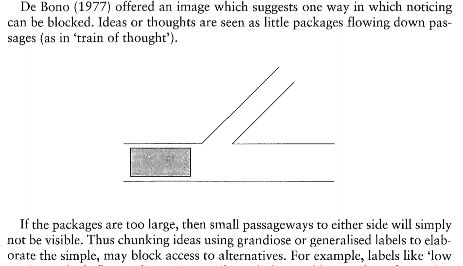
I am in media 4, this is my first studio which we really try to extend the same concept from the first task towards the final project. In the progression of each task, I have met difficulties at the end of each task because I don’t know how can I extend any further on a topic. For example, when I complete task three, I have considered for a week time on what should I talk about in the pitch because I have no idea where can I extend further on colours. I remembered a reading at the start of the semester saying sometimes our mind is being blocked by the large things we care about in our life so we haven’t left any room for the small things. I forced myself to not pay too much attention to the large things, in the case of assignment three, I divert my attention from colours to the meanings behind, and I have also get myself to listen carefully during class discussion even it’s not about my project.
Learning to notice is helping media makers to not miss out every tiny thing in our surroundings, other than completing works for my project, I have also collected many amazing ‘noticing’ pieces that I am still doing even I have completed the final project (see media below).
-

-
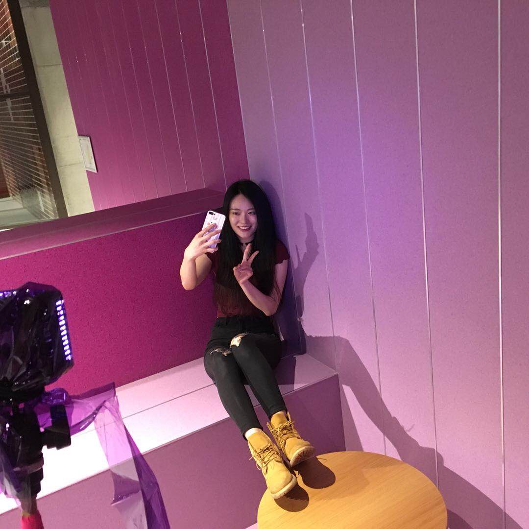
rainbow on me
-
-
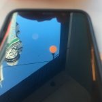
what you see?
-

-
rainbow and its mirror selfie
-

-
what is orange?
-
-
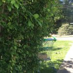
green hide and seek
-
-
what is yellow
These are just a small part of my daily collection, and they are all captured with my phone, whenever I took my phone out and captured all these details I noticed that I had tuned myself after participated in this studio. Because my project is always about colours, so these photos are commonly about colours as well, with all this photographs and videos I made through the course, I love to watch them over and over again, and I guess most directors will have the same feeling with me.