Part One:
Smokers – In class exercise
Using a script from class, we were assigned groups and set out to film the short scene. As many of us were fairly new to the ‘proper’ practises of a shoot. Taking turns producing, acting, directing etc. we eventually covered the scene from three different angles, changing actors each shot. The first shot had a continuity error in which the smoker was on the right instead of the left. In order to combat this, I mirrored the clip so that, while the background may not be entirely consistent, at least the audience doesn’t have to struggle to understand who is where. I think the fact that the actors changed throughout the scene didn’t really matter too much as the framing and cuts between shots allow for continuity throughout.
With this second edit, I wanted to try my hand at the ‘a e s t h e t i c’, ‘wave’ type of editing that I am seeing online more and more- for examples, search for ‘sadwave’ or ‘simpsonswave’. It encompasses this kind of retro, VHS style of video with blue/purple undertones. I also wanted to try and move the footage around a bit more in this version, but with such a short clip and very little other footage, I found this hard to do. Instead, like my ‘Day Out’ video, I tried to match the footage to the music of the clip. I think this worked well with the drop, where the cigarette is thrown away as the beat kicks in; but at the same time I think the jump cuts at the beginning, which happen to the beat, could have been more pronounced.
Day Out – Filming on the weekend
The initial plan for this vlog-like video that was shot with my friend was to head out to The Royal Botanical Gardens in order to shoot both some nature shots and ones with her as the subject. I wanted to do this so that I had a better feel for using a DSLR and try to experiment with composition. Obviously, with the weather on the weekend (literal hail), The Royal Botanical Gardens were out of the question- which we found out when we were hailed upon after just arriving. What I then decided to do was create a little sequence of shots that encapsulated the day we had. I wanted to work around the music, Baoj- Sunrise, to create more intrigue as while the shots aren’t of particularly interesting nature, I feel as though the edit somewhat makes up for that.
In this second edit, I wanted to create more of a psychedelic ‘vibe’ to the vlog. This is something I’ve never done before, so it ended up being more of a learning exercise in bettering my skills and knowledge of Premiere Pro. I tried to create this hue-rippling effect based on the music used in the video. In all honesty, I think this is something that needs to be planned out in terms of colour schemes in order to create a ‘nicer’ visual effect, i.e. make sure the sky is what you aim at colour-changing. I wanted to produce something similar to Mac Miller’s ‘Gee’ video (below), but honestly, don’t believe I quite got there (more research and skill building is necessary).
Jaie’s Script – Two-line script edit
What I found most difficult with this edit was how I was supposed to ‘change it up’ the second time around. Overall, in the first edit I am fairly happy with how it turned out. The foley matches up with the visuals (although the dragging noise could have been better in my opinion) and the overall pacing of the video, I believe, is correct. I did have to crop the original footage to size so that the framing was ‘right’ as there was too much headroom to begin with- I think this is something to be mindful of when shooting in future, that is, to make sure your frame is one hundred percent correct.
With the second edit, I wanted to see just how much of a role editing can have on the pacing of a video. Switching back and forth between the two characters made the conversation feel more intense and argumentative, and the way Jaie is cut off through the phone allows the viewer to suspend their disbelief and feel as though Nat hung up on him. I feel as though this was an interesting and useful excersice to undergo as it has really opened my eyes up to the fact that the most obivous way to edit something isn’t necessarily the best.
Part Two:
Fargo (1996), The Coen Brothers
The audience expectation when going to see a Coen Brothers film is that the film will be that of a low budget production with events that are over-exaggerated, almost absurd and that it comes under the genre of a ‘black comedy’- all of which are present in their 1996 film, Fargo. We can clearly see an over dramatisation in the acting of Kristin Rudrud in the scene where Jean Lundegaard is kidnapped by Carl and Gaer. Her blank stare at the two attempting to break into the house and her following hysteria all play into this genre convention of absurdism- that someone would react the way Rudrud does in that situation. By including such overdone acting, especially when she caught in the shower curtain and flailing down the stairs, this not only fits in neatly to what the audience is already expecting, but creates a source of entertainment as well; as while we should feel shocked or horrified at the events taking place, the way it is carried out again adds to the ‘black comedy’ of the text. The overarching storyline of the film, that a husband would hire two felons to kidnap his wife for ransom money from his father-in-law, delves again into the constructs of this genre by having the plot be so bewilderingly absurd, despite its dark themes, that you’re able to laugh at it.
Fargo partakes in this fabulistic-like structure which can be seen from the beginning of the film. The imposition of white text on black stating that the film is “based on true events” with folkloric music playing in the background, which is recurring throughout the film, lends to this ‘Grimm Brothers’ fairytale. We first see a car climbing up a hill, which is reminiscent of the hero climbing over the mountain trope, creating intrigue within the audience as to who this ‘hero’ could be. This motif is later bookended at the end of the film, with Margie driving Gaer to the police station, her voice telling the ‘moral of the story’ and her car seen climbing up a hill once again. Throughout Fargo, we are also reminded of storybook elements, from the over imposing statue of Paul Bunyan to Margie first being shown in a child-like room covered in paintings and duck statues and portrayed to be a little girl in bed. By the Coen Brothers continuing this fairytale element throughout the film, it allows the audience to connect to something they are already greatly familiar with, while also creating intrigue as to what could happen due to the off nature of the film itself.
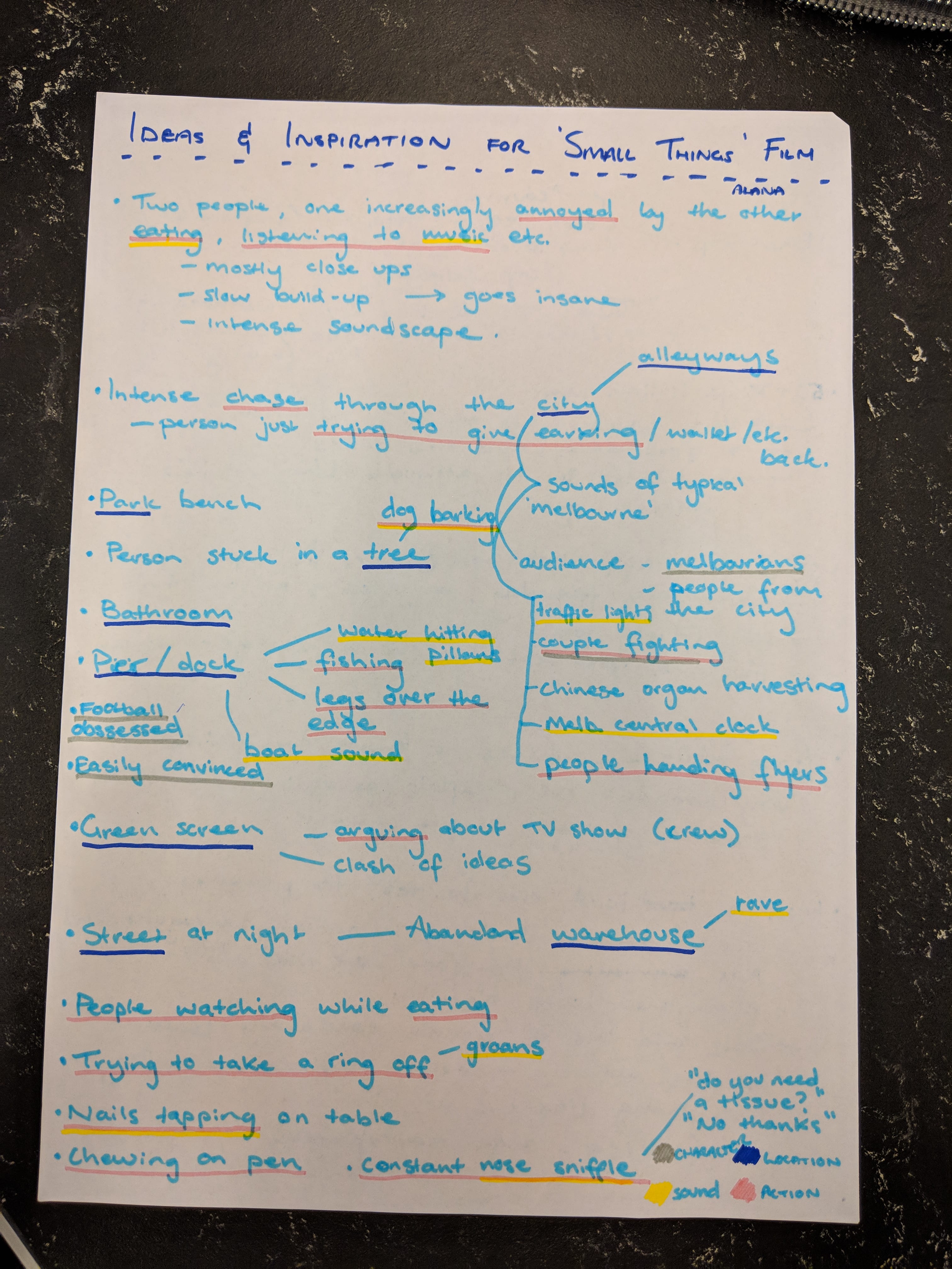
A piece of television that I want to draw a lot of my visual inspiration from is the Netflix series ‘End of the Fucking World’. The editing style, use of visual flashbacks- Wes Anderson-esque centred and stylised shots, as well as the colour palette, drawing on pops of colour against natural tones, is an aesthetic practice I would like to incorporate into my final piece.

I also really enjoy the editing style of Edgar Wright and his ability to show an entire period of time elapsed in seconds through his use of quick shots.
Part Four:
Colour Grade
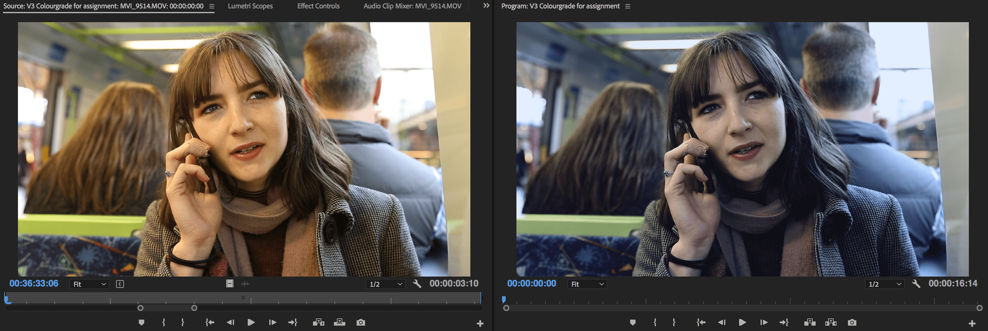
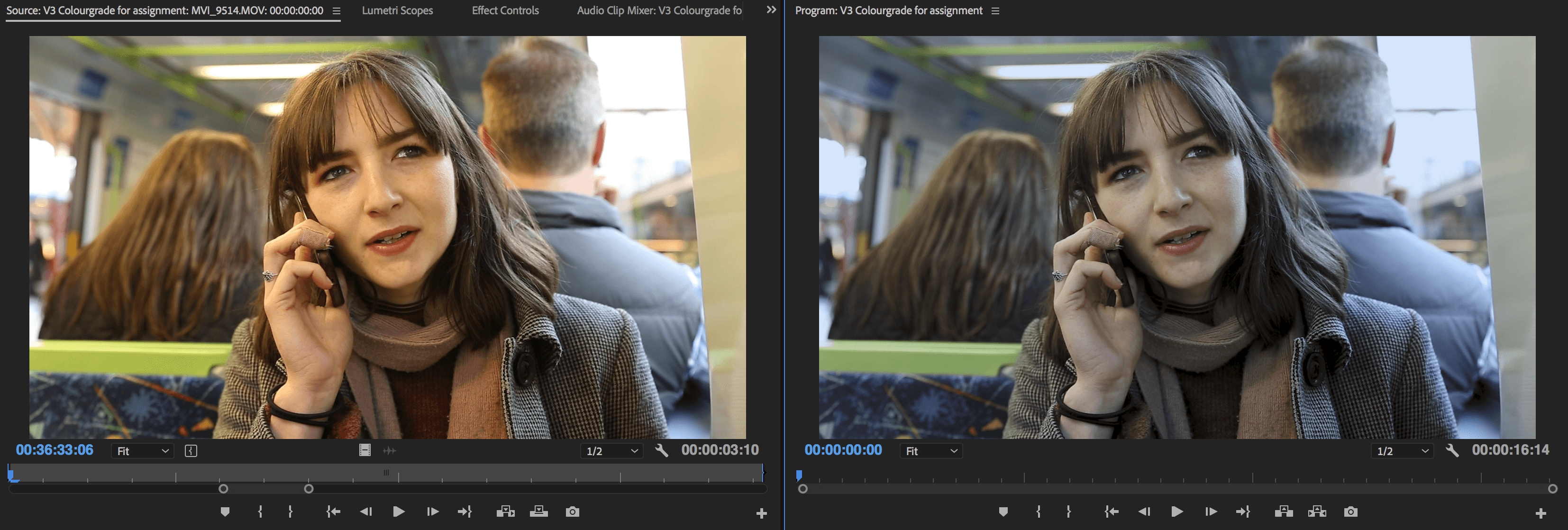
With these three grades, I wanted to see how I could push the colours to create subtle differences and thus affect the mood. With the first one, it was more subtle, making sure the colours weren’t too saturated and restoring some more realistic tones to my model’s, Alex’s, skin. The difference between the next two was pushing green over blue tones and seeing how that affects the image. I feel as though the middle one represents a ‘truer’ more desirable pallet over the slightly more green-toned one.
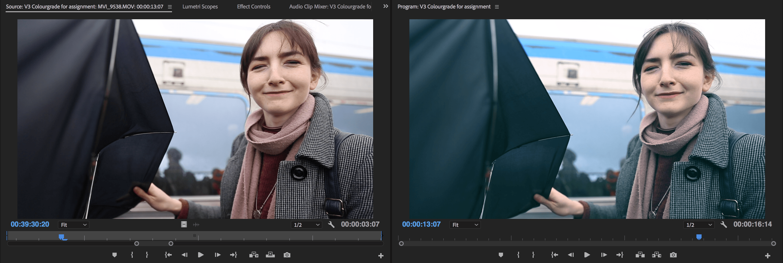
Pushing the colours a bit more here, I wanted to see how far I could go with Alex’s pale skin. In the last image, I see I’ve gone too far trying to make it seem as though she got a bit of sun- looks more like a case of a bad tan. I do however like the tones on the umbrella and jacket in this particular case. The first image, I feel, has more of a vintage camera vibe to it, more akin to ‘End Of The F**cking World’, which is what I want to draw a lot of inspiration from in my future work. I think this particular grade gives some extra *oomph* to her skin tone as well.
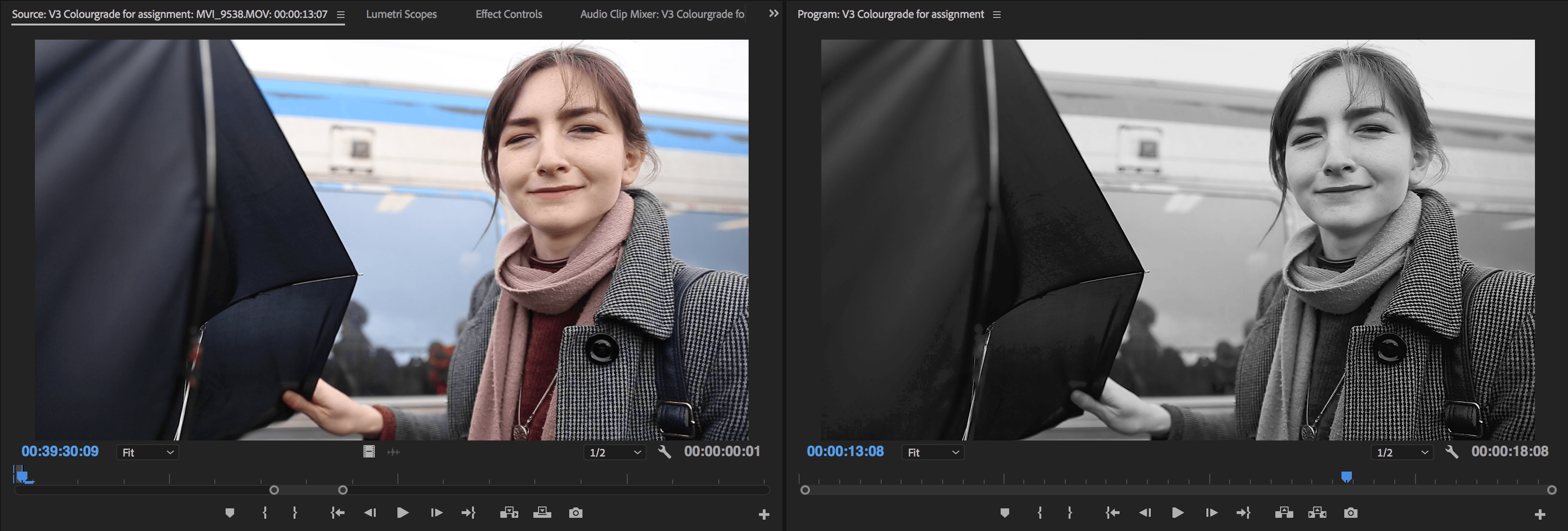
The black and white piece is something I wanted to compare and contrast with a separate image, to see how black and white affects subjects differently. While in the chair piece (below) it is far more contrasty and dramatic, I don’t know if it adds all to much to this particular shot.
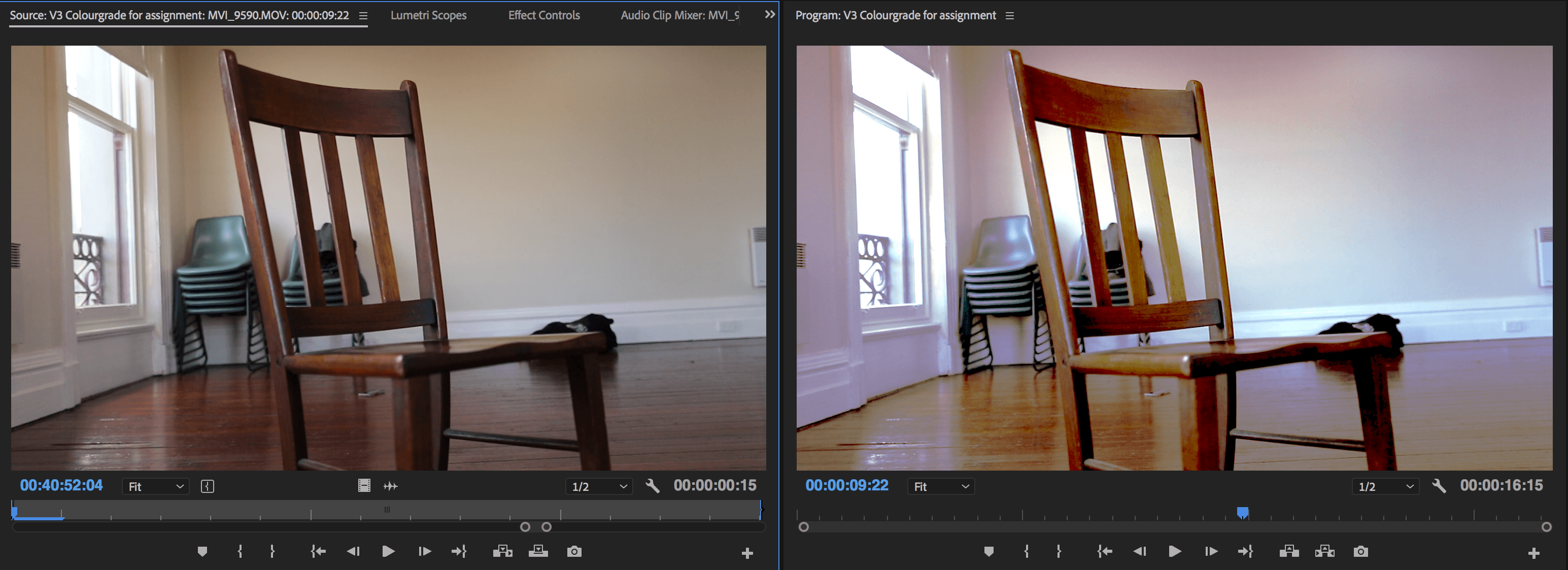
Finally, I wanted to push the colours in this sequence and see how much I can ‘get away with’ before I hate it- the last screenshot/grade I am not a fan of. I feel as though this could have to do with the fact the blacks aren’t ‘black’ and this might be something I’m drawn away from. Although, I do love the deep black and white shot as I feel like it really gives the shot a sense of drama.
