Screenplays as an Independent Medium


“screenplays should be experienced […] as a form of cinema itself” whereby “both, although via opposite polarities, are audio-visual (the screenplay cueing the images and sounds in our mind)” – Chris Dzialo

In the above quote, Dzialo contends that screenplays are more than just a written text, that instead they are somewhat of a middle ground between literature and film. Though, they are ‘opposite polarities,’ as a screenplay is a purely written medium, and cinema is audio-visual. Dzialo suggests however that screenplays are more than a written medium – that they also contain sounds and images, but instead the text cues them to exist in our minds.

Authors like McKee advocate that a screenwriter should remove all camera related phrases like ‘cut to’ and ‘pan to’ from a screenplay because they might take a reader out of the audio-visual experience and remind them that they are reading a screenplay, not a film. McKee and Dzialo would probably get along, as they have similar points of view. McKee would have a reader of a screenplay be fully immersed in the screenplay, and not thinking about the film production process as they read, instead immersed in the audio-visual experience that is being created in their mind – as what Dzialo proposes is happening when a screenplay is being read. Other authors, like Ann Ingelstom, argue that vocabulary like ‘cut to’ and ‘pan to’ are actually a useful tool for helping the reader visualise the screenplay. Yet, she does not that if this ‘extrafictional voice,’ as she calls it, is used, then ‘‘the reader is always aware of the text’s purpose to become a film.’ (Ingelstrom, 2014.)

Whereas, someone like a director who is writing the screenplay to his own film might have a more practical approach. They probably won’t dawdle as much on the mechanics of what is a screenplay really and see it more as a stepping stone in their production process.

Dzialo’s point of view might suggest that a screenplay is more than just a means to making a film, that a screenplay should also be enjoyable as a stand-alone piece of literature. After all, if screenplays should be experienced ‘as a form of cinema itself’, then should they not therefore be as enjoyable as cinema?

If Dzialo is on the right track, however, why do not more people read screenplays more enjoyment in the same way that they watch films, or enjoy books? Perhaps because screenplays are not as readily accessible. Or is he wrong altogether, and screenplays are not able to be a stand-alone medium and are always intrinsically tied to the film production process. As Ingelstrom puts it, the text’s purpose is to become a film. So screenplays may be in some ways a form of cinema, but they cannot be experienced independently of the cinema.

Visual Storytelling Examples

Below are some examples of films that have sequences that show good visual storytelling.

Du Levande – Roy Andersson

  • Though there is some dialogue in this sequence, I love the way he walks around the table, carefully picking up the chinaware, measuring it thoughtfully. Also the way the others are positioned against the wall, dressed in stiff clothes, and the decoration of the room. For some reason I find it ridiculously funny.

  • Cross cutting b/w Gyllenhaal’s character and the letter being delivered.
  • Tells us about his character and sets up the storyline of the film – letters from zodiac killer.
  • Shows us that he’s an illustrator – also essential to the film.

  • Begins at 32:00
  • Good short little sequence – no dialogue. Clearly shows the waiter’s interest in her.


  • Some dialogue, but functions more like music track to link together scenes like in a montage sequence.
  • Sequence tells us a lot about the character and the decisions he’s made

Fictional + Extrafictional voice

Whilst reading the assigned Ingelstrom reading for this week, it occurred to me that Ingelstrom directly contrasts McKee’s opinion on the use of the extra-fictional voice in screenplays (e.g camera directions.) She deems them to be a useful part of the writing, able to help the reader visualise the film, in contrast to McKee, who considered them to be taking the reader out of visualising the story. Ingelstrom does concede, however, that these notes could possibly have been added during the production process of the film, but this is not possible to know because most published screenplays are these final versions, not earlier drafts or spec scripts.

These extra-fictional voices are helpful also to add extra info, and to help the reader such as the example she notes from the king’s speech: “For ease of reading, Bertie’s stammer will not be indicated from this point in the script.”

So this appears to be a controversial topic, one that most screenwriting manuals disagree with, indicated by the quote from Field: ‘the writers job is to tell the director what to shoot, not how to shoot it.’

Only screenplays that do not have scene headings can not use extra-fictional voice (because these are also types of this technique) – but these are rare. I’d like to have a look at one if I can find one – it seems difficult/impossible to write a clear screenplay without using scene headings.

Ingelstrom notes finally that if this style of writing is used rather than a fictional voice, ‘the reader is always aware of the text’s purpose to become a film.’ Yet I would argue this is not a bad thing. A screenplay is not a novel – its purpose is to be adapted. so how can the use of camera directions and ‘we-form’ then be bad? if you want readers to be immersed without this then just write a novel.

As Ingelstrom concludes, these techniques are tools available to the writer. So to say you can’t use one or the other like McKee does is actually very limiting, and why would you want to limit yourself as a writer?

Inspiration: The Revenant

This week I decided to read the screenplay for The Revenant, a film I found personally very engrossing and influential. It is written by Mark Smith and Alejandro G Inarritu, who is also the director of the film. As I brought up in a blog post last week, we discussed in class how the guidelines for screenplays can be bent or broken, especially if a director is writing a screenplay for his own film.

Firstly I noticed that the screenplay contains a lot of camera direction, for example in the opening page:

This is one of the things that last week’s reading told us not to do, but in this screenplay it is abundant.

I also noticed that there is hardly any dialogue in the screenplay. As many joked at the time, Leonardo DiCaprio won the Oscar just for grunting in pain a lot – which is what drew my curiosity to want to read the script in the first place: how do you write a screenplay with minimal dialogue but still advance the story and create a clear visual blueprint for the director? I feel like as a writer with little screenwriting experience, aka yours truly, it would be easy to fall into a creative writing trap and begin to write the script as if it were a novel instead of a screenplay. I imagine you’d have to be very careful with choosing words that are appropriate and tell the story visually.

I think this a good thing to keep in mind whilst moving forward through the studio and thinking about the final project. Dialogue can easy be a cheap and easy way to advance the story and create exposition, but it is more difficult to do this skilfully through visuals alone.

But Why Should I Picture This?


This week was the first week of the studio and a large part of it was an introduction to how scripts are created, both in terms of the actual writing and the formatting. This led me to wonder how defined the structure of scripts actually are – in some instances there are appears to be more flexibility than first thought. Leaving aside wondering who first decided that scripts would be structured the way they are – this is probably as useless as wondering who first decided to milk a cow, and what they hell were they thinking. A more important question is, why do we still do it this way? Why are we still using a typewriter font when typewriters long became irrelevant, and we have a range of different fonts available to us? Don’t tell me the answer is just ‘because it looks cool.’ I mean, you’re not wrong, but it just makes no sense.

My high school English teacher once told me something along the lines of you have to know the rules in order to break them. A lot of people probably say that. Does this apply to screenwriting? It seemed that a lot of times during the class where we examined the screenplays of popular films that one would say, don’t do this or that, and then whilst reading the actual script the writer would have done exactly the thing that was deemed incorrect, and there’d be a yeah but… For example, that you’re not supposed to write ‘cut’ or ‘pan to,’ as it draws the reader out of the visuals and reminds them that they’re reading a script. But then this is okay if a director is writing his own script. Or as the author of the screenplay guidelines reading proposes, that it is okay if it is a shooting script but not a spec script. Who is deciding this anyway? I’d like to find out in what other ways the rules of screenwriting are not clearly defined or illogical or really more guidelines than rules.

PB4 Update #2

My project is chugging along at an alarmingly slow pace, which I had anticipated but is no less frustrating. I decided to use plain ol’ white A4 printer paper, as I’m going to need a lot of paper and this type is cheap and in plentiful supply. Traditional animators use a backlit drawing board in order to let them see the last few frames they’ve animated through the paper, but I am not fortunate enough to own one of theses. Therefore, I pulled an old glass table out of the garage and attempted to build my own with a desk lamp and some manoeuvring, to moderate success. It’s pretty much only useful in a very dark room, so I feel like somewhat of a reclusive hobbit when I’m animating.

Make shift drawing table. I accidentally stabbed myself on a rusty bit of metal that was sticking out from the iron and I thought I was going to die from blood poisoning but I didn’t. Unfortunately that meant I had no choice but to continue.

The story of the animation has not changed since my last blog post, though I suspect as I continue my work some shots might be sacrificed because of time constraints.

At the very top I linked a video of a test animation I did, using a charcoal pencil on the printer paper. It worked reasonably well, even though some of the frames are not very well aligned because I just took the photos quickly on my phone. I was still pretty amazed by how sharp the photos were though – kudos to 2017 smartphones and their siq cameras. Even though I had hunted around on the internet, I couldn’t find a program that would easily let me composit the frames into a video, as the only ones I could find were targeted purely towards stop-motion animation. Therefore I decided to use Adobe Premiere Pro to put together this sequence, as I already knew how to use this software which saved me a lot of time as there was no learning curve associated with using the program. However, this meant that my plan of “x amount of frames per second” turned into more of a, “hey this looks pretty good”, approach, which I don’t think affected the final result negatively.

From here on in I pretty much just have a tonne of drawing to do, which should be pretty straight forward but also very time consuming. With some good time planning I should be able to deliver a short narrative that has some sort of arc. I hope that there will be no more blood shed, but I can’t make any guarantees. After all, art is pain. Or beauty. Whatever they say. I should get back to drawing.


PB4: UPDATE

Storyboard progress.

As I have stated in the final reflection for Project Brief Three, the main ideas I’m interested in exploring throughout Project Brief 4 are ideas linked to materiality, especially the history behind a physical object and the memories that can attach themselves to this object for an individual or a group of persons. 

I’m drawn towards using old media, not only for my personal enjoyment but also to put to the test notions regarding old media that we have discussed throughout the semester, for example increased concentration and ‘flow.’ I would like to do this by creating a hand-drawn animation in the form of a short narrative. I have quite a strong background in drawing and I know how I engrossed I can get in a drawing, and I’d like to see if this holds up with a time consuming and potentially frustrating activity like animating. I’ve done a bit of research and groundwork in setting up the animation, like looking into traditional animation techniques. Videos like this one provided some good insight into the work required to animate. I’ve done a few character designs and tested a few mediums.

I want the animation to run for a decent amount of time in order to be able to tell the story, ideally 1-2 minutes. If I animated at 24 frames per second, I’d never get this done in time, especially seeing as how little experience I have. Therefore, I think I will aim for 3 or 6 frames, resulting in quite a choppy look, but I think this will add to the rough charm of the work. Thus far, I believe my final medium will be charcoal, with maybe a highlight colour. The smudgy nature of charcoal will also help create a dreamy tone to the video.

Character design progress.


The rough outline of the narrative is this:

The character is a man who lives alone in a small house. One day, he goes outside and finds an old clock in the dirt outside his house. He picks it up and remembers that the clock used to hang on his wall, and it reminds him of when he lived with his wife in the house and they were happy. He dusts off the clock and hangs it back on the wall.

The story will be told quite ambiguously, so that it may be interpreted alternatively by the audience. After all, memory is incredibly personal and different for everyone. In the narrative I’m drawing strongly on the notion raised by Philip Gore, who, speaking about an antique clock, said that “if it could talk, it could tell you a lot of tales.” This is where I got the idea of a clock being the catalyst for the character feeling a stronger connection with his memories, and it also stands as a symbol for time, and its passing.

I think that this project will provide a lot of insight into the the principle of patience and time in regard to old media. Hand drawn animation is less efficient and more challenging than digital, but that is precisely why I want to attempt it.

GLITCH . ART


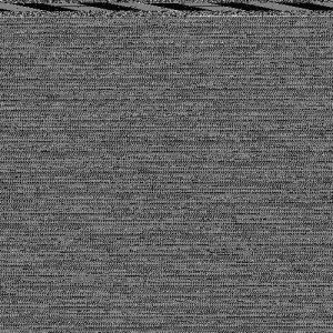
With this image I opened a .jpeg file in TextEditor on my Mac and copied and pasted the jpeg code, effectively creating digital scrambled eggs but without the joy of eating scrambled eggs afterwards. Instead, I was left with this thoroughly glitched image.

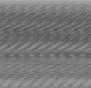
This image was the result of converting a .jpeg file to a .tiff file and opening it in Audacity and adding an echo filter. Different filters resulted in different effects, as you can see with the next two photos, the last of which is slightly more subtle rather than extreme glitchy death metal.

Data Visualisation

Data visualisation is an incredibly useful tool to help us make sense of data.

My day yesterday visualised as a pie chart looks like this:

Yesterday was a bit of an anomaly because I don’t generally spend almost 3 hours in a hospital unless I can’t avoid it, but interestingly there was two big slices of pie, sleeping and working that sandwiched the other smaller activities. If I did this pie chart on a different day, like today, those big slices would become uni and sleeping. If I did a pie chart for every day of the week, I think that the charts would alternate between these two big sets of activities, as those tend to be the dominating parts of my day.

This is a visualisation of my last two academic essays and reflections for this studio. I think it’s pretty clear that the last two essays were cinema essays, as cinema related terms dominate in the world cloud. However, when I only use the media reflections it starts to look very different, with photographic terms taking over:

PB2: A photograph is more than just an image.

Full album here.

A photograph is more than just an image. This statement was partly inspired by the idea put forward by Sean O’Hagan in his article that a photograph is made, and not taken. Photography is more than pointing a camera at something and clicking the shutter, in fact, you can take photos without even using a camera at all – all you need is light and photographic paper. Hubert Damisch also reinforces this idea:

‘Theoretically speaking, photography is nothing more than the process of inscribing… a stable image generated by a ray of light. This definition, we note, neither assumes the the use of a camera nor does it imply that the image obtained is that of an object or scene from the external world.’

He goes on to purport that a photograph does not belong to the natural world; it is a product of human labour. It is also a form of craft, that can be experimented with: in the words of Laszlo Moholy-Nagy, ‘the enemy of the photograph is convention.’ Photography is many things: it can be placed in different contexts, remixed, and made in various different ways, but most importantly it is intrinsically linked with humanity, especially with memory and history. This connection to memory and history is essential to photography (Murray) – so a photograph is more than just an image not only in the different ways a photograph can be produced and contextualised, but also in the way it carries meaning for us. A family photograph is not going to have the same impact on someone who doesn’t know the people in the photo, as it is to someone who knows intimately the people in the photograph. Photographs are always going to be a representation of something, and because of this it is impossible for them to be completely objective. It is invariably going to have some personal element, no matter how minute.

I focused on this connection to memory in my exploration of the statement through the media artifact. I found photos of my mothers family in old photo albums. These photos have a lot of meaning to me because of seeing how different my family was in the 60s, and how they have has developed and changed. Someone else who looks at the photo won’t know any of this, so they won’t feel this connection and the same feelings – aside from maybe sharing my amusement for their gorgeous 60s outfits.

I took the photos, scanned them, and placed the copies in Adobe Photoshop. I then drew over the photo with the Paintbrush tool and a Wacom drawing tablet. Thereby, I created an alternate version of the photograph, which is not quite a drawing and not quite a photograph. This process forced me to look at the photo with a level of scrutiny that one wouldn’t usually use to look at a photo, the colours, the shapes, the tiny details in the subject’s faces and expressions. Whilst my hands and eyes were busy, I also had a lot of time to reflect on the photographs and my family situation, and at one point I even had to stop because I was getting too emotional. 

After making these media artifacts, the meaning of the photographs has changed for me. Especially now, they are more than just images.


Works cited:

  • Damisch, Hubert (1978). ‘Five Notes for a Phenomenology of the Photographic Image.’ October, Vol. 5, pp 70-72.
  • Murray, Susan. (2008, August 1) ‘Digital Images, Photosharing, and Our Shifting Notions of Everyday Aesthetics.’ Journal of Visual Culture, Vol 7, Issue 2.
  • O’Hagan, Sean (2016, July 3). ‘The digital age reshapes our notion of photography. Not everyone is happy…The Observer.
  • Risatti, Howard (2007). ‘A Theory of Craft: Function and Aesthetic Expression’ North Carolina Press, USA.