Category: Interactive Doco Inspiration

Text in Interactive Documentary

This week’s interactive documentary inspiration is Grayson Cooke’s film Live Audio-Visual Performance in Australia. I viewed this film under Seth’s recommendation. He advised that it may inspire us to reconsider not using text in our group K-Film. After viewing the film and observing Cooke’s use of text, here is what I thought…

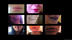
  • Text is used in the preview windows to provide a clue to what the content is about.
  • The bold capital white text on a black background is 1-10 words in length
  • The text may be a vague phrase that the subject mentions in their interview or an unusual word that is said. This means that the user will still be surprised when they watch the clip as they don’t have any visual clues regarding who is going to speak or what it is actually going to be about.
  • This idea is used to encourage the user to choose their next clip based on content rather than visual interest. The user is likely to chose a clip based on a title that intrigues them the most.
  • Text is also used above the main viewer window stating the name of the subject and occasionally a small description of their personality.Screen Shot

If we were to reconsider introducing text into our final K-Film we would need to be extremely careful about the words we select. Our film is all about surprising the viewer with the philosophical words that the subject provides us with in the interview. Many of our clips do not include a personal story along with their advice therefore we believe it would spoil the content if the words summarised the footage the way Cooke employs text. We want our users to select the clip based on the feet that appeals to them the most.

We may still consider adding text to the main viewer window to accompany the footage, but once again we wouldn’t want it to detract from the experience of hearing the words from the subject’s mouth. It would not be consistent if some videos contained text and others didn’t, but some videos are short, sharp and to the point so it may be difficult to add to that, unless we add in something to do with the visuals, maybe where it was filmed or some extra information about the subject.

K-Film Inspiration

The film I selected for this week’s Korsakow inspiration is Hands: Thinking Out Loud. Under Seth’s advice, I viewed this film due to its similarities to my group’s concept.

RED

  • Personal
  • Observant
  • Familiar
  • Artistic

BLACK

  • Volume of music too loud, it competed for my audio attention. I was interested in hearing the noise from the clip in the viewer window.

YELLOW

  • The soft acoustic overarching soundtrack, it connected the whole film, but allowed breathing space while I contemplated the clip that had just finished
  • Combination of the audio from the main viewer window and the previews playing with the soundtrack, made the film crowded and exciting
  • Black and white preview windows, distinguished between the main viewer window
  • The interface design of four boxes, evenly place in the centre of the screen. The consistency of the design would allow an individual who was not familiar with K-Films to adapt to the structure.
  • Relations based on theme
  • Short clip, including audio plays in the preview window
  • The titles

GREEN

  • Lower the volume of the soundtrack so it sits balances out with the audio from the clips.

K-FILM Inspiration

This weeks K-Film inspiration is Fibonacci Korsakow #2 by Matt Soar.

As usual, I will utilising the list and the hats to critique.

RED

  • Personal
  • Poetic
  • Rhythmical
  • Homely

BLACK

  • The background layer that shows the SNU design.
  • The shots that were intended to be static, but included slight movement.
  • The big pauses between each window loading.

YELLOW

  • The way the interface is organised so the preview and display window fits together like a puzzle. This unifies different windows across the film.
  • The repetition of circles
  • The main viewer window and previews all appear at different points in time- this could just be the download speed, but it works to the film’s advantage.
  • The varying quality of the clips. This made the work feel like a collage.
  • Short looped clips. This made the work rhythmic.
  • I liked that this film felt like a work in progress.

GREEN

  • Use a different background window with every fragment. I think the background image could work.
  • Introduce more movement into the clips.

(Linear) K-Film Inspiration

I viewed the K-Film Planet Galata (2010) to benefit from the ways in which Florian Thalhofer and Berke Bas utilised the software. As this is a type of linear film, it doesn’t directly apply to the structure of my major K-Film, but I can still learn from the techniques used. I found the description of ‘linear’ in the film description intriguing.

‘A linear film is a film that is exactly the same every time you look at it. Every scene is glued to each other once and forever. The concept of linear film is the result of technical limitations during pre-computer times’.

Red

  • Insightful
  • Personal

Black:

  • A certain clip took a few minutes to load, which was too long

Yellow:

  • Interchangeable interface
  • Main window positioned on the left and the play head positioned on the right
  • Background music track fading out after the clips play, easing the viewer from the clip back into the interface.
  • The title text on the preview windows in capitals on the top left hand corner
  • The preview windows had a darker exposure, making them less of a focus on the screen
  • There was a soft piano sound that played after I clicked on the next preview window, before the following interface loaded. This formed a pattern of sounds, linking together the clips.
  • Narration and clips of footage of the surrounding areas broke up the talking head single shot interviews, making it visually interesting.
  • Slow Motion preview windows

Green:

  • Some interfaces contained too many preview windows surrounding the main window, making it difficult to focus. Perhaps there could be fewer preview windows in the interfaces.
  • One of the interfaces contained a main window that was the same size as the surrounding preview windows therefore it was almost lost amongst the preview options.

Some more Korsakow Film Inspiration

The 2013 Korsakow film The Making of a King by Nicole Miyahara is the subject of this week’s interactive documentary inspiration. This film follows Drag Kings in LA and what this involves in their lives.

I will be critiquing this film using De Bono’s hats in the structure of lists.

Red

  • New concept (I did not know about before)
  • Raw and honest interviews
  • Intriguing

Black

  • There was not enough content to choose from in the preview windows.
  • The film ended relatively quickly. I felt like there were clips that I missed out on.
  • The preview clips played sound when they were hovered over which overlapped the sound from the main SNU window and was distracting
  • The talking head style interviews that I watched at the beginning were confusing as I had no background into the film (I didn’t read the description until afterward). It seemed as though I had joined in mid-conversation. Once I grasped the idea being explored, they started to make sense. This may not necessarily be a bad thing!
  • Some of the clips were too long and so I lost interest, particularly one clip where a subject was discussing one of her costumes. The beauty of Korsakow is that I was able to change clips by clicking on another preview window.

Yellow

  • Very interesting concept that I knew nothing about previously.
  • Traditional documentary style talking head interviews mixed with other footage of performances made it more engaging.
  • The preview clips only appear and play when the cursor hovers over the right hand side of the main SNU window toward the end of the clip. There is less distraction in this style of interface than in other K-Film interfaces.
  • Obvious distinctions between connections in the film e.g. preparation for the shows, show footage and talking head interviews.

Green

  • The play head was placed in an unusual position within the interface. It looked a little out of place being under the preview windows. I would prefer to see it positioned under the main SNU window.
  • The film ended a little abruptly for me. I would have preferred if there were more links in the film so I was able to explore more of the concept.

K-Film Inspiration

I concentrated on the technical elements of the K-Film I used for this week’s inspiration. I critiqued it by listing my response to De Bono’s hats.

I viewed the 2012 Korsakow film Money and the Greeks by Florian Thalhofer.

Red:

  • Highly developed
  • Overwhelming
  • Depressing content
  • Insightful
  • Observational
  • Cinematic images
  • Melancholy/pensive

Black:

  • There was too much to observe at once. I lost attention on the main window I should have been focusing on and observed the movement in what was surrounding the frame.
  • The preview windows displayed the end of the clip all had the swirly graphic and I could not remember the name of some of the titles, so it felt like more of a lucky dip selecting the next video to view rather than choosing my own adventure.

Yellow:

  • Well constructed clips
  • Numerous subtitle languages
  • Stylish interface design
  • Unique preview window design containing black and white swirl graphic
  • Well edited opening sequence
  • Continuous soundtrack of soft piano after film paused
  • Ratings were an interesting idea
  • Text appears on the preview windows when the cursor hovers over them
  • The preview videos shake and play in slow motion black and white when the cursor hover over them
  • Unique hand written opening credits and ‘full screen’ toggle button
  • Interspersed narrated clips with montage of visuals among the many interviews
  • Eclectic visuals within the clips (such as overlay of images of country side) which gave the film a travel diary/sketch book feel
  • The soundtrack that played through the whole film

Green:

  • I would suggest less content (preview windows) displayed on the interface on the screen while the main window clip is playing.
  • Remove the continuous piano music when the film is paused, as I had to keep pausing to wait for the clips to load.

Inspiration from Student K-Film

The K-film I explored for the essay provided me with some inspirational ideas. I’m looking forward to exploring my own concept for the major K-Film.

I really enjoyed the concept behind the film Life is a MusicalI felt as though I was moving though time and space from someone else’s perspective through the observatory clips. This gave me insight into the detail of sounds provided in everyday life that I overlook. This provoked me to think about my surroundings and the sounds that occur around me, like the clicking of the keys on my keyboard as I type this post. The simplistic idea resonated with me.

I am inspired to create my major K-film based on a concept that surrounds us and is taken for granted. I also like people and find human behaviour fascinating. I think elderly people are particularly interesting. I wonder if I could incorporate these two somehow? Perhaps an old people’s activity that is under appreciated and therefore may be dying out.

These are all just ideas. I thought I better note them down somewhere before I forget.

More K-Film Inspiration

I have been impressed by the student interactive documentary from previous years. I have been able to form my own understanding of their concepts.

I am looking forward to exploring my own concept. Previous filmmaking experiences have taught me that I tend focus heavily on visuals. I realised the importance of continuity to assist the editing process and many other elements that are required when creating fictional narratives. The observatory nature of the clips I create for this K-Film forces me to concentrate on my concept. Although I can still present some aesthetically pleasing images, it is not the purpose therefore I feel this medium is giving me freedom for my previous constraints.

I watched the student film Body of Memories by Erin Rosenberg, Carla Reid, Megan Whytcross from 2012. I am going to adopt the ‘De Bono’s hats’ idea for critiquing other works.

Red Hat: I engaged with the natural and endearing personal stories. 

Black Hat: The difference in quality of the clips.

Yellow Hat: I enjoyed the concept of sharing memories. I love nostalgia.  The design of the layout reminded me of The Brady Bunch opening titles.

Green Hat: The repetitively framed visuals could have contained cutaways of pictures relating to the memories.

Screen Shot 2014-03-31 at 11.35.23 PM

IDoc Exploration

Journey To The End of Coal is a harrowing interactive documentary by Samuel Bollendorff and Abel Ségrétin. Set in China in 2008, the documentary explores individual coal miners who risk their lives trying to provide for their families in a society that looks past the safety of their employees in favour of the demand for coal.

As the participant, I was placed in the position of a freelance journalist investigating the conditions in which the subjects live and work. I witnessed a variety of mines and recounts from workers, including mine accident survivors.

The extremely sophisticated visual design of this IDoc along with the suitably eerie soundtrack worked together to involve me in the story. I was given my position and then presented with an option in the beginning that involved choosing a direction to travel in. The hand held captured footage presented on the train journey presented me with the familiar idea of the waiting involved in travel.

All components were able to be ‘skipped’ over. Each new photograph of a town or subject also provided a general information box in the bottom left hand corner of the screen which contained information such as the name, population, temperature and age (of individual). When interacting with a person from the town, an image of the person engaging in an activity or staring directly into the camera appears on screen. Options for questions to ask the subject appear on the screen. I selected a question and then the audio from the interview was played with an English translation. There were also videos incorporated into the documentary. Some of these were not directly related to working in mines, but rather home-style videos of the people that exist in these polluted, desolate landscapes.

The final interview I encountered with mining survivor was a truly heartbreaking insight into his future. He was compelled to continue working for the mine and also needs to provide for his family and with no money and therefore way to return to his home town, he has no option but to stay. He will not be guaranteed safety in his work knowing there are no unions to prevent these frequent accidents and a government that prioritises their economy.

The closing statement  asked me to reflect on my experiences when I return home, and contemplate how I could solve this problem. At the end I was presented with a map of my journey that allowed me to put my experience in perspective geographically.

This documentary opened my eyes to this dangerous and unstoppable industry by allowing me to feel as though I was engaging with the individuals who were suffering first-hand. The combination of video, photography and sound recordings from interviews hooked me into the unfamiliar environment. I felt sympathy for the workers who have no hope.

I now feel compelled to learn more about this issue. I also feel inspired to create an informative IDoc myself knowing that this unique concept was conveyed simply and effectively through creating simple, yet meaningful connections that I formed myself.

Further Exploration of Interactive Documentary

In an attempt to gain further insight into the medium of interactive documentary, I participated in two (non-Korsakow created) IDocs.

The first was the stylishly produced Type:Rider by Arte Creative that I discovered on Submarine Channel. This game based IDoc educates the viewer on the history of typography. The user travels through the time periods of significance in typography development “starting with the classics from the early Gutenberg bible. Later levels feature newer fonts such as Helvetica (1957) running all the way up to screen fonts” (Byrne 2013).

The IDoc was well executed with its use of graphics, music and design for each level to reveal written information regarding the typography involved in that stage. The game begins with a simplistic tutorial that suited me much more than a written manual. I began to lose interest after a couple of levels as each new stage took a few minutes to download. This sounds as though my attention span was to blame, but I think it was more that the narrative became disjointed whilst waiting for the next stage to load. I think this IDoc is ideal for educational purposes. I also enjoyed the pun in the title.

Type:Rider Instructions

The tutorial in the beginning incorporated stylish graphics.

Type:Rider GameI was playing as the two black dots.

The second was a morbid French production Thanatorama by Ana Maria de Jésus with Upian that I found on the ‘interactive’ tab of Moments of Innovation. The narration begins by explaining to the user that they are the dead central character in the story. The eerie narrative guides the user through the processes involved in their funeral by providing them with questions that require a ‘yes’ or ‘no’ response. This leads them down a unique narrative path.

The IDoc is narrated in French with English subtitles. The photographs that flick through as the events unfold depicted my chosen experience. The images reminded me of an even more glum, realistic and explicit episode of Six Feet Under. I participated in the embalming process which displayed graphic photographs of the process. I found this unique concept amusing and insightful, but also uncomfortable. Perhaps it was the photographs of the deceased lying on the morgue table that made me feel this way. I liked the function of being able to skip ahead to a different stage in the process such as visiting the funeral director. The production values were high and the graphics were also very well produced.

Coffin Factory

The coffin factory.

coffin

Morgue The morgue.

My experiences with these two documentaries has provided me with an understanding of the variation of concepts presented in IDocs as well as the large number of possibilities for presenting them. It will be useful to research Korsakow IDocs more exclusively as it is the software I will be using, but for now it is helpful to understand previously produced concepts created under the IDocs umbrella.