I’m going to be reviewing the student k-film ‘The City Through a Window Pane‘ (2012) using De Bono’s hats.
RED – A very visually interesting piece. There is a lot of variety and it makes me think about all the reasons why I love Melbourne. It’s the kind of activity I do mindlessly but never acknowledge (that being looking at the city through a window pane contemplatively). The entire piece is tied together by the theme of observation.
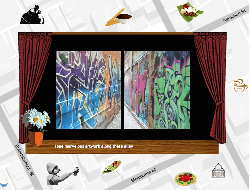
BLACK – The background image of a street map with landmarks and cartoon images is a bit too ‘busy’ for me, and it almost looks amateurish. Some of the clips are too slow to load and I lost interest quickly. Also, some of the clips had too much to look at and I was overwhelmed. I couldn’t find a pattern between which cartoons Korsakow suggests to click through to next. Some are about food or art, whereas others are about culture, or iconic Melbourne landmarks.
YELLOW – I like that the interface has a window pane built into it, however, I’m not sure I like the design of it. I like the continutiy of the text below the fragments, always starting with “I see…”. I like the creativity behind some of the clips, such as the tram clip which shows the same view from night and daytime to illustrate convenience.
GREEN – In a similar way that it uses the start SNU as an introduction to ‘set the story’, I wonder if there was any way that they could have anchored some more ‘narrative’ sections amidst all of the footage to help the viewer learn a little more about the person who is doing all of this ‘looking’ through the window pane. This could make it more personal. The music which is created to suit each clip/mood tries to do this a little too obviously/forcefully for me to enjoy. It hits the viewer over the head instead of being suggestive, which in turn puts constraints on interpretation.
