
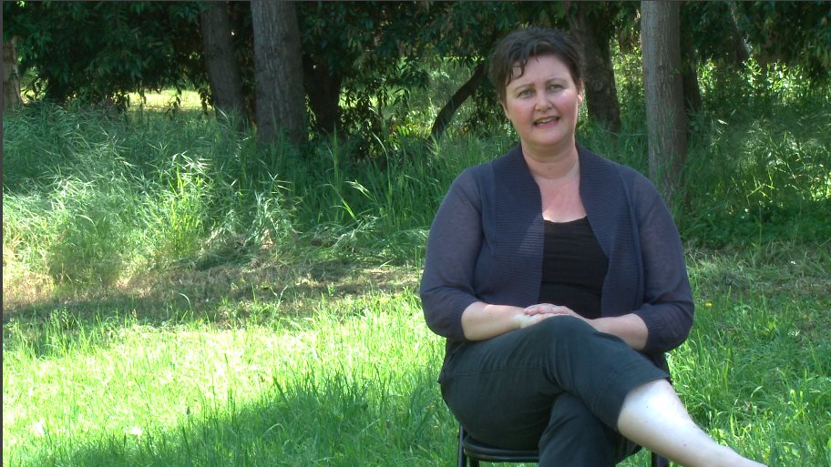
-original image

-input levels remain unchanged
-shadows pulled down slightly to blue-green in order to enrich and emphasize dominant tones in pallette
-mid-tones pulled slightly toward green in order to balance out patches of light bouncing off skin tone
-highlights pulled toward green in order to make pale patches of grass appear vibrant as opposed to washed out
 – input/output levels balanced in order to create truer blacks and whites in palette
-shadows pulled from blue-green to green in order to maintain vibrancy and dynamism of palette while appearing truer to natural tones
– tonal range: blacks turned up, whites turned down
-contrast turned up to 10.0, brightness to -13.0 in order to create a richer sense of colour
-highlights on skin appear slightly unnatural or sickly in both graded shots, unsure how to correct