
I reflect on one class exercise we did titled the abstract image.
- The Abstract Image
Aim: to investigate a place
This exercise involved us directors to choose a certain framing in a specific location we choose to capture. We considered the following:
- Different planes (of focus)
- Texture
- Movement
- Expressive potential of image size, focal length, focus, depth of field, exposure, colour
- Implications of framing – what is in and out of frame
What I learned from this exercise is that I am highly in favour of intimate shots whose subject is usually something around us that is often overlooked. I don’t have the videos we have captured but these photographs could give one the sense of what I mean:
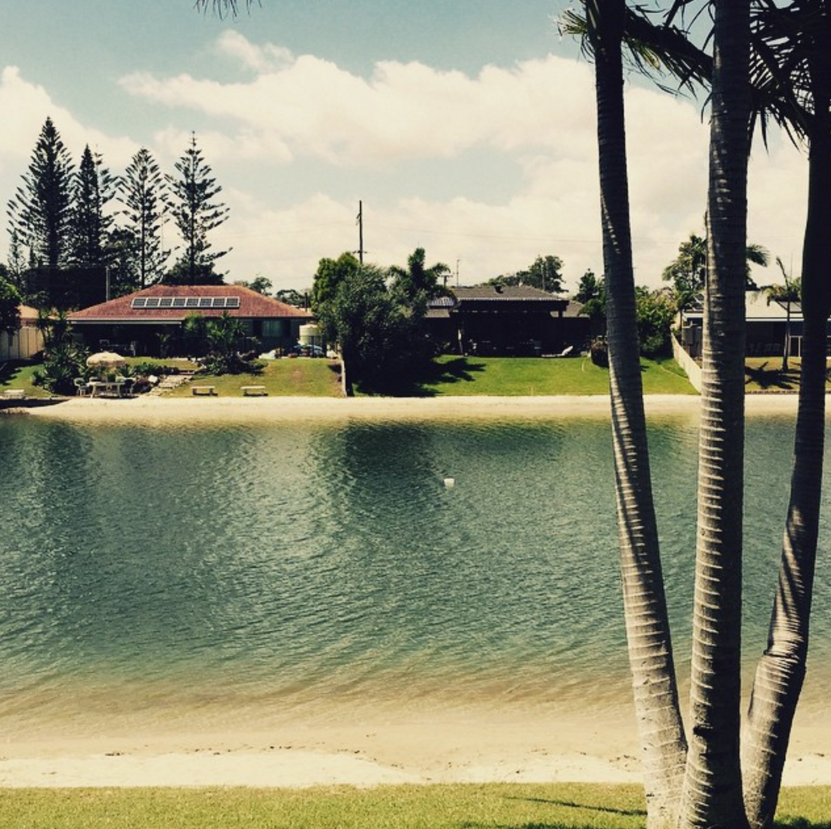
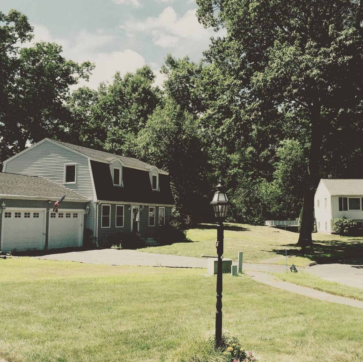 Observing the two images that I took above (not from class exercise), you can see that in the frame are two subjects: the tree and the lamp post. These two images, though taken months apart, convey my decision to frame my shots on a particular object that is not my subject. Of course, I deliberately chose to place these objects in my frame, sort of like I was the set decorator and the Director of Photography at the same time. In the exercises, my cohorts and I did the exact same. The shots are motivated by a certain object in the frame that is not necessarily the subject of the photograph/video.
Why do I do this, you may ask? I think for me, this certain framing implies a sort of closeness to the scene; an artefact that you can almost grasp or hold on to, something to fall back on and easily remember when you are trying to recall this scene. For example, with the photograph on the above, taken in Massachusetts last August, I was struck by this lamppost that punctuated the first time I have been in an American neighbourhood. It was the image, the artefact, the object that struck me upon my arrival and my soaking in of the scene. However, I can’t say the same for the photograph below it. I could have simply taken a photo of the lake of shining waters and left the palm tree out of the frame but then it just wouldn’t be the same. For me, especially, that image wouldn’t be special, would not have captured the essence of that lake and its simplistic grandeur if I had not included the palm tree (no matter how many times I have seen one in my life).
In video, I work the same way. I could roll and allow things to happen, but I can encourage something to happen also. I think reflecting back on this work and after I edit the videos we have captured, I would be able to eventually define my reasons for these shots and how I can utilise them in my creative practice and vision.