With Absentia being an anthology of episodes varying in genre, it was essential that we create an opening sequence that was both visually appealing, yet does not adhere strictly to a specific style.
Here is the unaltered screen grab of the opening sequence’s first shot:
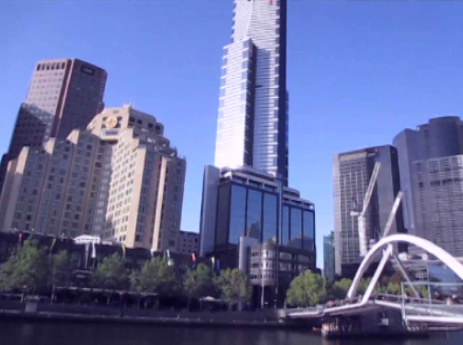
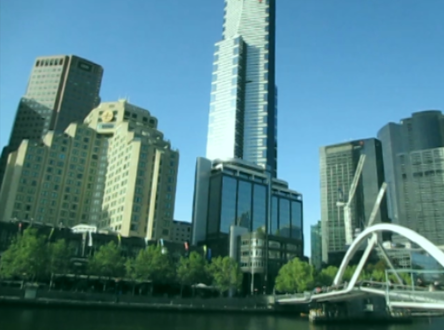
 As per Paul’s instructions, I began to play around with the colour grading techniques on Adobe Premiere. From the Video Effects tab of the Effects window, I used Three Way Colour Corrector to achieve the following effects:
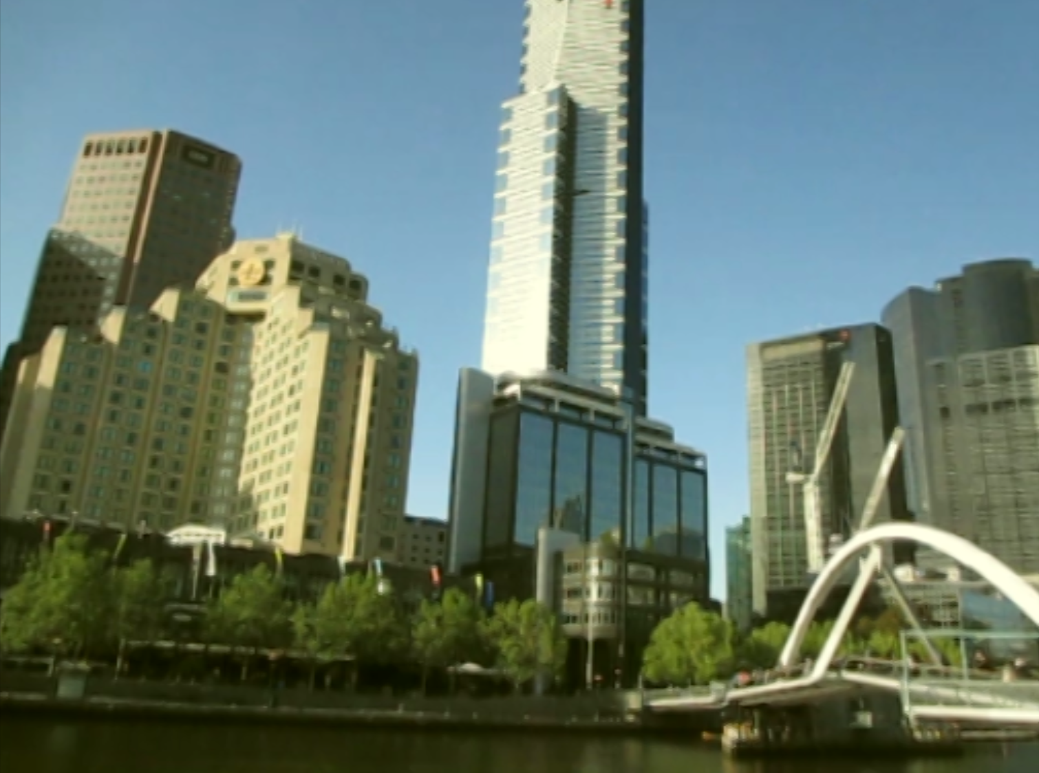
Melbourne in summer. The melancholic motif consistent with the episodes are magnified by the intensity of a hot Melbourne
Playing around with colours to portray summer. How does our eyes see clear skies and a brilliant sunlight? Do skies tend to be more blue?
Perhaps Melbourne in the afternoon is more effective symbolically, as Hitch’s life ends?
The group will continue editing the footage and the final sequence will be uploaded on this blog.