I have attended almost every tutorial and contributed meaningfully to group discussions, particularly within the group for the final project. When I encountered any Korsakow- related issues, I asked peers for help or read the manual the Korsakow site religiously . I kept up with my participation diary and I’m happy with the outcome of my sketch film and essay.
What have I learnt to do better?
I’ve learnt to throw myself into the depths of a software I had never encountered before and figure out its ins and out just by tinkering with the various functions. I’ve encountered ideas surrounding non-linear story telling that I haven’t in any of my other courses and that has provided me with an alternate way of thinking about documentaries.
What could you have learnt to do better?
I could’ve tried to invest more effort in the readings. A few times they seemed vague and dry to me and I haven’t completed them. I could have made more of an effort to attend the lectures and kept up with the media factory homepage as they would’ve concreted my understanding of the course.
After some initial struggle, our group clarified the intention of our Korsakow film.
We will be looking at the opposition of “Loneliness” and “Solitude”. We will do this by interviewing 30 people and interviewing them about their interpretation of the two terms.
When filming, our subjects will be somewhat ‘hidden’ when they speak about Loneliness and ‘revealed’ when they speak about solitude. We hope that the polarities between the two sentiments will surface through our interviews.
It’s already time to get started on our final assessment!
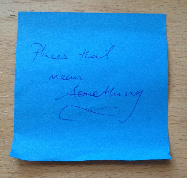
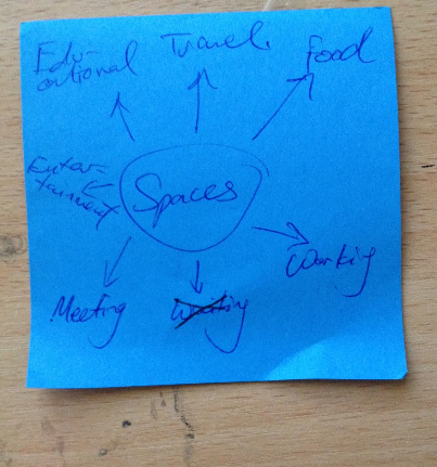
Out of the gazillion post-it notes we used up in class, our group, ‘The One Dollars’ have decided to concentrate on Places & Spaces that mean something and how those places are utilised.
“The Galata bridge in Istanbul is a cosmos of its own. Between shops, restaurants and inrushes of tourists we meet people for who the bridge is home, hope and purpose in life.”
This is a film by a Turkish filmmaker known as Florian Thalhofer. It looks at the Galata bridge in terms of all those affected by its presence in Istanbul.
I’ve been looking for different ways to show the interface for our next k-film and thought the way it was used in Planet Galata worked really well: The main ‘playing’ clip in the middle and the other profiles on either side of it. Everything looks neat, clean and nicely balanced. When you hover over one of the images, a title text for that profile is shown.
Ho. Hum. Another observance, another idea to keep in mind.
It was really interesting to see how other people interpreted the same constraints. I’m not very proficient with Korsakow and it was useful to see what more I could’ve done within the interface.
I had a few technical issues with my aspect ratios as well as compression of my videos. The use of interface space probably probably wasn’t the most efficient either and this was purely because I was struggling to learn the ropes to Korsakow. I’d like to think that knowing what I know now I could do a better job.
The poetic approach to documentary making is often characterised by utilising time and effect to create “an openness of form that facilitates moments of pause and contemplation”. In doing so the intention of the piece becomes greater than simple factual representation.
Frankham speaks about how “de-forming” familiar story shapes can allow for a more poetic approach to documentary. He uses the notion of relationship aesthetic to explain a a de-formed documentary’s generation of critical interaction and enlistment of the audience as co-creators of meaning. He talks about how de-formed poetic structures can break through preconceived ideas or interpretations and allow for new associations to be made in the minds of the audience.
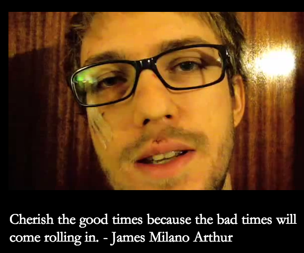
Best Spent is a work organised into nine rotating thumbnails set out in a 3×3 layout that link to a corresponding video. The videos include a piece of text that takes the form of a popular saying or quote (Image1). These help contextualise each clip in their own right as well as provides a link to the work’s overarching theme of Time, the way it could best be spent and the way it is spent.
Image 1.
Some clips reflect the idea of the way time is best spent such as for example the piano playing clip with the text “Practise makes perfect” added. However most of the content seems to refer more to how time comes to be spent rather than how it is best spent. It poses questions about the activities that fill our time: our habits, procrastination, leisure activities, educational obligations, mundane chores, eating habits and set routines.
As an audience and participant the title of “Best spent” places a weight on the proverbial shoulders. It creates a sort of wariness of time, it’s passing and the choices made in filling this constantly passing time. It made me personally conscious of the fact that I was spending time analysing a piece about passing time and made me think (with some concern) about how much time I spend doing what I want versus the time I spend doing what I feel obligated to do.
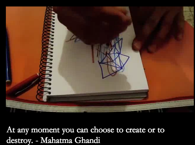
The opening clip’s text and corresponding video is a quote by Gandhi on the choice we all have at any given moment “to create or to destroy” (Image2)
Image 2.
The pattern that follows this is that each clip relates to an obligatory action (perhaps a destruction of ‘time best spent’) or a chosen action (perhaps a creation of ‘time best spent’. The clips shift back and forth from the everyday and mundane activities of doing the washing and brushing teeth to the more animated such as playing games, practicing the keyboard and talking to a friend on the phone. Then there are the “in-between” videos that seem to exist in a suspended time. These are the videos on procrastination and even the ones spoken “to camera” (Image 3), The to-camera pieces have a journaling quality that transports the viewer to the subject’s present—like time travel. I don’t know if that was the intended feel but it was a pleasant one.
Image 3.
The interface is simple and the vast collection of quotes and phrases alongside the stationary 3×3 catalogue of clips contributes to the voluminous feel of the work. Nine stationary thumbnails (from a rotating collection) are available to the audience at all times. The thumbnails and their corresponding clips exists as mini films in their own rights that “tell” their own story of choices and actions undertaken in time. The relates to Ernst’s view that narrative sequences exist as facts in their own right and are interwoven into a contextual reality. The contextual reality here is the nature of spending time and how vast and varied this “spending is”.
The choice to click on the most aesthetically pleasing of the rotating nine thumbnails is always available. This interface helps to develop the pattern of “choice” where the viewer/participant is actively choosing what activity they would like to witness next. This in turn corresponds with the role of choice within the theme of Time. While the use of the quotes helps contextualise each individual clip, not all of the clips include text or a quote. This feels like a downfall in the piece or a break in the pattern. In the absence of a piece of text, some clips seem quite “lost”.
Narration is an interesting element in this piece. There is no set narration or narrator through the entirety of the piece. However a handful of clips do have a speaking character. At times these characters speak absent minded, unaware of the camera and at others, the deliberately speak of the creation of the work itself. The latter seems to create a sense of realness as it forms a relation with the audience directly as they understand and process the spoken words as well as opposed to simply interpreting the quote-clip combination available with most of the other clips. It was these clips that engaged me the most.
The work reads like a list—an informal cataloguing of a day’s activities. Bogost’s view of listing as a practical way of reading and understanding content certainly applies here, especially as the activities listed in the collection of clips are commonplace to the viewers as well as creators. The content has a tone of familiarity to it.
All together, the work reads as a categorical narrative as the information presented is without a point of argument or persuasion. It simply “is”. It is a documentary on how time is spent and it is a simple non-linear narrative that portrays just that.
PATTERN:
– How various content relates to each other
– The connection between content
– The relations that are created
– E.g different perspectives from different people on the same topic
INTERFACE:
– How does “what is there to do” relate to the patterns that emerge?
– What does it allow you to do?
– How does the creator control the user’s experience?
– The interface is where the user-experience occurs.
– Talk about the way the thumbnails are designed.
– Is placement changing or staying put?
CONTENT:
– In actuality- what it is
– What you put into the system of relations
– What is the work “about”? : Place?
– Inside what context is the work situated?
– E.g. strong use of narration?
How do the three combine? How is one used to explore the other?
FORM:
– System of relations
See this for a sample analysis:
http://www.embres.ca/exhibit/process/