Looking at: Bright Splinters
0April 4, 2014 by sharona
The Korsakow piece I looked at was called Bright Splinters, and can be found here.
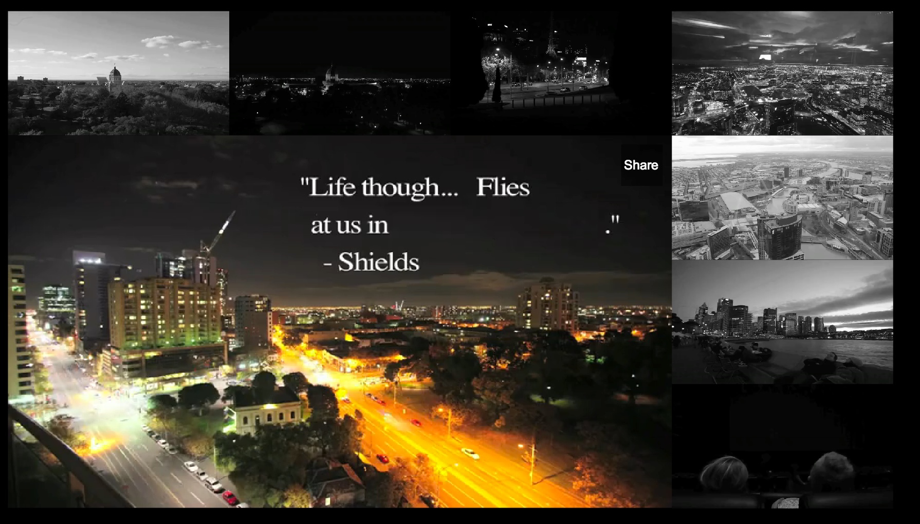
Bright Splinters has patterns in both its content and as an overall Korsakow piece. Within the piece, there was plenty of repetition. Ideas such as the light in darkness, the unpredictability of nature and light, and humanity are clearly present, in some interesting ways. For example, there are several videos of public transport, some with people on them and some without. Another pattern was the imagery of buildings. There are also many clips of people: surrounded by light, interacting in places such as the cinema, on public transport and in cafes. All of this had the common idea of light: from the cinema screen, from artificial lights, headlights and from natural light. As the title says, Bright Splinters is all about bits and pieces. There are splinters, with different parts, colours and movements, sort of like an indie music video or a strange slow-motion film.
Musically, the same instrumental track is heard throughout the piece, giving the entire piece a sense of unity. The only deviation is the start of the k-film, where the music and sound effects link with the text displayed.
The interface of Bright Splinters is fairly simple: the main video box is surrounded above and to the right by several preview windows. However, by having the preview videos in monochrome, there is a clear distinction between what we are watching and the choices available. There are a huge number of clips, and obviously by presenting more clips, more choice is given, which means there are (not quite infinite, but) hundreds and possibly thousands of combinations and possibilities one can view this film in. I’m aware that having so many clips was part of the assignment brief, but I really liked the fact that there were so many options.
I also found that they did not emphasise text at all, preferring instead to let the piece speak for itself. However, there was opening text, which was very profound, and I felt like it was all the explanation Bright Splinters needed. The rest of the k-film was text free.
The simplistic nature of the interface is ultimately very effective as it matches the mood of the pieces: contemplative, natural and flowing. However, I did find it interesting that the creators chose not to have preview thumbnails. While it creates quite a nice effect in that mousing over the previews starts them up, it also means that if you’re running anything less than a perfect internet connection, the interface can be quite laggy. This detracted slightly from the experience.
The interface relates to the patterns in a very organic manner. The depiction of light and people is beautiful, and by having the preview windows in monochrome, the focus is on the main window and the lighting within it.
The individual videos in this film are, as I noted above, contemplative. A lot of them present us with imagery from the city, while water and light, both natural and artificial, also recur. There were perhaps one or two clips that used cuts, which I found a little jarring, as the majority of the clips were just one continuous shot. I felt that the inclusion of jarring editing styles detracted somewhat from the flow of most of the piece. However, the rest of the editing, which mostly consisted of changes in speed, was very well done.
I found Bright Splinters to be an interesting, abstract k-film, with a huge amount of choices in the interface. As it is fairly simple, forgoing many different choices in music or text, it takes on a philosophical bent, where the viewer can determine what to make of it. The lack of narrative in both music and text places the choice in the viewer.
Category Integrated Media, tasks | Tags: assessment, Bright Splinters, case study, Korsakow, video
Leave a Reply