Naomi
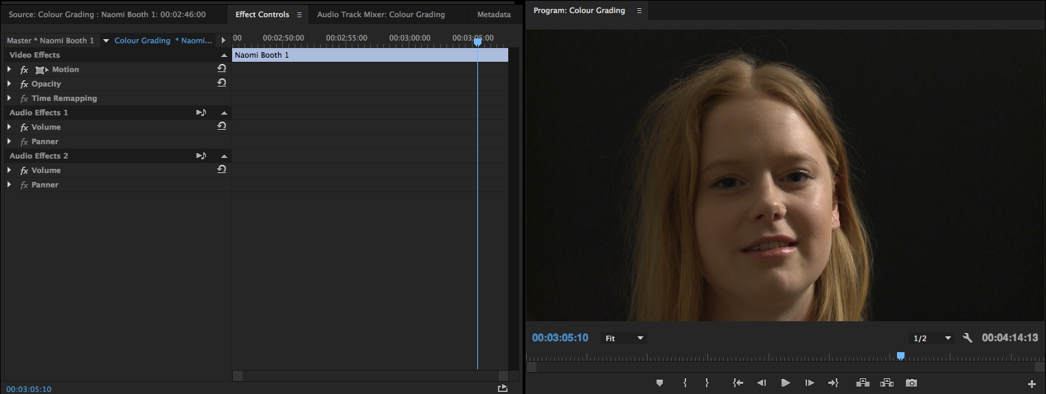
My initial concern for these shots was that the blacks weren’t very rich black. It made it quite easy to tell that the black cardboard I used was incredibly close to the subject and that it wasn’t truly black. Secondly, I find the shot quite yellow in particular because of Naomi’s strawberry blonde hair.
First:

Bumped up the input level, crushing the black, which result in making the subject really pop! I did fiddle around with the tonal range definition slider but I’m not really sure of what that does. The image is still on the warm side but I feel that it’s far more pleasant. Then in an effort to counteract the yellow I added some blue to the highlights.
Second:

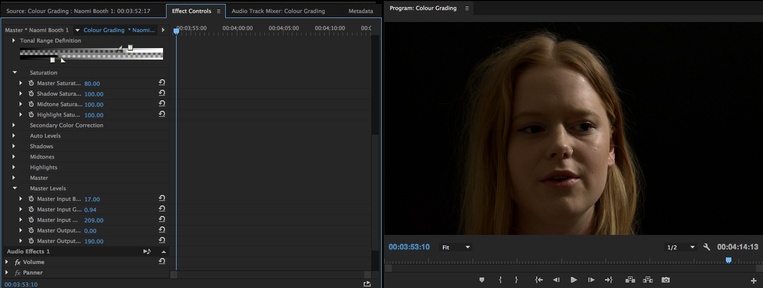
In this grade I wanted to further explore cooling the tone of the image. So in the individual colour wheels for the shadows, midtones and highlights I brought them all closer to the blue side to see if I could counteract the warm hue. I think this image is striking but I find it quite stylised. This in part due to the fact I also played around with the input levels, mainly just to crush the black background. Here though I believe I have pushed it too far resulting in darker shadows around Naomi’s eyes.
Third:
Once again I crushed the blacks as a starting point before further experimentation. This was done to improve the overall look of the image but also that there is a sense of continuity between it and the prior booth interviews I had conducted. For this grade instead of adding blue to the image in an attempt to neutralise its yellow tone, I decided I would play around with desaturating the image. I then also played around with master levels but wasn’t entirely sure what I was doing.
I am most pleased with the second attempt. However, I do feel that it is somewhat too stylised. So I am going to look at more experimentation in an attempt to find a naturalistic look whilst also applying these same attributes to the other interview I had shot that evening. The other interviewee had a darker complexion and hard and I’ll have to fiddle to get the two shots to match.
Bel

I had already experimented with different grades for this particular scene however I thought it might be valuable to look at another shot. In particular I wanted to focus on the stuff I shot in bathroom due to the fact that it’s quite warm.
FIRST

For this grade I used the White balance eyedropper against the wall which seems to have reduced the yellow hue of the image quite a bit.
SECOND
Using that initial end I then when on to manually play around with the Fast Colour corrector seeing what I would be able to do
Using the input levels slider I crushed the blacks and also brought down the midtones. This resulting in something that was a little more brooding, no longer appearing fairly washed out. I experiment with adding more blue on the Hue Balance and Angle Wheel but decided against it.
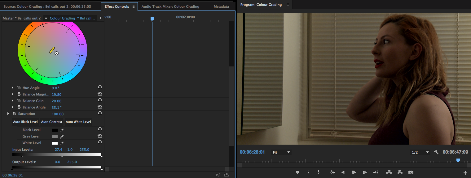
THIRD

For the third colour grade I went back to using the three-way colour corrector just in terms of the freedom that it gives. Plus after just using the Fast colour corrector I wanted to compare results and ascertain which I believe to be easier and provide a better result. On the colour wheels I dragged them all towards blue to neutralise the hue of the clip. As per usual I also crushed the blacks and experimented with reducing the highlights. I found this particular grade less stylised than the previous one but it still appeared a little warm.
FOURTH

Started with setting the white levels to auto and crushing the blacks ever so slightly. I then desaturated the highlights to zero, which I found not to have a massive effect on the image. I finished off this grade by reducing the master saturation down to 70.
BONUS – 70s Filter

I started to muck around with the Lumetri filters and I found the seventies ones quite intriguing. All of them were too stylised for my work. I’m guessing using them is probably frowned upon and they’re ultimately just there for people to compare their own colour correction and for a chuckle. Anyway I applied the 70s one to the clip, found it to be quite yellow so I then used the eye dropper for the white balance and now it kind of looks semi alright. Probably a bit too much for this piece but in terms of other projects it provides it with a bit of a cinematic look.
Leave a Reply