I started working on the visual style on week 9 when everything is finally on set.
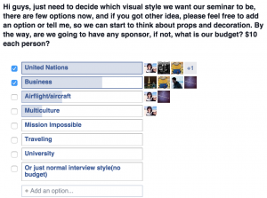
Then we chose United Nations as the key concept of our visual style.
The reason that we chose United Nations as our key concept of the seminar is, getting a job is always a big thing in everyone’s life. And just like United Nations, we are trying to help everyone to escape from this unemployed situation, to improve our skill of getting a job, to know what is out there waiting for us. So our journey starts from here.
We tried to create a international feeling by using different countries’ flags, passport-look brochure and some other elements.
Flags, we use the small flags to decorate the pathway that people walking in. And use some small flags stuck on the food that we prepare.
I also create an opening video and 2 versions of brochure.
I used some footage from a United Nations promotion video, try to create a sense of feeling that we are an international organization like United Nations.
For the brochure, the first version is like what we planned before, a passport-look brochure. But since we can’t print it in high quality paper for everyone, and it looks quite cheap, we give up this idea.
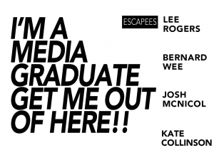
The second version is a contemporary look brochure which has our title on it. I use the typoface Anivers Black, it looks great and simple. After few times modification, we decide to use the second version.
The inside of the brochure.


