What is it about the lighting that appeals to you? Describe it – what do you think the light source is?
I love the heavy red, blue, and yellow lighting because of its high drama and atmosphere. The light include coloured flood LED lights being diffused. There are lights under the pool and additional lights to emphasise the waves’ reflection on the walls – plus some projected effects as well since the waves are consistent with different versions that feature varying sizes and speed of movement.
The yellow/gold bathroom sequence features a spotlight where you can see the light’s round edges on the walls and a tight rectangle light with hard edges.
What is it meant to be in the context of the video/film? (i.e. what the source of the light appears to be in the world of the video, vs how the lighting effect was actually achieved)
The video is set in an indoor swimming centre. Though the lighting in the pool sequences feel more natural because of the blue wash and the wave patterns, the video embraces the theatricality of the lighting.
In moments where a bright/harsh blue light is tightly featured, it appears to be from some sort of “outside world”, as if the harshness of reality is penetrating the hazy world of the pool. A similar effect occurs with the gold bathroom sequences where the lighting is reminiscent of golden sunset/sunrise but is not trying to be super natural.
What effect does the lighting produce in the viewer – how does it make you feel? How does it affect the interpretation of the work? What does it conceal and reveal?
The lighting is crucial to the emotional stakes of the video. Without it, Selena Gomez is just writhing around on the floor of an abandoned public recreational centre. The lighting plays a dual role in concealing the drabness of a pool atmosphere whilst also revealing its dramatic potential, emphasising its eerie vastness and emptiness. It elevates the setting to match the painful lyrics and dramatic tension, offering insight to the character’s psyche. The lighting also highlights Selena’s physicality and sexuality through its placement of brightness and shadow, accentuating curves and flattering shapes/angles.
Look Around You is a BBC show running from 2005-2007. It is a series that satirises educational programs from the 70s and 80s.
Find a piece of video with an interesting soundtrack – describe it carefully and think about how it works with the images.
Is it naturalistic/diegetic/non-diegetic?
The sound is barely naturalistic. It features an excellent synthesised score, building excitement for the potential scientific wonders the viewer might witness. The foley deliberately brings attention to its contrived quality through the sound not being mixed in accordance to spatial relationships. The foley also drops in and out, sometimes objects would be interacting onscreen but without a diegetic sound.
Humorous usage of sound include the finger skate board accompanied by the sound of a car backing up, the disposal of a bunch of items and only hearing one large clank, and the very modern/clear gun sound that is obviously a stock sound.
Is it emotional or unemotional? What is the pace, volume, musicality etc.?
The music builds excitement and wonder through its synths. The narrator’s voice, though not emotional, is definitely energised and expressive to an extent. The sound moves at an engaging pace. The voice’s tone uses a deliberately contrived British accent with exaggerated pronunciations as well as an undulating musicality in his phrasing to mimic those of documentary narrators. The voice, aside from being informative, leads the viewers’ anticipation and excitement.
The music does not have a steady rhythm for the most part, more like incidental music than a song. However the music becomes rhythmic at the climax when the magnet/sulphur relationship is being tested. It is then comically cut off by the narrator when the experiment and excited tension proves futile.
What effect does the soundtrack produce with the images? Watch the same footage without sound and compare the effect.
The soundtrack elevates the image, granting it dignity and value – in fact, it grants it ALL of its value. Without the sound, we notice how poor the quality of the props are and furthermore, how amusing it looks for the hands of grown adults to be playing with these makeshift science tools. Without sound, the very slow deliberation of hands suddenly becomes even more exaggerated and melodramatic. The video’s satire is even more heightened without sound because we notice the awkwardness and disjointedness of physical movement – movements that are only suitable if underscored by an equally camp soundtrack.
Soda_Jerk’s Terror Nullius was an exciting, incisive, epic piece of video art that blasted the Australian media and forced us to think of how cultural cringe intersects with our yet unconfronted violent past with its Indigenous people.
I am still in awe at the sheer volume of media they have amassed and edited for this project.
I am really glad that such a project is screening at a public arts institution and alongside one of its biggest exhibitions as well. I hope that people will see it who do not usually engage with the “left wing” politics and that it will give them a chance to reconsider how “beloved” Australian classics have racist, sexist, and homophobic overtones.
I watched the film with some older creatives and it was interesting to hear them say that they sometimes felt found the speed of cuts overwhelming. Whilst there was definitely a lot going on, many layers of image and sound and text to pay attention to, and that the sense of bombardment is definitely a part of the work’s intentions – it occurred to me that this style of rapid cuts is very much taken from the Youtube age of video creation.
It is exciting to see the humorous and frankly brilliant techniques exemplified by Youtube creators legitimised by being in a gallery space. It’s not a major shift from ACMI’s usual programming but it is still gratifying.
Brooklyn Nine-Nine is a comedy which premiered in 2013 to critical and popular acclaim. It was created by Michael Schur who has created and written some of the most successful comedies of the decade including The Good Place and Parks and Recreation. He cut his teeth written for 6 seasons of Saturday Night Live. The SNL influence and training is clear through the fast-paced and confident pace of the dialogue, almost like a sketch in this opening scene’s form/feel.
There are 27 hard cuts in the opening scene of Episode 3! It was hard to count because they happened so rapidly and we are now so used to it that we don’t notice. The show has a single-camera layout.
The camera work is handheld, shaky, rapid zooms in and out. The camera work gives it an urgent, handmade, mockumentary-like feel.
21:40
21:39 (1 sec)
21:35 (4 secs)
21:33 (2 secs)
21:23 (10 secs)
21:20 (3 secs)
21:17 (3 secs)
21:16 (1 sec)
21:14 (2 secs)
21:12 (2 secs)
21:10 (2 secs)
21:08 (2 secs)
21:07 (1 sec)
21:01 (6 secs)
20:57 (4 secs)
20:55 (2 secs)
20:51 (4 secs)
20:50 (1 sec)
20:48 (2 secs)
20:45 (3 secs)
20:44 (1 sec)
20:43 (1 sec)
20:42 (1 sec)
20:37 (5 secs)
20:34 (2 secs)
With shots that go for more than 3 seconds before each cut, the camera can rapidly zoom and/or pan between characters. It might also be because of a longer line/s of dialogue per character. Shorter shots that go for less than 3 seconds are either quick single-liners, interruptions, or facial reactions.
It is established that the scene is unfolding in real-time. The setting is a busy morning at a police station – and the characters are having a quick personal discussion that may be at threat of being cut off – so the rapid pace appears characteristic.
The cuts are crucial in perfecting the rhythm and pace of the scene’s comedy. In this scene, the viewer receives only two or three moments to “breathe” or even “catch up
(where the shots go for more than 5 seconds). It’s used as a release after the single-second -or-less shots. The cuts build and release tension.
Watch some TV and try to observe and note some of the formal conventions at work- instead of being a passive receiver, I want you to think about how TV is constructed:
What is the news? How is a story constructed?
The news appears to be an hourly notification of what is happening outside the world. What I find most amusing is the changeover between a very serious news story about something violent and then moving on to sports or entertainment. There is a moment between the ending of the horror and beginning of the “lighter” content in which the news reporter tries to be respectful whilst still maintaining ease.
What are the timings, how do they change over a program?
One of two things happen to announce the upcoming show that will replace the news: the anchor will tell viewers what is on, or a lower third will advertise the the “Up next” show.
The program changeovers are very smooth, with the next show always being advertised in the last 15 minutes of the previous show. It is almost eerie that we always know what it on next , that we are constantly being told to stay and watch so frankly.
How do the images and words interrelate?
The text that appears on screen are minimalistic key words that emphasise certain qualities or summarise a story. Much of the detail in the news is delivered through sound/speech. The accompanying visuals can be quite varied and are not always the best. If they cannot get quality footage of the action, they use images of people from social media or images of the setting (those usually appear innocent without context).
Are there invisible conventions that you take for granted, that you may not have noticed before?
The announcing of the next show and the effect that has on the viewer. I haven’t watched television in a while and sometimes found it difficult to peel away from the television.
When we finish a show on Netflix or something, we have to choose the next thing we watch and if we cannot think of anything suitable enough, we stop. With television, because the next option is presented, there is a weird moment where we would stay to watch a show we would only moderately enjoy just because it’s playing. That is similar to the Youtube autoplay that now happens, making it much harder to end your viewing session. Of course that is all related to networks’ objectives of making us watch as much advertising as possible so they can gain capital.
It was a really joyous and rewarding experience to be able to work on A with Aria, Niki, and Maddy.
Being clear about the ultimate goal of the film; aesthetically, thematically, emotionally was crucial to being able to work smoothly. It was also important to spend a bit of time after filming/editing/planning sessions to casually hang out. I felt those times made our patience and communication during work times to be better. Believing in each other’s work throughout the process was important, as we often encouraged and inspired each other to be proud of our work.
Figuring out the character and film’s arc was the process that required the most discussion and compromise. The flavor of the narrative required thorough discussion and brainstorming as we all had different understandings of how the final piece would play out. Personally, I wasn’t sure about portraying some of the specific themes of abuse but being open to the team’s interests as well as sticking to my own guns about what should/shouldn’t be visually portrayed on screen was a great example of creative compromise between all parties.
This was the most collaborative screen project that I’ve taken part in so far and it has made me so much less nervous about that very crucial element of filmmaking. I’m really proud of our final project. We balanced collaboration and independent working which culminated in an ultimately unified final project that embraced the multifaceted elements of stories and ourselves.
The sound throughout this scene is quite natural and minimal. There are sound effects of the computer program’s generic intro music then the sound of the mail being sorted – a soft tap/brush very typical of computer sound effect, almost wouldn’t notice it were there but it gives the whole thing more body. Atmos was a hollow sound evocative of the location, apartment high up in the city on a quiet evening. Sounds like a deep but quiet air conditioner. A constant and even sound.
The most prominent would be the music at the end during the final wide shot and slow zoom out. The score was surely influenced by sparse computer app sound effects but with tender chords playing under it. It also suggests that the character probably spends the rest of the evening getting to know the program, like time ticking and going forward.
Shot construction
The medium shot of Theodore and the computer has Theodore and the computer sharing halves of the frame relatively evenly. Shot like a conversation between two people. The shots really embrace the blurred out speckles of light in the background, lending it a magical yet metropolitan atmosphere.
The first third of the scene only shows Theodore being shot from his left side. The shots are comfortable and casual, much like the mood and conversation between he and the male OS voice. During the installation of the program, the music swells and we see Theodore shot from a completely new angle on the right side. He leans in – capturing his interest being piqued and the scene entering a new mood. The rest of the scene never sees a frame shot from the previous side. There is Before Samantha and After Samantha and once the program has installed, there might be no going back to his old lonely life.
The first time Samantha speaks, the frame is completely dominated by the computer screen. It’s an obvious and expected shot but one that underlines the fact that the Samantha character is a computer. It also ensures that the significance of her presence is acknowledged.
We notice the depth of his apartment through the touches of light behind him. The final shot reveals the rest of his side of the room. He’s right in the middle of two very different sides – the sparse/laid back/acceptably messy shelf with art and books on the floor vs the deep and shadowed opposite side peeking into a room. Not many things can be clearly seen from the lighting but it does so in a warm rather than sinister way. It plays with perception just as the film plays with how much and how little is revealed about people’s private thoughts/lives away from the public eye.
Camera movement
The scene was mostly shot hand held – there are some very slight movements of the camera in the stationary shots as well as the numerous shots following Theodore. In those shots, the actor leads and the camera moves a moment afterwards to follow. The camera acts like an interested and even loving eye who follows the character’s movements rather than both of them moving together in an automated fashion.
There is a slow zoom on the computer screen whilst the program is loading. It cuts twice between that and a stationary shot on Theodore waiting. There is a tension between the camera building tension for the program and the lack of excitement in Theo’s literal physical world. For about the first 30 seconds of their first interaction, the camera does not move at all, instead placing all the attention on Theo’s incredulous reactions. I enjoy the simplicity of letting the absurdity try to make sense of itself.
The camera then moves to gently follow Theo leaning backwards and forwards.
The final shot is a slow zoom out of Theo’s half of the room. That movement sets up a sense of a brand new truth in the logic/narrative of the film. There is also the audience’s reminder of the rest of the world that still exits. The focus of the scene so far had been on the beginnings of their odd relationship, one that might easily become its own absorbing world…but we then wonder how it can be contextualized with the rest of reality.
Production design
The colour of the room/his shirt/the OS program held against the rest of the cityscape evokes how that tale is very much a part of the world.
The room is warmly though darkly lit and designed with quite warm colors. Lamps play a major part in the scene with 5 visible lamps throughout the scene and the obscured backgrounds also lit in ways suggestive of a lamp. It’s actually very romantic and moody, a tenderly lit scene between the two major characters meeting for the first time.
Theo’s things on the table are arranged in a quite laid back, slightly messy manner that appears very natural. There are papers and envelopes scattered on the desk that suggest a likability to him.
Performance
Joaquin Phoenix is easy to watch and a little goofy looking which lends him that likable lonely soul vibes.
Scarlett Johansson’s husky voice is friendly, charming, and pleasant to listen to.
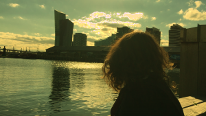
The bold and bright blues are very striking in this sequence of clips. What I’m most obsessed with, however, is how the sun is being reflected in the water – the sparkles, the glints in the many ripples. There is also the inverted reflections of the buildings/bridge in the water. It is as if a completely different version of our world exists right under our noses. The play between what is physically present and what we can also see is so interesting, the relationship between what we perceive and what is true.
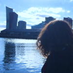
The ordering of the first two clips also stuns me. The establishing wide shot of Docklands appears so vast with its tall buildings and prominent sea presence – then it is followed by the shot of Maddy, a character existing in this overwhelming space. I just love that sudden contrast of senses, as well as the third shot featuring people’s silhouettes; like an alternate cityscape but with people.
2
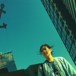
I love these angled shots. It’s just an interesting perspective (literally) to view the world from and it instantly lends us the sense of a skewed reality. The first shot I have always been obsessed with but slowing it down just increases to its drama and it’s so satisfying to see the wind blow her hair so slowly. It’s as if she’s on the verge of something huge, a realization or an action that will propel her life forward. The strangeness of the giant anchor is also so constructed in the best way possible with a large portion of the frame reserved for it.
The second shot frustrates me because of the amount of blank black space and because the character is not in frame for so long. I wish I had directed Aria to walk from a direction that enabled me to film her beginning her walk from the bottom right hand corner of the frame. Still, I love how the sun glints off on the rippled buildings. There’s also a building reflected very clearly on the side of the featured building which again asks the viewer to question what they are perceiving on the screen.
3
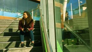
Though I love the reflection on the left hand side, I wish I had focused on it even more and found a way to have the rail down the middle of the frame as now there is not only a lack of symmetry but some dead space on the right with just the wooden stairs. It makes the eye have to work a little harder to focus on the character which is not what I wanted.
I love the slow motion wind blowing through hair in the first two shots. There’s something quite pleasant about it – I think I just enjoy seeing the natural motions and movement patterns of hair. The sun changing Maddy’s hair colour in the second shot is especially delightful – I love the ombre it creates and seeing the body/shape of the curls. There’s a dreamy quality to it, especially since the character is completely unaware of its happening in that moment.
The hand movements in the first two clips also end up sharing this lovely relationship in terms of space and momentum. I wish I had cut the first clip sooner though so that the movement in both never comes to a completely halt at any point, almost becoming a unified continuation of movement.
I listened to this song a lot when trying to create bits of writing to inspire me. I love its discussion of what it could mean to feel like a human woman. There’s a sensibility in the writing which I found myself quite receptive to – there was a real wondering of what human-ness means, what it implied, the pain it is associated with. The mood of the song, the electronic sounds also fit into the strange alternate future we wanted to depict. There’s a section in the middle where the speed and pitch are altered to sound like time has been suspended – I wonder what playing with time and sound in my clip would be like, exploring disjoint between the two and its effects.
~
Some bits of character writing to develop A:
I think I’d like coffee if I could taste it. I’d be one of those addicts – alive and shaking and constantly on edge. What I’d give for truly human headache that come from inside my skull instead of at it.
Reflections are created when light bounces off an object. The light hits a thing, and we see what we see. The only difference between a red sky and a blue sky is time. A race of wavelengths. The sky is actually every colour. The sky isn’t just blue but blue is what the naked eye can see. You see, our eyes are limited by nature. It’s all nothing and exactly at it seems. Everything we’re sure of is an optical illusion of what’ actually in front of us. If an object does not emit its own light, it must reflect light in order to be seen.
Perception vs reality
Expectations
Objectivity
Darkness, hope.
REFLECTION:
I wanted to explore A’s senses with the coffee stuff; her physical pains, her perceptions on taste (or lack thereof), her past experiences of trauma.
There’s also the observations on the behaviour of people and its relation to the logic/science of perception. I was just brainstorming and playing with some key words with double meanings e.g. dark/light. In terms of the style of it, I quite like how scientific it sounds. There’s minimal narrative and emotion in the language but the subtext is loaded with implications of the discriminatory society, A’s desperation for a better world, and the resignation that this is how things are.
~
After 1
After 2
Reflection on aesthetic after doing test shots:
Haven’t worked with more futuristic looks before. Admittedly didn’t even have a particular interest in it prior to the project.
Taking the test shots at Docklands and RMIT really inspired me. I feel like I developed a new liking to that look and am not very excited to be working with that aesthetic.
Lines, symmetry, and geometricity are what has stood out to me during this day of filming. I love the depth and interesting shapes it created within the frame – the attention its uniqueness demands, its striking quality.
The images of these young women existing within those shapes also indicate a vibe of being overwhelmed, being one person in a big world/city, the private moments in the public space, humans existing within heavily constructed surrounds.
I tried to stick closely to the 30 second-1 minute rule and I quite enjoyed those time constraints, not getting too hung up on the look or mood of it. I learned to embrace dragging the toggles to the extreme ends of the spectrum to achieve completely different looks. The “extremes” would often not look outlandish at all and so some of the results look quite fresh and interesting.
I’m a big fan of playing with tinting to achieve very stylized looks. I found a new liking to the colour green during the exercise – I usually lean towards warmer colours like orange or yellow but I now find something very fresh and interesting about green. E.g. The After 1s of the first two rows. Perhaps it’s just a mood I’m not used to? There’s a tension in the colour green that is very distinct, like an impending doom or a dystopian kind of setting.
When looking at the Before and its subsequent Afters, I loved speculating on what possible “genre” or type of movie those screen grabs might come from. That game itself was a fun exercise on colour/narrative association.