Alarm Clock
Original:
Darkened image to get rid of bright spots, lowered saturation to reduce the blur of the numbers:
Altered colours to try and make the shot more interesting (contrast between blue/yellow). High contrast to show this:
Lowered saturation (again, to better show the numbers), darkened the image and tinted it yellow. This is my favourite. At first I thought the colours were too extreme/the image looked to fake, but I like how the yellow seems to smooth out the image and how although there’s low saturation, everything stands out as it need to. I also feel like the yellow colour gives it a more treated/cinematic film look, but that could just be me!
Sam Standing
Original:
Darkened image to make blacks look black, lowered the saturation and made the shot slightly yellow. I like this, because I think that the colour grading has made the lighting in the room look more natural, even thought it’s quite bright.
For this one all I did was make the image slightly blue (to see the difference from yellow), however I think it looks as though I just raised the saturation, which was actually not altered at all. I did darken the blacks though, so perhaps this is what gives the image that look:
This time I did alter the saturation, just to see the difference, and I think it looks a bit off. There’s just too much colour in a room that looks darkened (closed blinds). I prefer the first correction.
Silhouetting
Original:
My main concern for this shot was getting rid of the bricks in the background so that I could layer another shot lit the same way overtop (with the person positioned to the right), and the darkness would cover the split in the screen. Therefore, to begin with all I did was darken the shadows: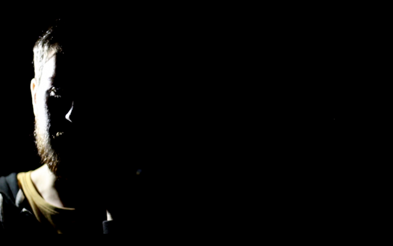
After that I also heightened the saturation, and I think it looks really good when you take into consideration the colour of the shirt. This is my favourite:
I then tried altering the colour, making highlights yellow and shadows blue. The saturation is also high. I thought this might give the light an interesting look, but I don’t really like the end result.