These are some brief reflective notes on how I went about designing the interface for the k-film note commentaries that I made.

Figure One. First Interface.
Here the thumbnails are jpegs, that are black, with the text centred in each one. The background of the project is black. The text on all iswhite but the grey ones are at 25% opacity (done in Photoshop) and I added it in a template and did an export so I could see how they looked. I prefer the grey to the white, their more discrete, less in your face. You can still see what they say but they are quiet in relation to the material because they don’t have to be big. I used text rather than an image because they are pretty plain screencasts and the key here is not the visual component but the subject matter of each of the tracks. What I didn’t like was that with black thumbnails on black they all ‘bled’ into each other – is it four thumbnails or one long one? At this point the video was also centred. The thumbnails do not align well with the video but the black on black did a good job of hiding this.

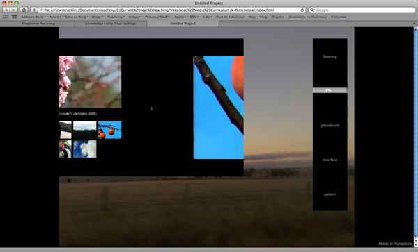
Figure Two. First Application of an Image Background.
So, I moved the video rather radically so that its left edge aligned with the edge of the project space. This gave more room to the thumbnails, as well as adding space around the whole project. I wanted the edge of the video not to bleed in to the background of the project (I did not want the black on black effect) so thought I would change the background colour of the project to achieve this. I added a photo as a background to the project, which is the same size as the stage as defined in Korsakow. I think this gives the work more visual texture and depth, and all the thumbnails now have grey text. The problem of the thumbnails all being joined up is a problem, as before, since you can’t tell if there are several thumbnails availble to click or one. Also the videos are long, and there is no information available to indicate this.

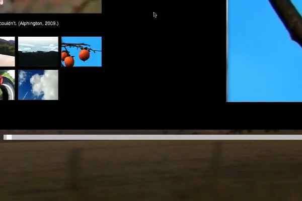
Figure Three. Playhead Element Added.
A playhead element was added, under the video window. This helps solve the problem of letting the user know how long the video lasts for, and how much longer they have (adding some text that indicated length would also do this). However, the playhead is at the default size of 10 pixels which for me is just too big, so…

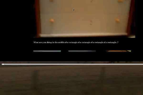
Figure Four. Playhead Modified.
I made it 5 pixels high, and the playhead itself (the white square) 5 pixels square. I made the bar light grey and the playhead white, keeping it reasonably discrete.

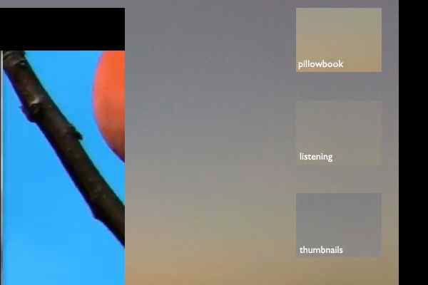
Figure Five. New Thumbnails (Version Three).
Finally, I redid the thumbnails but this does not show a fraction of the work involved. First of all I cropped out of the background image the thumbnails (so the background now had empty white squares), and then I tried to use the interface editor in Korsakow to have the same thumbnail appear in the same location on the interface (this is the Preview – Fixed Link thumbnail element) but it turns out this doesn’t actually work. The thumbnails appear anywhere in the live project, so after spending a lot of time cutting out the right spot (they have to be pixel perfect to match the interface) they didn’t work. The idea was to have the backgrounds for each thumb match the image, so it looked like they were sitting ‘in’ the background. So, instead, I kept the backgrounds, but the effect, while still pretty interesting and visually cohesive, lost some of what I was aiming for.
In addition, they all got resized (from scratch) so that they aligned properly with the video, while one hangs below the video pane itself, their dimensions work so that 4 equals the height of the video and I can keep the same size and distance going down for the fifth without breaking the visual solidity that this grid provides.
How long did this interface take to build, test, change, test, and so on? Four hours. What remains to be done? Mainly changing the background from black to white. I played in the CSS files for the site but appeared to fail spectacularly in managing to change the default background colour of the entire page (as opposed to just the project space).