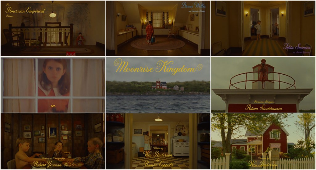
Time to look at the illustrious style of Wes Anderson and Robert Yeoman.
These guys are brilliant because their visuals are so different from what contemporary audiences are used to seeing in films. They opt for geometric, clean, exaggerated shots. Everything is always perfectly symmetrical and meticulously paced. Fantastical visuals arise from their theatrical camerawork. The camera kind of identifies a stage for the action and somehow keeps us at a distance from that stage. In other words, we don’t completely enter the world, but are always observing it; we are watching a spectacle. This is unlike so many modern movies which aim to pull us right into the film/story world.
Anderson in fact remarks that his work is a lot “like the theatre”. But this is in terms of more than just recreating the stage-like separation. His long-takes let us see the actors’ performances play through in real time, building a kind of “tension” and “excitement”, which is intensified when we get to watch the actors do something difficult in the shot / there’s some sort of challenging blocking.
I have always wanted to work in the theatre, but I’ve never actually done it… But I’ve had many plays in my films… Theatre is a part of my movie work.
What makes Anderson’s visuals so unique is that he often goes for a “storybook illustrated 2D look: flat” (which can also be likened to the stage/theatre look). Everything is whimsically square and flat and colourful to generate this desired “storybook feeling”.

Some distinctive Anderson-Yeoman camerawork (that I’ve noticed from the few films I’ve seen) includes:
- Front-on symmetrical shots of characters (in terms of shot / reverse shot)
- Bird’s eye angle
- 90 or 180 degree pans – each frame landing on a square/symmetrical picture
- Directly linear / straight-line tracking shots – especially those following an action.
Flat and square shots, meticulous devotion to composition, well lit, usually maintaining deep focus.
(more of that last scene: https://www.youtube.com/watch?v=eqm5UUEGl9Y)
Although I’m not as large of a Wes Anderson fan as a lot of film students I know, I always seem to find myself – when I’m thinking of my own film ideas – drawn to the theatrical style that’s so characteristic of his work. I actually wasn’t familiar with his work until three or so years ago (bad film student, I know). The production design is always extraordinary, as is the cinematography and the kooky characters / eccentric acting performances. Every shot always looks like it was made with meticulous attention to detail. And his films sometimes have a musical-theatre kind of pacing. Moving to a beat. His work could almost be likened to Baz Luhrmann’s in this regard.


I can definitely grasp this storybook feel. And stage play feel. It’s incredibly creative. But it’s not quite my taste in viewing and I can’t quite put my finger on why – because I do like the style, there’s just something about it that doesn’t quite align with me. It might be the flatness? I don’t know. At the same time, I haven’t seen enough Wes Anderson films to make a judgement. (And, anyway, what could happen is that my taste will change in a couple of years and I’ll idolise his films.) Anderson is fantastic and absurdly talented though. What is strange is that this style – which isn’t quite my taste in viewing – is one of my tastes in making. I often imagine my film ideas to have this sort of look.