Integrated Media Assessment 1 – FILM ESSAY
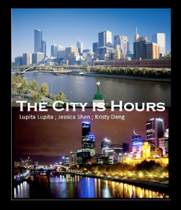
So when I ventured into choosing a K-Film I left it up to chance. I was given “The City is Hours…” from 2012 made by 3 students Lupita Lupita, Kristy Deng and Jessica Shen.
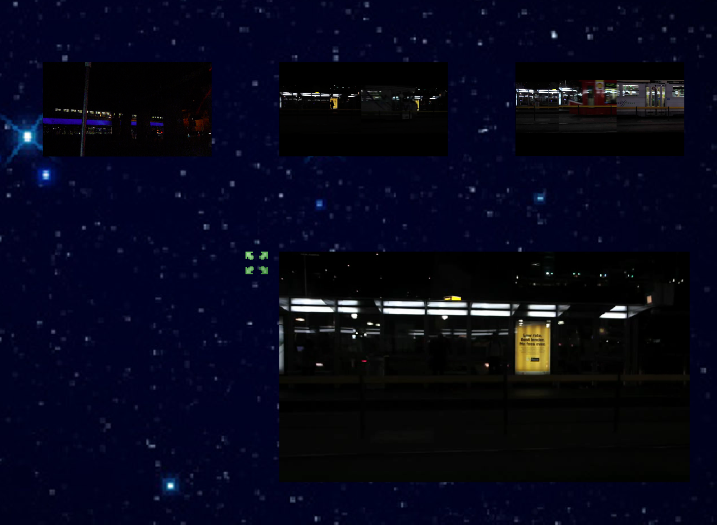
INTERFACEThe interface opened with a title card in which it established the theme, albeit indirectly. The starting page was laid out evenly, the background was black and each composition piece was finely cropped (save for a line about 15 pxls long and one pixel wide). This particular page had me interested, it looked polished and the two thumbnails used to direct to either day or night were seemingly pulled from the same illustration or at least the same artist which boosted its sense of consistency and balance. The very first thing I noticed was when I clicked passed the title card I was greeted with a window eclipsing 4/5ths of my screen and this message: “[IOErrorEvent type=”ioError” bubbles=false cancelable=false eventPhase=2 text=”Error #2032″]”. I’m not sure if that is a fault in my computer or in the creation of this. I’m running it on Chrome and my computer is quite powerful. Just thought I’d make a mention of this but it didn’t really impact on my experience, although it happened when I went to certain videos. The first of the two possible strands I visited was the “night time view” and instantly my attention was drawn to the aspect ratio of the K-Film. It was in 4:3, the incredibly low-res background image of the night sky ended where black emptyness would resume until the end of my screen. I felt this to be a little jarring and especially coming from the opening screen. The interface is quite simple, the SNU you are viewing is shown in large on the bottom half of the screen while there are three other options left to right evenly spaced and all in line. Consistently throughout for both night time and day time. Day time follows the same procedure only the larger video is now on top with the three down the bottom. Other inconsistencies include lack of description on some videos, some videos having playback on hover while most others don’t.

CONTENT…
The over-arching theme for the K-Film is apparent from the get-go. The piece opens with a low-res still image title card. The text is the obvious title of the piece with the names of the creators. On the top half, a skyline shot of Melbourne during the day and on the bottom, a juxtaposing shot of a night time Melbourne skyline. Clicking passed it greets you with the opening fork. The video that plays on loop in the middle is a compilation of some of the SNUs in the K-film, prefaced with a white title on a black background and accompanied by a relaxed piano track. The night time view of the K-film contains just that, shots taken at night, which is one of the two major clusters, the other pretty obviously being day time shots. Every shot in this is taken in Melbourne. Other clusters include: trams, nature, transport, cafes/restaurants, notable buildings. Overall the content is pretty dry with no real undercurrent meanings or subtle messages. It is clear the three authors of the film had their own artistic direction when it came to making and filming SNUs. The three notable styles of film are:

Stationary/Still single take

Fast forward/slow motion edit.

Splitscreen/parallel editing
PATTERN…
First of all the obvious sense of pattern is in the opening page and that night time and day time are separate sections, mutually exclusive (kind of, but we’ll get to that later). The links between the videos in the night time video are all consistent, SNUs in night time link out to other night time videos. Clusters don’t take form or are seemingly inconsequential as only 3 videos are able to be selected. The only odd link in the night time view of the K-film is the lantern video. While every other video holds up to the base interface of main video, three other videos above, this one loses the background image and has a direct link back to the main page. The daytime links are a little more complicated. As far as consistency goes, the links don’t hold up as well in the day time view. There are often times where there will be a link to a night time video on a day time video which can be super jarring and cumbersome, although the links are placed on videos such as “day to night on the Yarra River”. There is also a lack of a video that links directly out into the homepage like the lantern one.

MEANINGS AND OVERALL THOUGHTS…
The meaning is obvious. It’s in the title, its in the title card before the K-Film even starts and it’s in the intro. This is a film about Melbourne as a city during the day and during the night. The juxtaposition is a semi-major theme in itself and it shows in the interface/composition. Although subtle, the initial split between the two photos in the title card say a lot. The title may also suggest that there are hours passing in between the shots of the film (not stated though this isn’t a narrative). Other interfacial choices contribute to the meaning as the authors have placed their content in specific positions. The night time view with the main video on the bottom, link outs above and the day time view with the main video on top, link outs on the bottom. This can also represent the sun, perhaps? High in the sky during the day and set below the horizon at night. Pattern and content go hand in hand with daytime SNUs linking to (mostly) daytime SNUs, nighttime SNUs linking to nighttime SNUs. Although the authors have create segregation it seem apparent that maybe they were going for a bouncing around type deal. What triggers this is obviously the nighttime SNUs linked in the daytime ones, also the lantern SNU that links back to the main page being an option on the very first nighttime SNU. Another angle we can take is that maybe the authors made assumptions about the audience and that they would instinctively click on the day time view due to it being on the left. I personally went with nighttime first which is why I thought the inconsistencies in the day time view with the pattern raised so much attention with me. Other notable patterns are that SNU content nine times out of ten linked to another SNU with similar content, for example, a tram SNU would always have at least one other tram link. The other two may or may not have been a tram but there was always another tram link. Broader patterns also arose. I noticed that the daytime shots had stronger emphasis on the lives of others and public spaces full of people while night time had stronger emphasis on transport, stoic areas. This could allude to the conventional attitude of humans as they are active during the day and either getting home or in their homes at night.

My overall thoughts were pretty cynical. I could see there was a great deal of edited and fancier shots for the daytime view. It seems a lot more effort was put into that than the variety of shots in the night time view. Other than that I feel like time was a major constraint for these guys, lack of SNU descriptions, clunky links, lack of thumbnail playback and thumbnails only being the very first frame of the video. I personally do not believe that deeper artistic thought was placed into the piece. It’s just a clean piece with a giant overarching theme and safe links.