From the Wk 12 presentation we gathered a variety of feedback from our fellow peers and tutor, that allowed us to rethink out interface designs and concepts that we wish to portray. Overall, everyone was happy with what we have achieved and thought that our ideas and research is shown throughout the k-film, through the personalised structure and the interface design. The main points from the feedback was to keep the interface clear and simple. The snu’s need to be larger, along with the previews because there is too much negative space surrounding the screen.
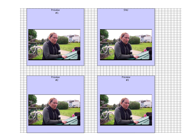
We need to find a way to have the selected snu stand out from the previews, so that the viewer knows where to look. The group suggested that we use text to guide the user – however we decided not to do this, as we didn’t want the text to influence where the user clicks next.
A couple of questions that were raised was:
1. Do we want sound over the previews? The class was debating about this issue, because the snu’s and the previews in our work all seem to look the same, which can become confusing for the user. The class suggested having no sound, while others said that we need sound to show the user what is to come. If there is no sound, the user won’t know what is in the videos.
2. Do we want the previews shown at the same time as the snu is playing? This, again, comes from the granules all looking the same, and something that we came up to possibly fix this issue would to have the previews appear 5-10 secs after the user clicks on the desired clip.
And to finish off the group said – the user can just watch the videos without clicking in the next one – how can we change this? Is it a positive or a negative?