
I don’t use much of color grading, just fix the brightness and contrast of my projects. So just for the sake of this exercise I did different color grading. It’s fun to play around colors and gave a different meaning to it.
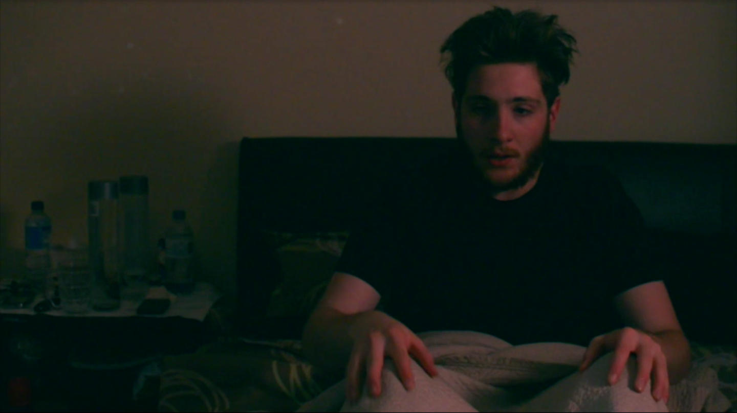
Here is the original snapshot from the clip:

This is the first grade:

I changed it to a bit cold tone to give a bit spooky feeling. I think this justifies with the screengrab. Mitch has expressions of fear so cold tone suits it.
This is the second grab:
For this, I made the highlights a bit blue and shadows a bit green just to have the both warmness and coldness to it. But I don’t think this is suiting my screen grab. I was just experimenting.
This is the third grab:
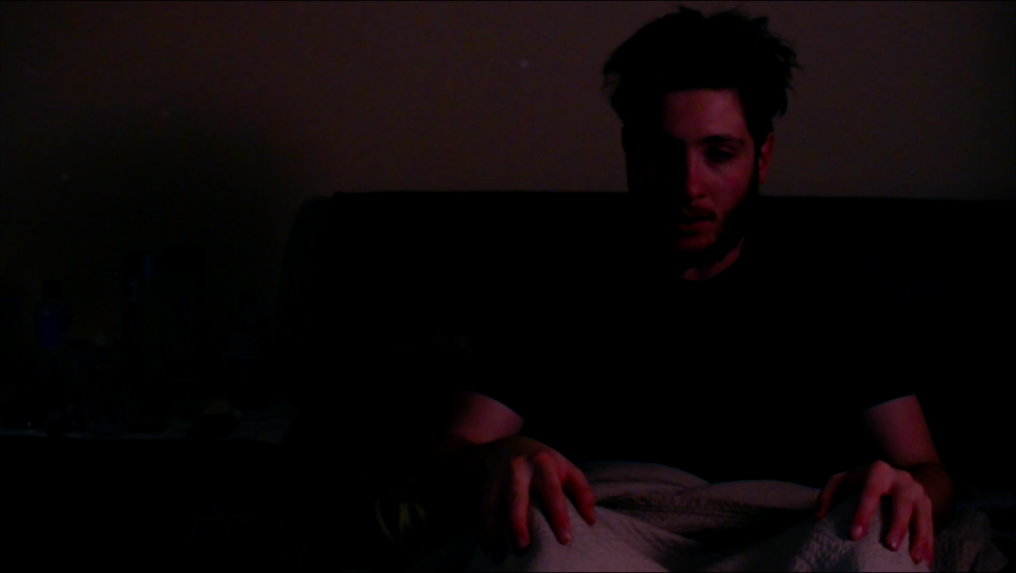
For this I changed the brightness level to low and put highlight to red. I wanted to see if it gives a surreal feeling to it. As if the character wakes from his dream but doesn’t feel like he is back to reality.